The Trick To Using Pink
We all know colour trends come and go, but some shades have timeless appeal – like pink, for example.
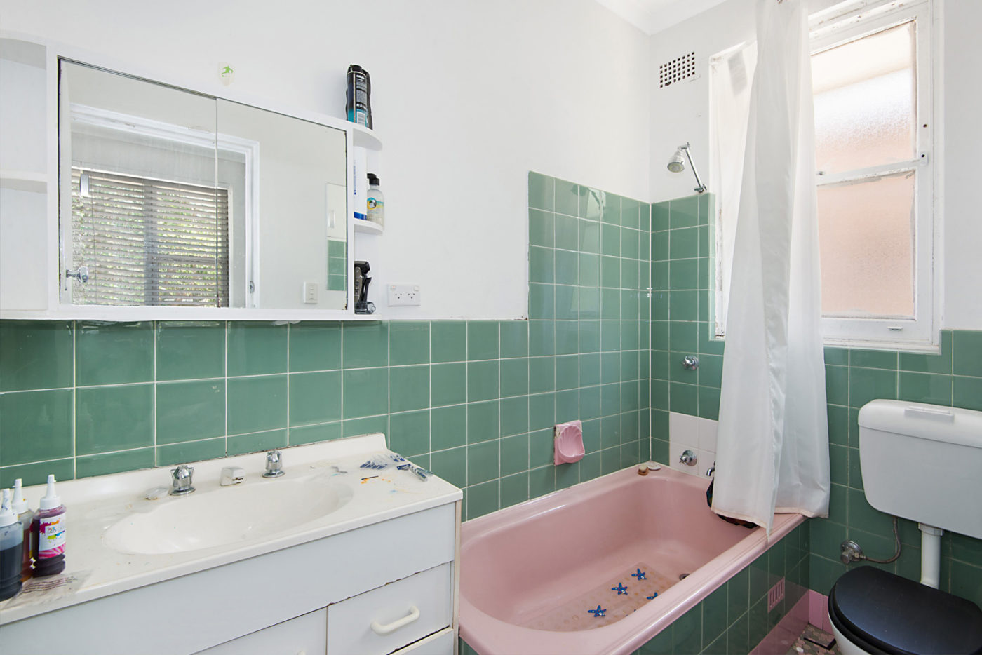
Its staying power in interiors and homewares has lasted long after Pantone named “Rose Quartz” its colour of 2016. It’s a popular accent colour in retro interiors (think pink bath, tiles or pedestal basins) and the soft coloured “Millennial Pink” has remained a firm favourite for many years now.
If you haven’t already invited it into your interiors, I’d say do it now, while Millennial Pink is still readily available in homewares and accessories. If you’re unsure how to incorporate pink into your home, here are a few tricks to get you started.
APPLY IN SMALL DOSES
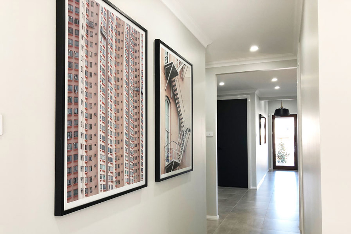
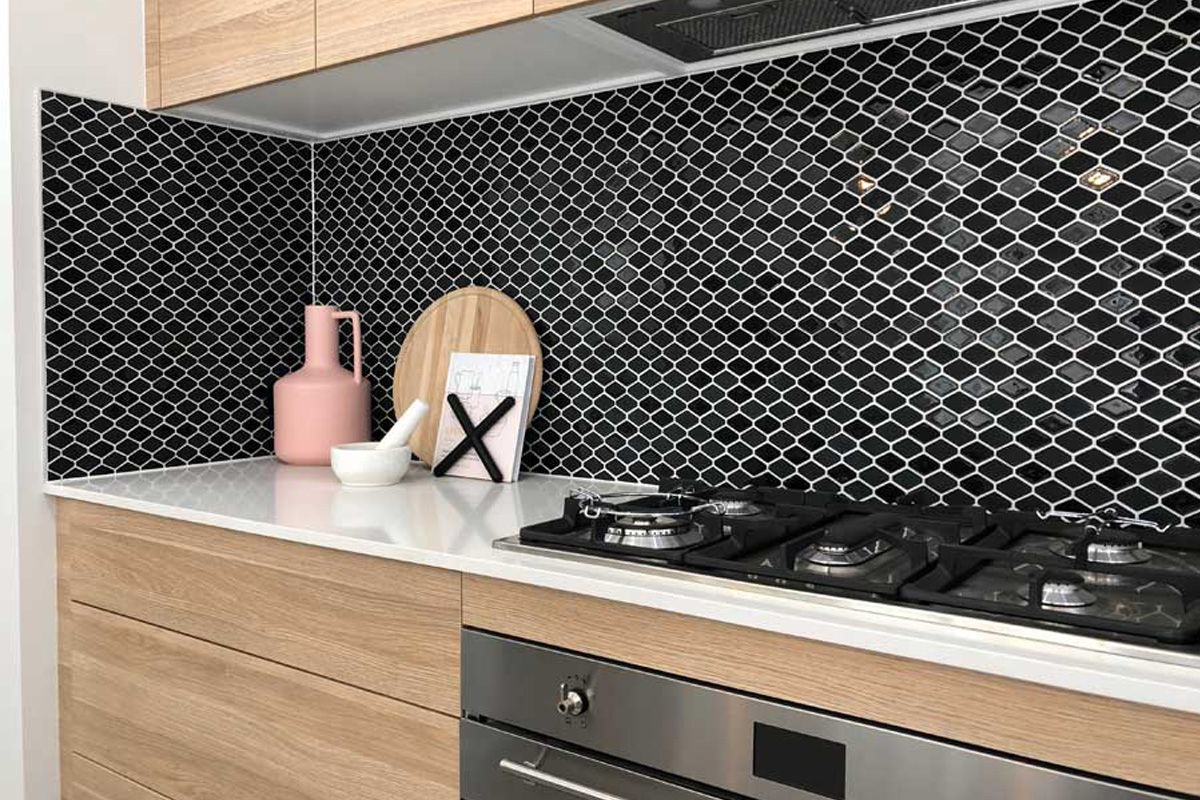
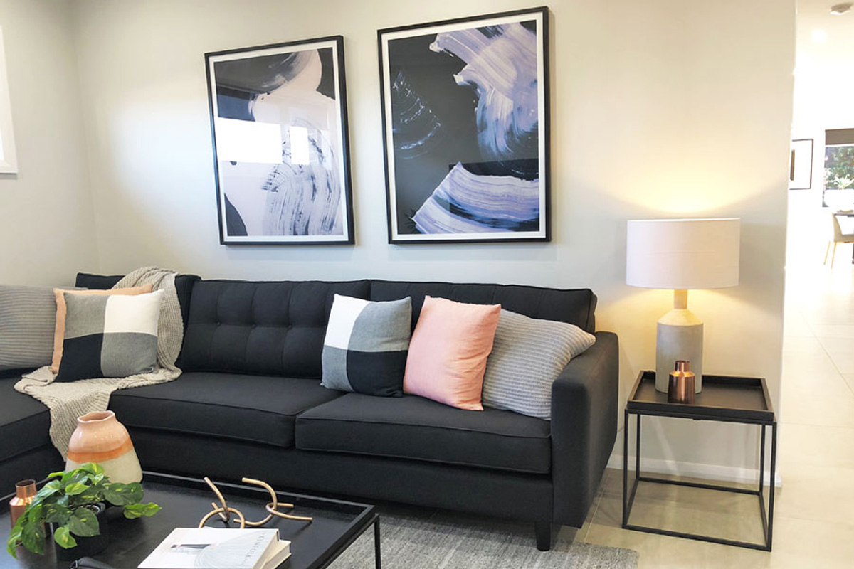
Any colour can be overwhelming in the wrong dosage and you’ll quickly tire of it. So welcome pinks in small amounts as an accent piece, and on easily replaceable items, such as cushions, vases, books or lamp shades.
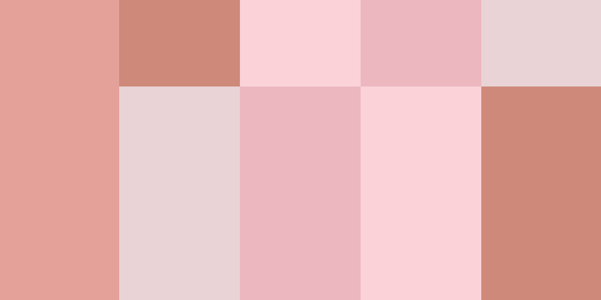
TRY SOFT, PALATABLE SHADES
When used in styling and decor, no colour usually works its best when added in its brightest hue. Experiment first with a muted version of your favourite colour. I believe this is why the MiIllennial version of pink has proved so successful. Its toned down, organic energy allows it to work very comfortably in any interior compared to the more vibrant versions of pink.
BLEND IT IN
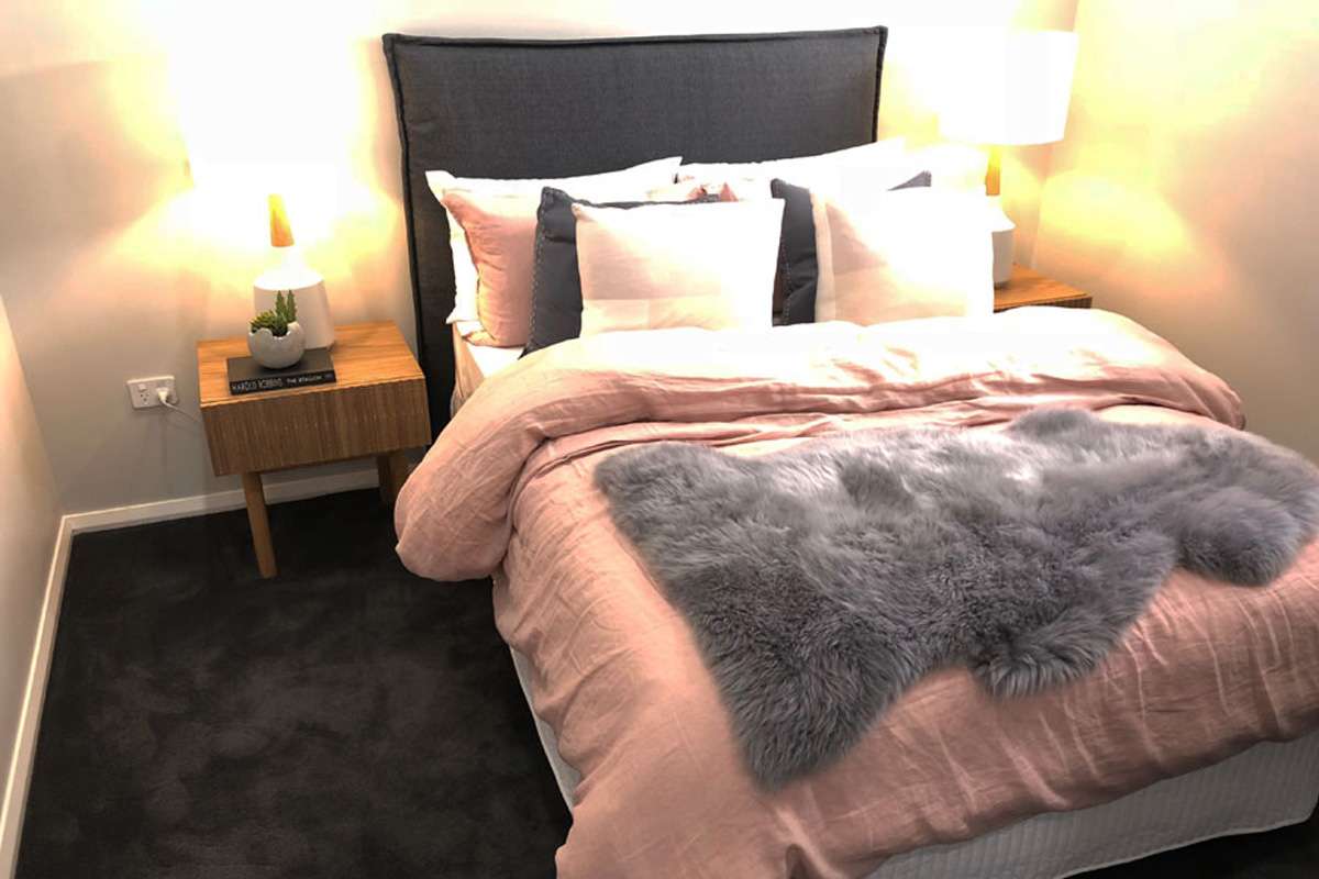
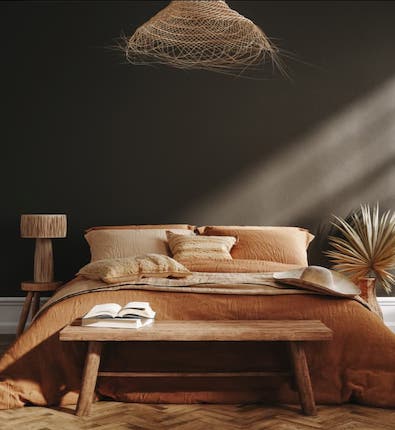
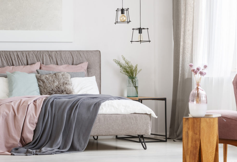
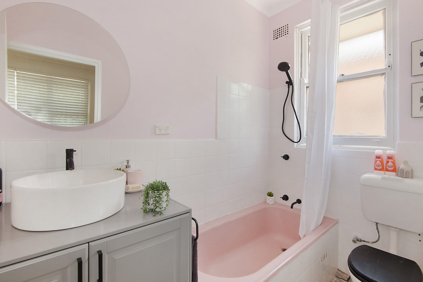
Instead of using colour as a ‘Wham, look at me!” feature (think a whole wall in pink), blend it gently into your home. Place a little here and there, allowing the pinkness to be recurrent, as you’ll see I’ve done in these rooms. This Taubmans video shows a great soft pink and grey colour combo for a feature wall, teaming Salinger with Moon Daisy.
ON CONTRAST
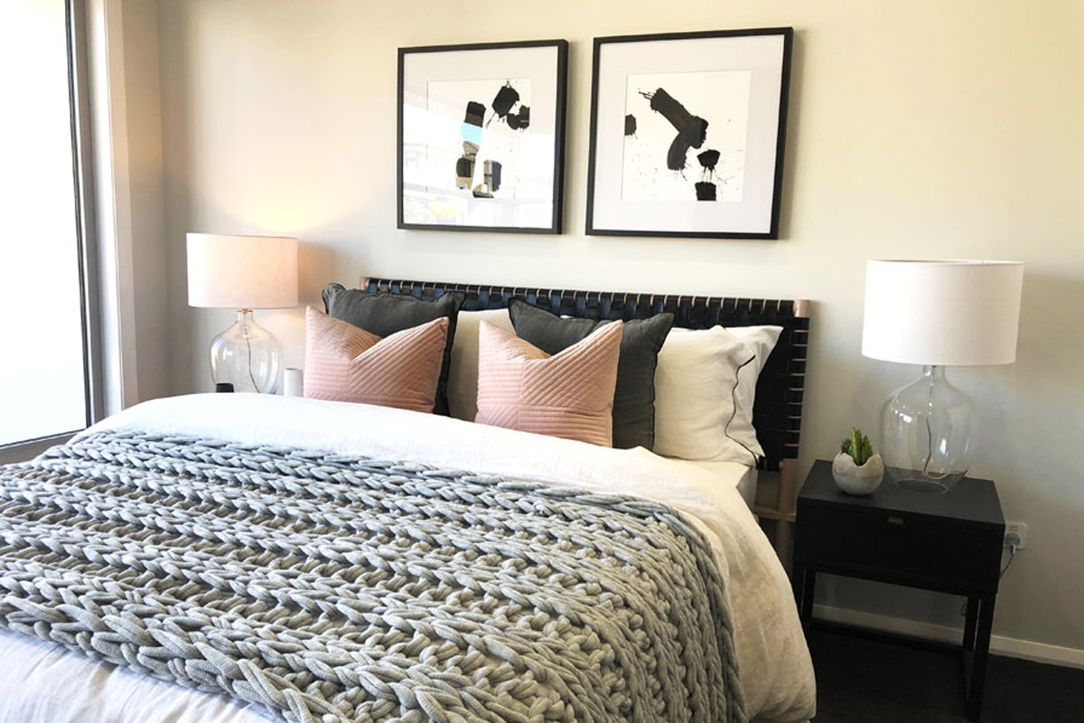
After much work deciding on the interior finishes for this home, I created a styling brief calling for a strong presence of charcoals, fresh whites and contrasting black; and to avoid the space becoming too masculine, the inclusion of a few splashes of Millennial Pink, adding interest and softening the space. The pink is present, yet the overall feeling is more industrial contemporary than overly girly, don’t you agree?