From Beige Blah to the Bold & Beautiful!
Turning “Yours & Mine” into “Ours”
Hi,
Welcome to Tracey & Stuart’s place! Think “Brady Bunch” but with more personality and a lot more clutter. Tracey and Stuart met 5 years ago & have since, unsuccessfully merged two households into one. Tracey’s already-bursting-at-the-seams home was suddenly packed with Stuart’s stuff, giving new meaning to “crowded house”. I had a serious mission here: turn this “yours and mine” mess into a cosy, colourful “ours” without sending Stuart packing.
THE LIVING ROOM
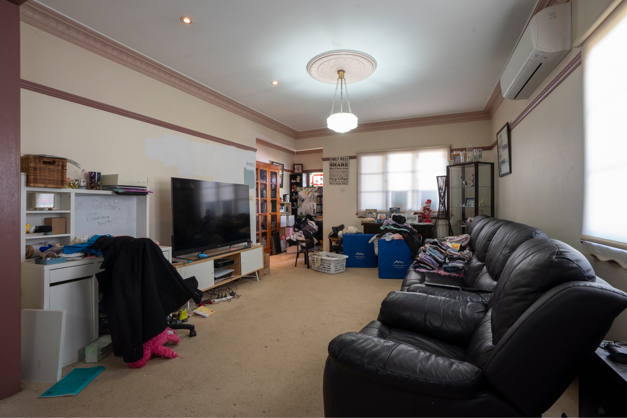
First impressions? Let’s just say this room was screaming for help – and colour. Everything was crammed up against the walls, leaving an awkward, empty space in the middle and not a shred of personality in sight. Beige carpet. Beige walls. Beige… everything. It felt like someone had dialled the “blah” to maximum.
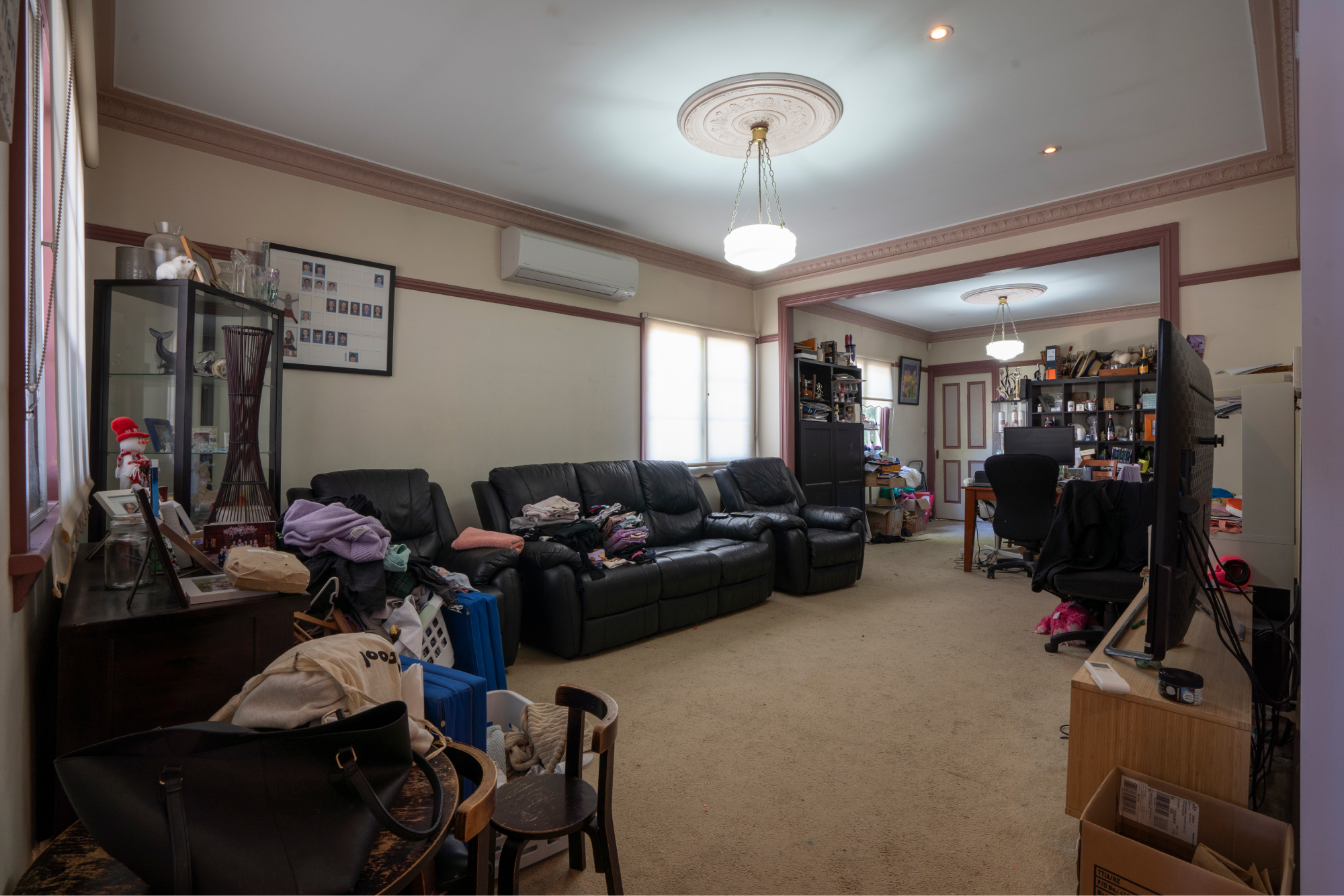
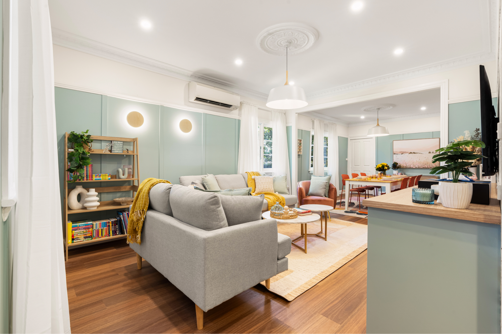
Slide the arrow left to right to see the before & after transition.
Step 1 – That carpet had to go. Out with the beige & in with new timber floors from Flooring Xtra. These floating floorboards are far more practical for a family of 6, have less cleaning issues and visually connect better with all the new furnishings going into the room. The living room had a picture rail, so instead of fighting it, I embraced it, adding lengths of timber moulding (which we then painted) to give the space some much-needed character.
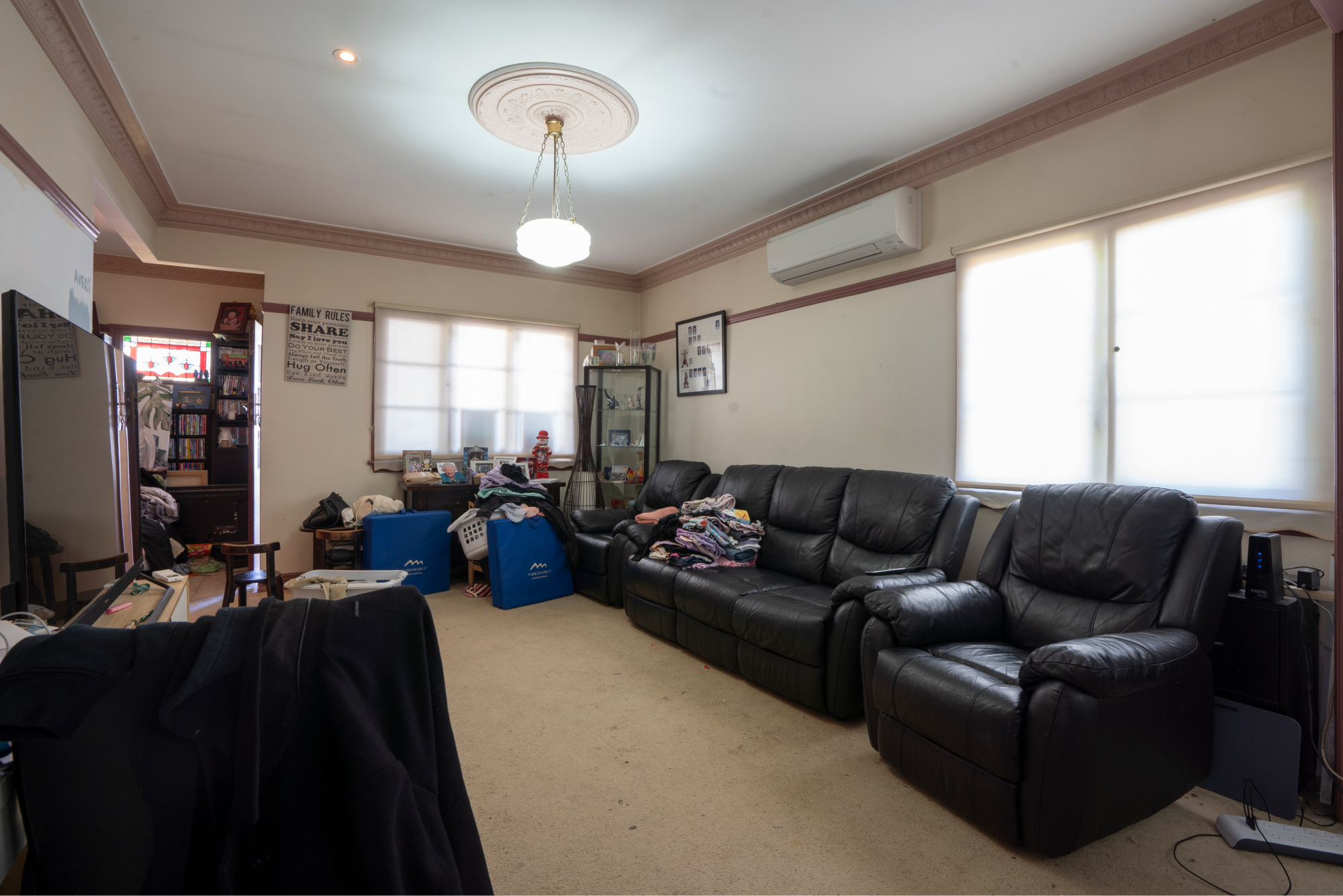

Slide the arrow left to right to see the before & after transition.
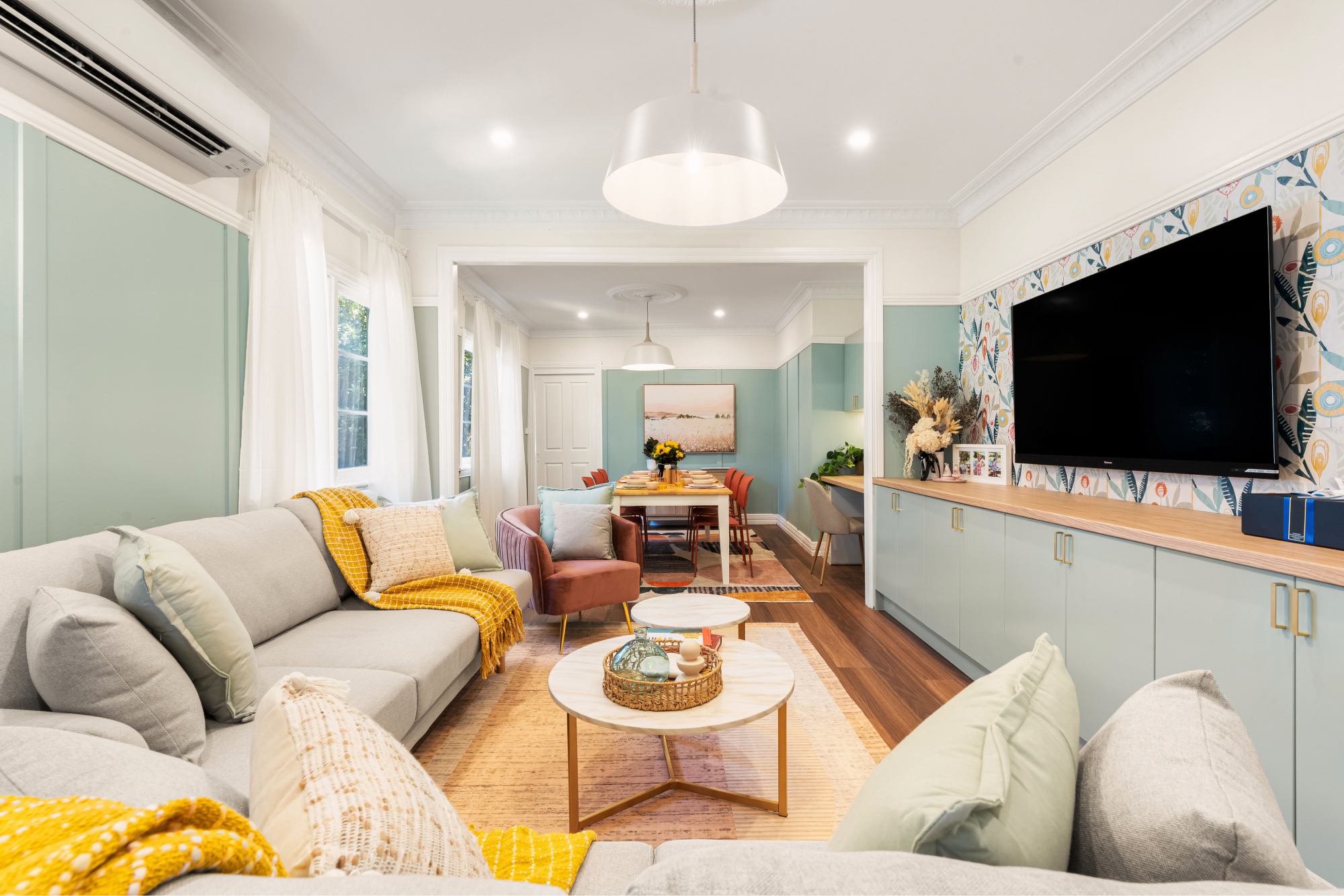
Step 2 – Goodbye, beige! Hello, colour. We coated the walls in a bold Taubmans shade called “Blue Willow” that suits Tracey’s sunny personality. This wasn’t just a lick of paint; it was a personality transplant. The room also needed better storage so that got an upgrade too, thanks to Kaboodle flatpack cabinetry, painted to match my daring colour scheme.
Step 3 – Good lighting can be a real game-changer and this place was begging for it. I had my sparkies swap out the old halogen downlights for LEDs in warm white (because who doesn’t want to see what they’re doing?). Beacon Lighting’s Husk pendant lights and timber wall fixtures added warmth and pulled the whole look together. New Hilja sheer curtains, straight off the shelf from Ikea for just $25 per pack, let natural light in whilst providing privacy. One of my favourite tricks is to install multiple packs of this curtain on each window so they appear fuller and therefore, look more expensive.


Slide the arrow left to right to see the before & after transition.
Step 4 – The final touches? We installed colourful wallpaper on the TV feature wall to add more personality to the room and lighter, textured furniture that doesn’t weigh the room down. A velvet armchair in blush pink from Luxo Living creates a clear boundary between the living and dining spaces. This room now feels like a space where people would actually want to hang out!
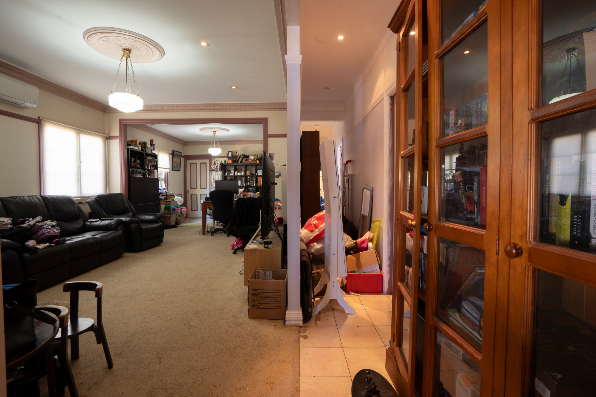
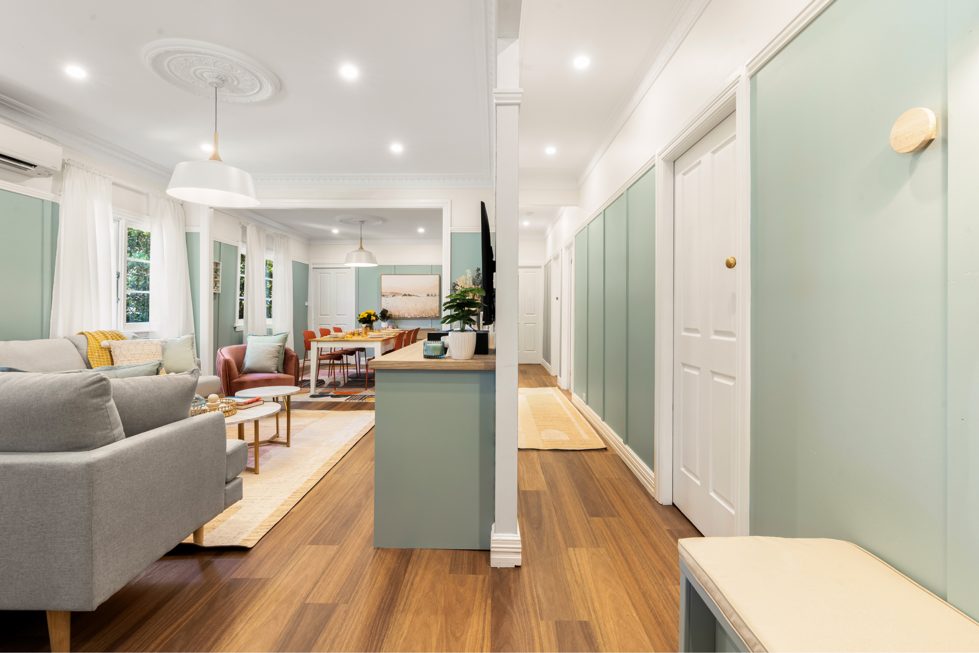
Slide the arrow left to right to see the before & after transition.
THE DINING ROOM
When you’re renovating, the last thing you want is your house looking like it’s got a split personality. No one wants to walk from “coastal vibes” in the living room to “grandma’s antique shop” in the dining room. The trick? Pick a style or theme and give it a starring role across your whole house. Think of it like a good Aussie BBQ—there’s variety, but everything fits together. That’s why in this reno, the colour scheme & lighting continued into the dining room which echoes the living room, but with the twist of colourful dining room chairs & a big rug underneath.
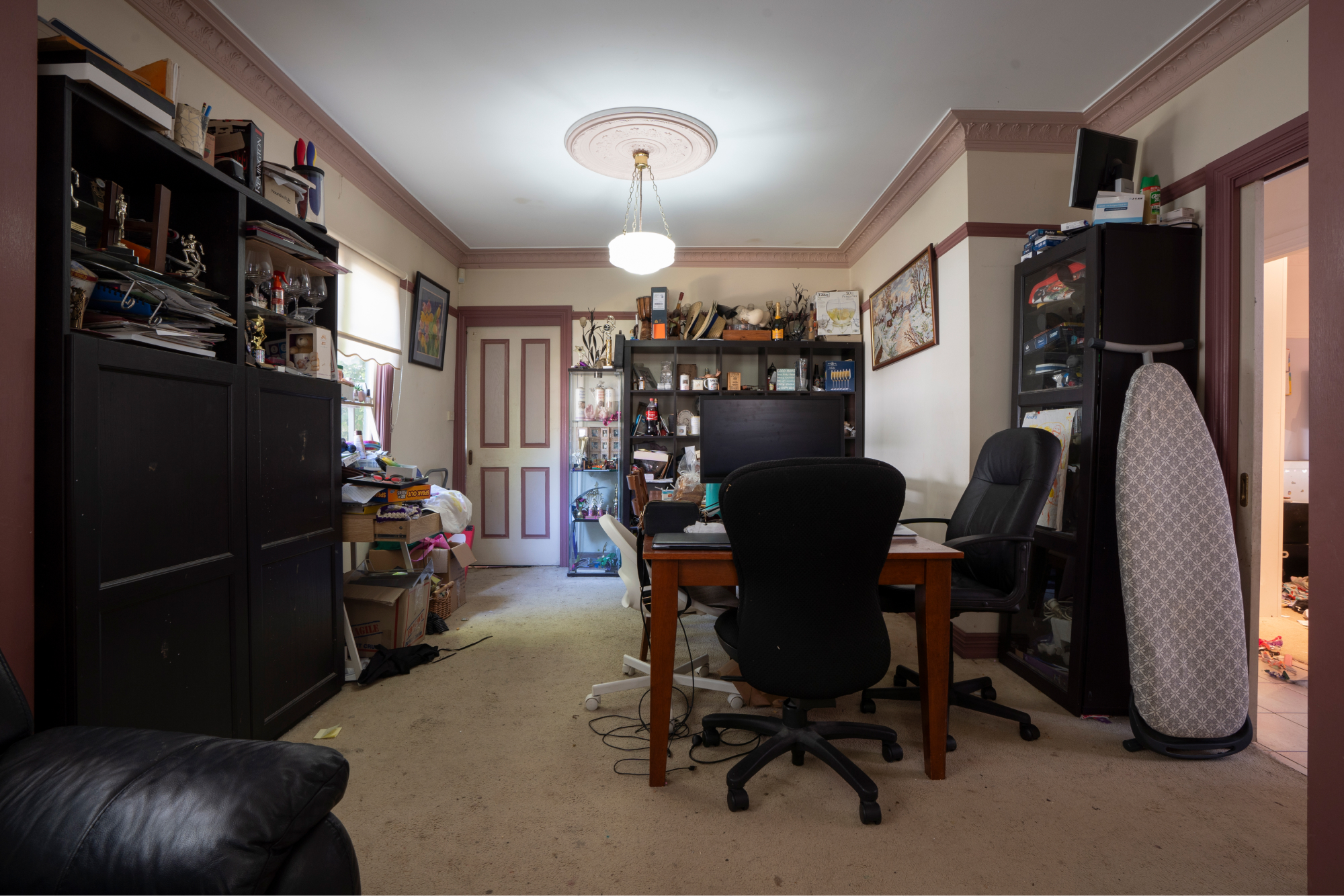

Slide the arrow left to right to see the before & after transition.
Now, let’s look seriously at this dining room. Stuart had turned it into his makeshift “executive suite”, complete with a massive black monitor screaming, “I mean business!” Why? Because every square inch of this house was already bursting at the seams. Right next to this office-on-a-dining-table was a doorway to the bedrooms—a handy shortcut, but a bit redundant since the hallway entry was only 5 metres further down. So, we said, “Bye-bye, doorway!” and walled it up with some trusty gyprock. We then added Kaboodle flat-pack cabinetry and one of my favourite products: Trademaster’s Oiled Oak benchtop on top to create a dedicated home office. Now Stuart’s got a proper desk with enough space for all his gear, and it matches the living room cabinetry for that “I planned this” look. Sure, the office is still in the dining room & that’s not ideal, but at least now the family can eat without tripping over Stuart’s spreadsheets. It’s a win-win—Stuart gets his own space, and the dining table is back to doing what it does best: bringing the fam together for a good feed.
Before we move off the dining room, take a quick squizz at the dining table in one of the before shots. Looks like a brand-new table, right? Nope – just a bit of DIY magic! It was given a “cosmetic facelift”, Aussie style. The old stain was sanded off the top of the table & the legs and underside, painted in Taubmans Crisp White. Voilà – a new lease on life through some simple upcycling that anyone can do!
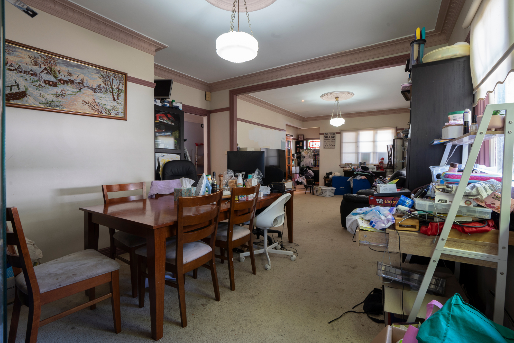

Slide the arrow left to right to see the before & after transition.
THE HALLWAY & MUDROOM
Next, the hallway. This stretch of house had become a borderline storage unit, cluttered with anything and everything. After clearing the clutter, we continued the living room’s timber flooring and colour scheme throughout. To break up the long hallway, we added a vibrant yellow floral wallpaper on one side, new downlights make an appearance once again and new wall lights for extra flair.
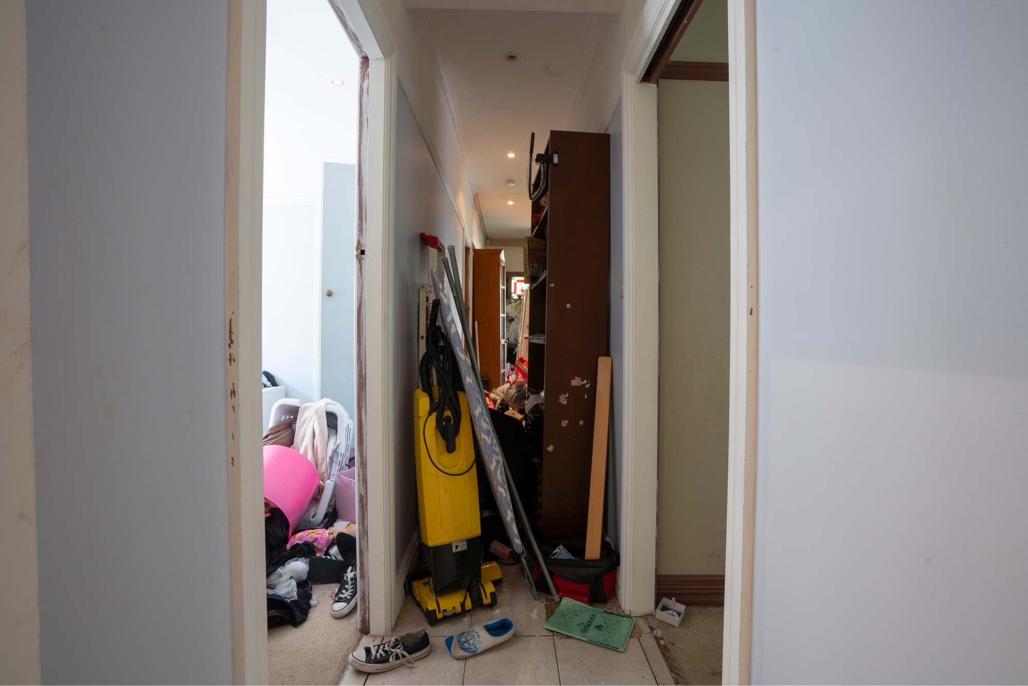
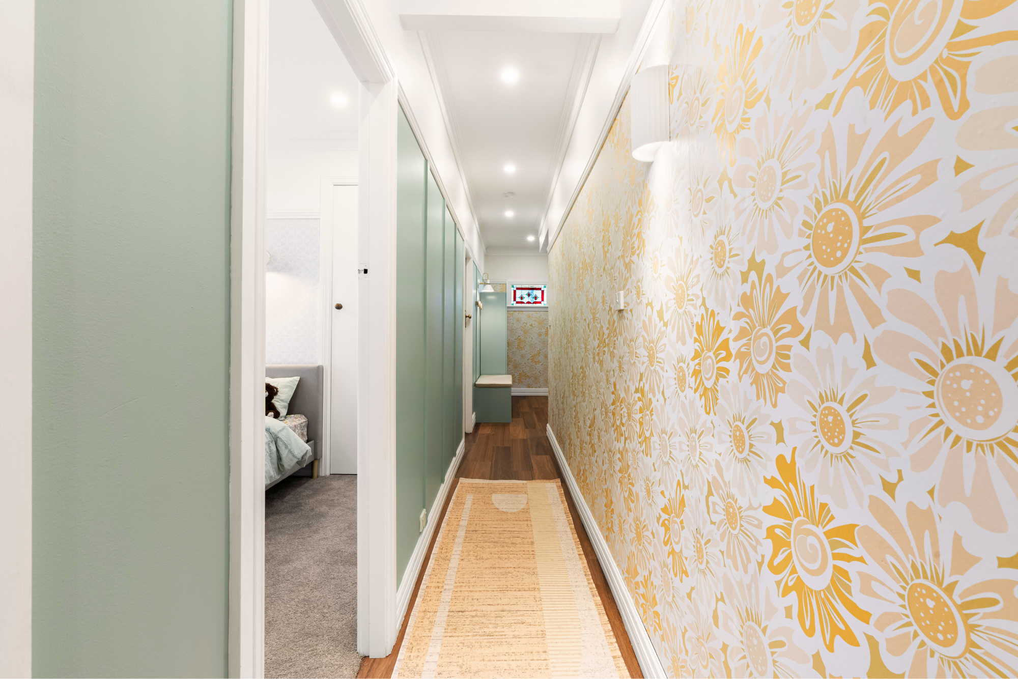
Slide the arrow left to right to see the before & after transition.
As for the other end of the hallway (near the front door), it was chaos central with clutter greeting you the moment the door is opened. With a Kaboodle pantry cupboard, a simple bench, some timber hooks & a bench seat cushion, it’s now an organised entryway that welcomes you with style. By matching the hallway wallpaper and keeping the colour theme, the mudroom feels like an intentional part of the home, not just a dumping ground.
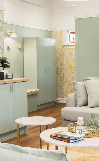
The new mudroom, located opposite the front door.
THE TEENAGER’S BEDROOM
Imagine trying to make a small bedroom work for two teenagers (from a blended family) who each want their own space. This room was dominated by a massive bunk bed and bulky storage, leaving hardly any room to move.
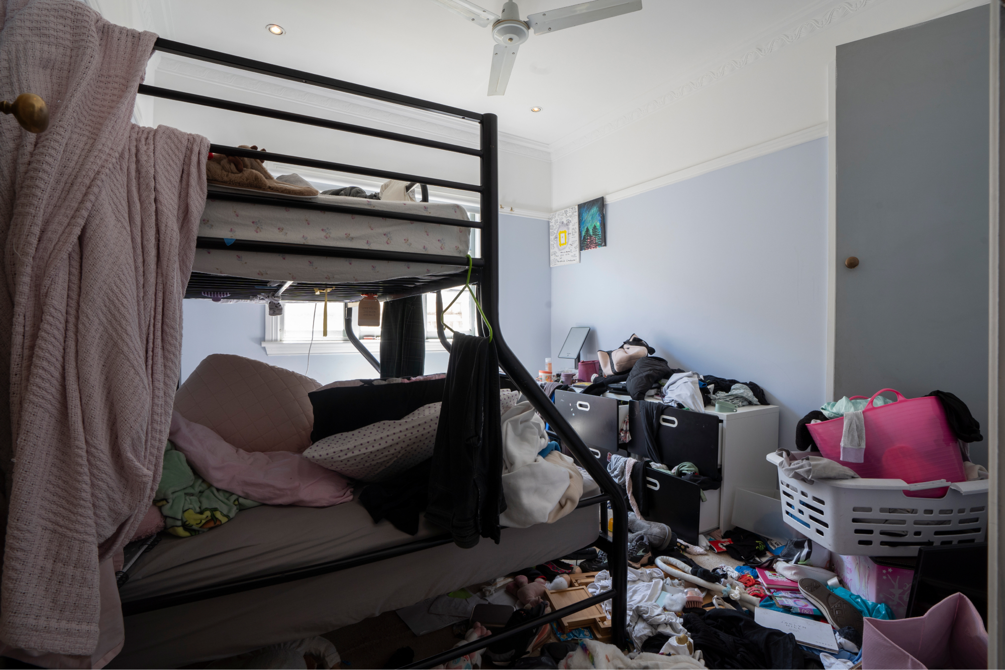
Bedroom – Before
First, we ditched the old carpet that had seen better days, in favour of softer, new carpet from Flooring Xtra. A new wallpaper feature wall draws attention to the beds – one for each girl, with cosy matching bed linens. The addition of a wall light over each bed provides practical task lighting & a fresh coat of paint, modern blinds and a sleek ceiling fan give the room a polished, grown-up feel. A shared study desk, a chest of drawers each and wall shelving, also provide much needed storage in the room. Now, the girls have their own space to relax without stepping on each other’s toes.

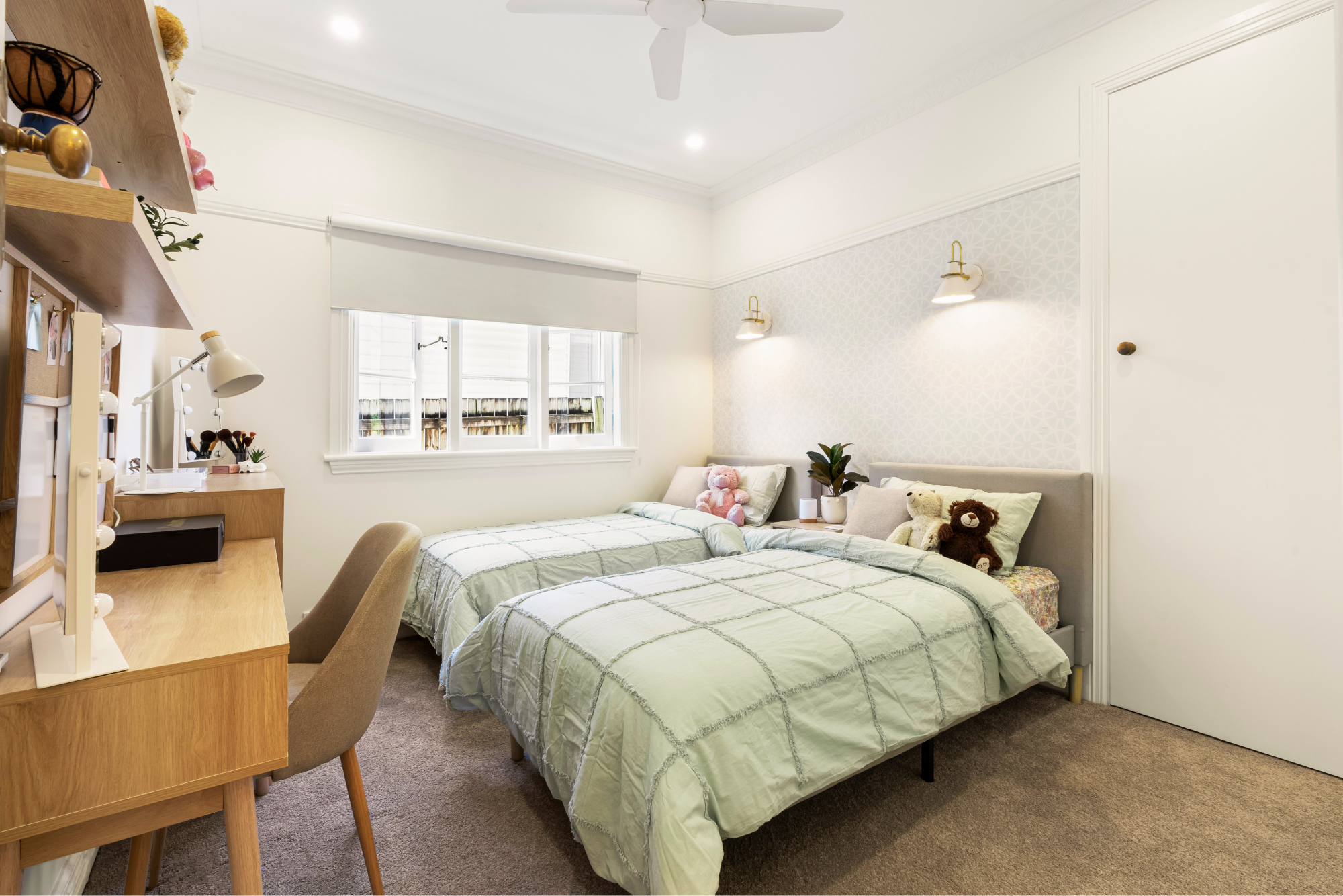
Slide the arrow left to right to see the before & after transition.
THE YOUNGER GIRL’S BEDROOM
Finally, we tackled the younger girl’s room. It needed to be cute for 2 youngsters but not too “kiddie,” so it could grow with them, over time. The carpet was again swapped for something softer, and we brought in a smaller, more open bunk bed with rounded edges that makes the room feel less cramped. I also wasn’t a fan of the bunk bed running parallel to the window so my aim was to minimise that.
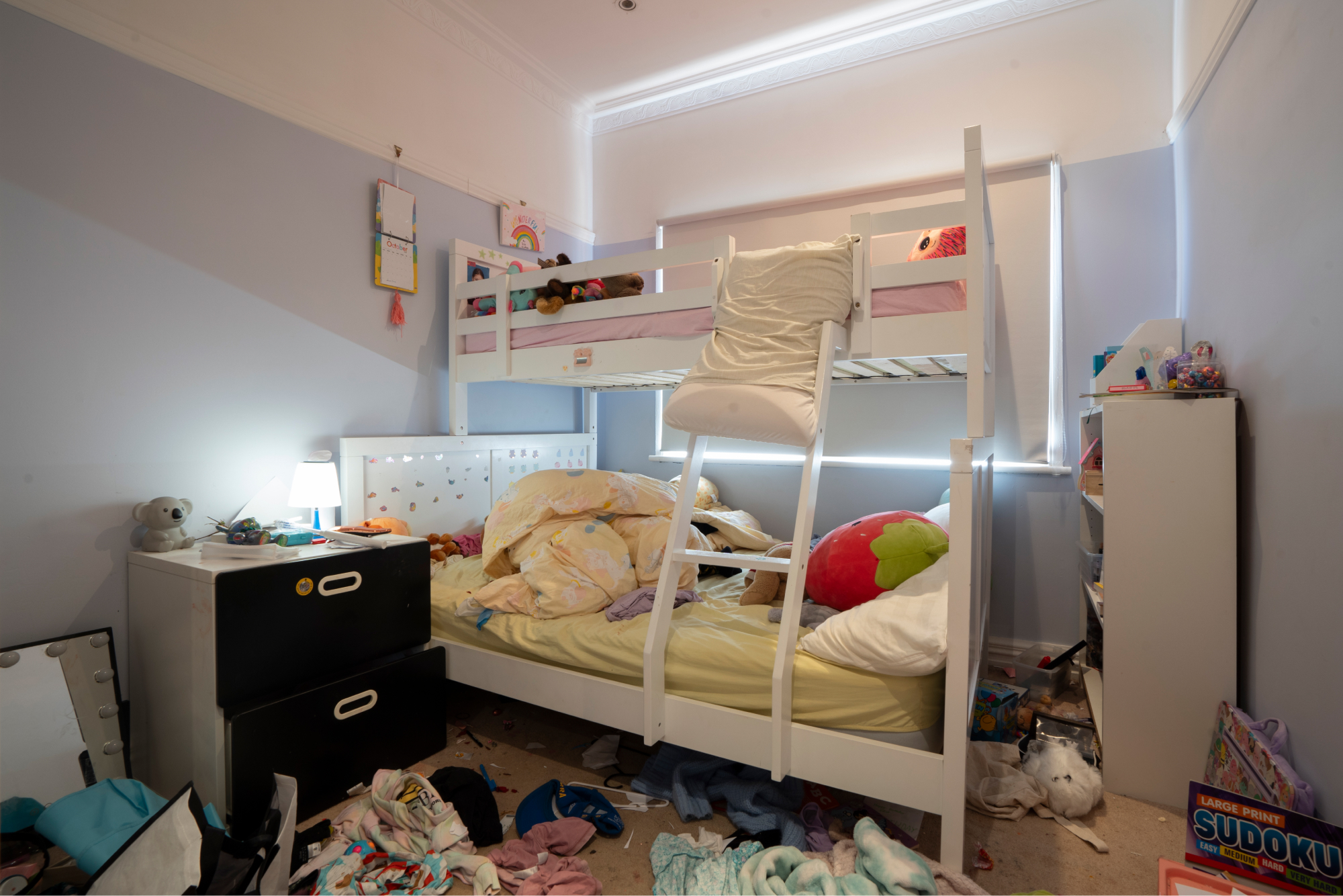
Girl’s bedroom – before.
A floral wallpaper feature wall adds charm, while twin desks and floating shelves give the girls space for homework and a display for their favourite things. Affordable quilt covers from Kmart add more colour to the room, making this room ready to evolve, as they do.

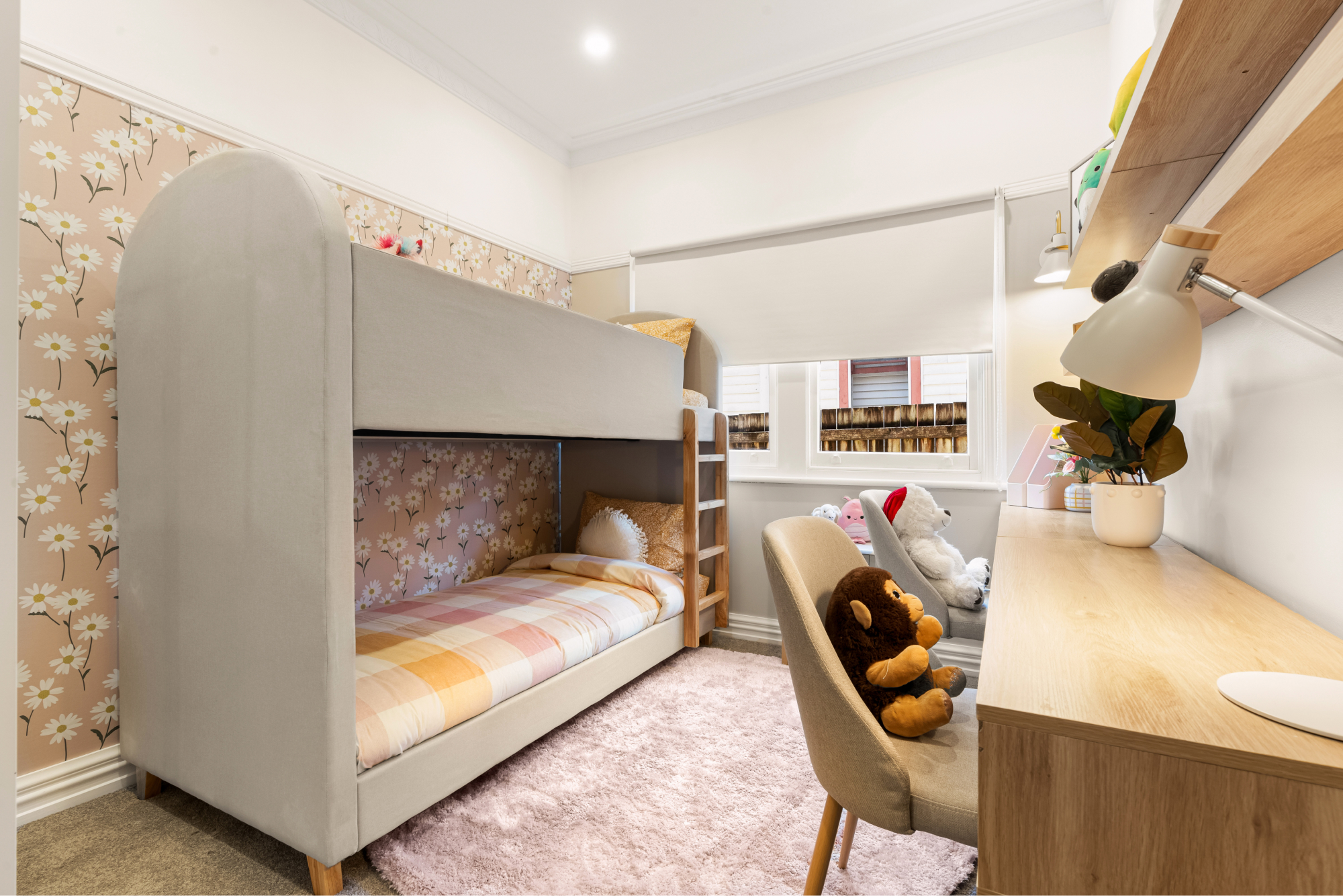
Slide the arrow left to right to see the before & after transition.
A HOME FOR EVERYONE
What this cosmetic renovation achieved (over two intense days of filming) is a home that now truly reflects the people who live in it. Each room feels cohesive, from the living areas to the bedrooms, thanks to consistent colours, thoughtful zones and a few bold choices. More importantly, it now feels like a place everyone can call “home” – not just Tracey’s house with Stuart’s stuff squeezed in. By turning clutter into character and beige into bold, this place went from drab to fab, becoming a welcoming, vibrant home for a modern-day Brady Bunch.
Until next time,
Cherie x


Amazing makeover Cherie. Love the colours and textures throughout the home. From dull and dreary to bright and happy. Well done.
This stunning makeover showcases how fearless design choices can completely revitalise a space. A must-read for anyone ready to embrace colour!
Thank you The Furniture Gallery!