


How To Choose Your Paint Colours Strategically
Thinking of painting your home? Did you know the colours you select, can have a direct correlation on your mood? Wondering why you’ve been a bit crabby of late? Not getting a good night’s sleep? There could be a simple explanation: you’ve stuffed your paint colours up!
Colour can have a profound & direct effect on your moods. It’s a critical thing to get right in your home renovation, with paint one of the most powerful & cost-effective ways to transform your space.
But … for the average person, choosing the right paint colours is hard & confusing. It’s an artform that some people do effortlessly, while others get it horribly wrong. So, with that in mind, I thought I’d give you some high-level basics of colour theory so you get your colour schemes right!
INTRODUCTION TO COLOUR THEORY
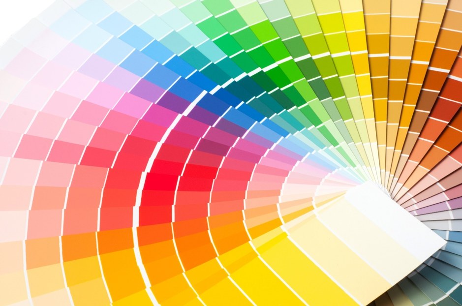
The concept of how & why some colour combinations work & others don’t, is a science based upon the relationship of colours on a nifty little device called the colour wheel.
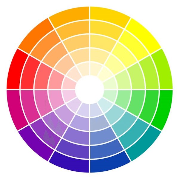
To understand the colour wheel, think of the last rainbow you saw. We all learn as kids that the colours of the rainbow, run next to each other in an order. This order is created by nature where each colour mixes with the next to create a new colour. Therefore, think of the colour wheel as nothing more than a simplified rainbow that helps us unlock all the colour combinations we have in our world.

BASICS OF THE COLOUR WHEEL
The world of colour is quite complex but let me have a crack at trying to explain it to you in the easiest way possible …
All colours stem from 3 primary groups: (1) primary colours, (2) secondary colours & (3) tertiary colours, as highlighted below:
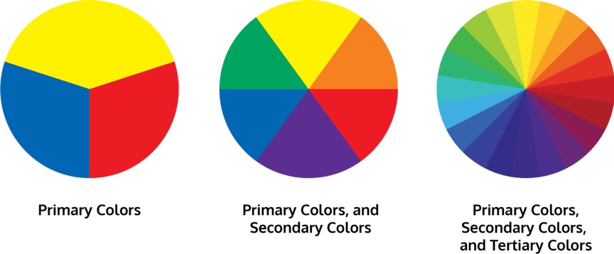
Colours are created by simply mixing colours with other colours to create new colours!
Pretty simple, huh?
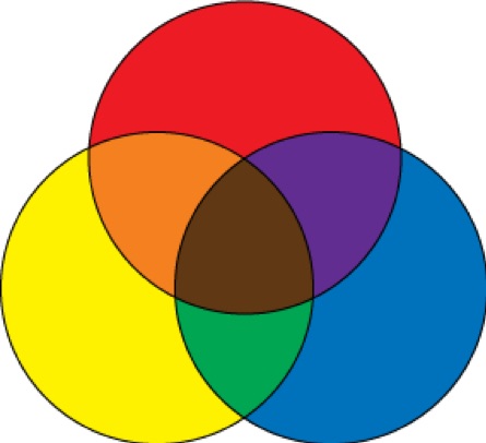
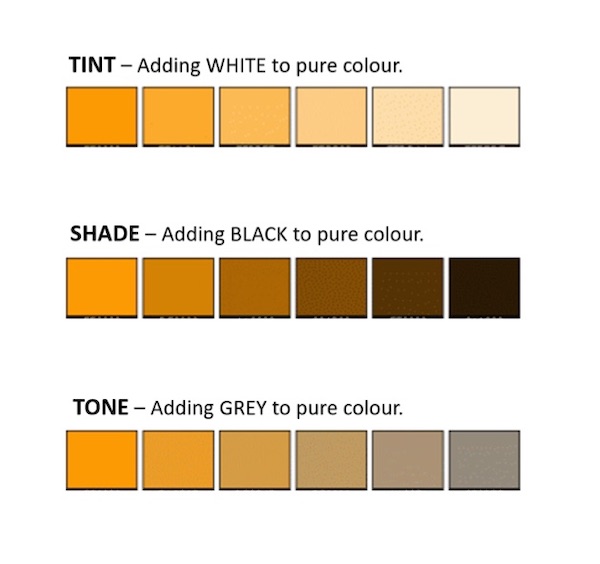
To create lighter & darker variations of a colour (for example BLUE becoming LIGHT BLUE or DARK BLUE, (plus all the slight variations in between), we add differing amounts of BLACK, WHITE & GREY.

You make colour lighter by adding WHITE (known as Tints), darker by adding BLACK (known as Shade), & moody “or dirty” by adding GREY (known as Tone) to create different depths of all colours.
HOW TO CREATE YOUR COLOUR SCHEMES
Now you know the basics of how the colour wheel works, choosing your colour schemes strategically is simply a process of learning which colour combo’s naturally work together.
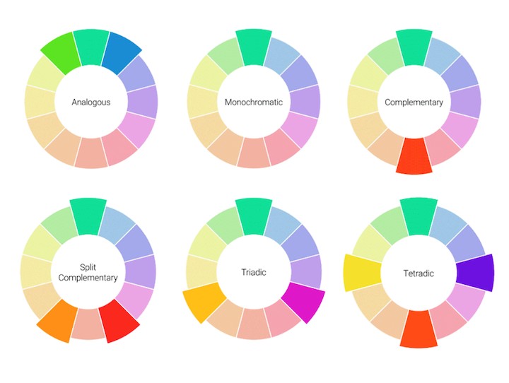
Using the colour wheel as your guide, there are many different versions of colour combinations that work best together but the 6 main ones are:
Let me explain each …
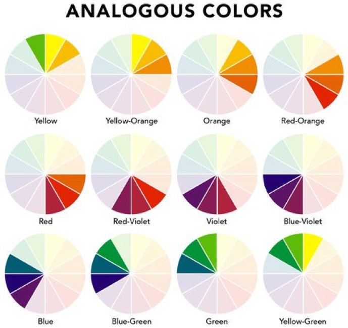
- ANALOGOUS COLOUR SCHEMES
Analogous colour schemes normally use a combination of 3 (maximum 4) colours that sit right next to each other on any side of the colour wheel. For this type of colour scheme, it’s about selecting 1 single predominant colour on the colour wheel then moving one segment to the left or right of the colour wheel to form a group of 3 colours.
 Analogous Colour Scheme – using Blue/Green, Green, Yellow Green
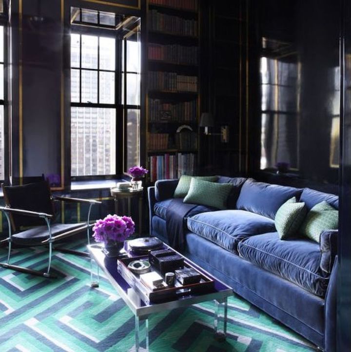 Analogous Colour Scheme – Blue, Blue / Green, Violet
Image Source: elledecor.com
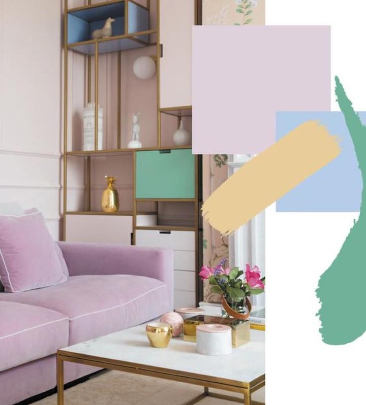
- MONOCHROMATIC COLOUR SCHEMES
This type of colour scheme is created using 1 base colour, but combining its various forms, tones, tints & shades to create a cohesive space. It’s usually combined with white, black or some neutrals to add contrast, but the colour is repeated throughout the interiors to create a harmonious look.

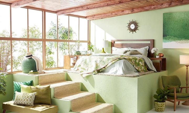 Monochromatic Colour Scheme – in this example, different variations of green have been used throughout this room.
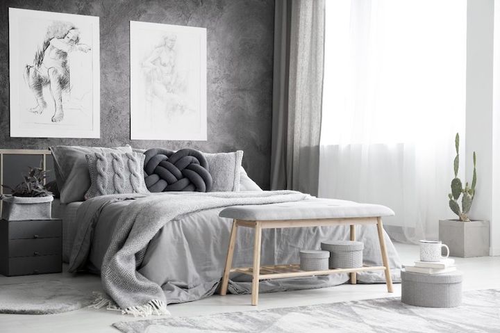 Monochromatic Colour Scheme – using grey as the base colour with light & dark pops of black & white for contrast.
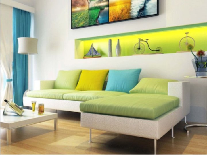
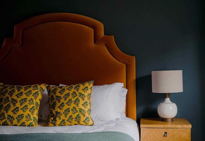
- COMPLEMENTARY or CONTRASTING COLOUR SCHEMES
Complementary colours sit completely opposite each other on the colour wheel providing high contrast. These combinations can be quite striking when the colour is used at full saturation however these types of schemes work better when toned down a little. An example of this could be to use a deep green (being a shade of green) on your walls, teamed with a soft pink sofa (which is a lighter tint of red).
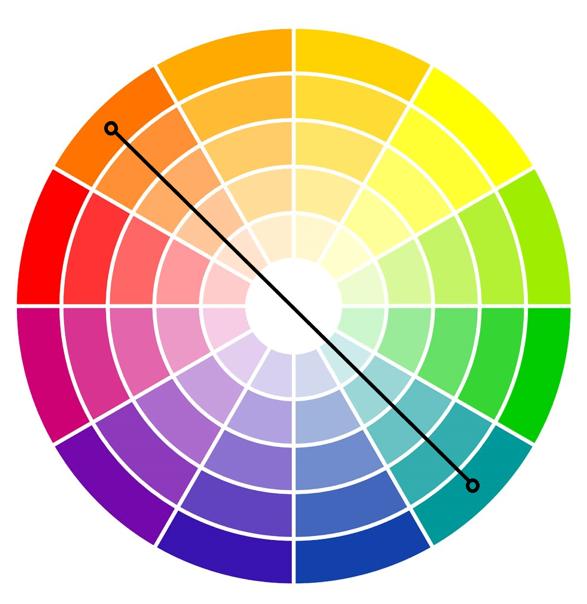
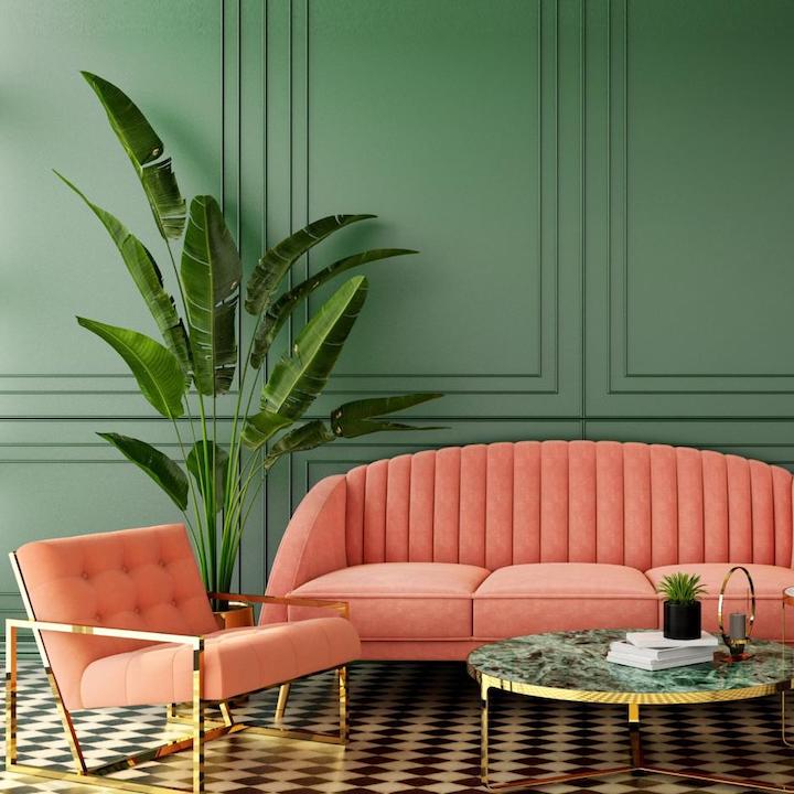 Complimentary / Contrasting Colour Scheme – Coral (red based) with teal (green based) which are opposite colours on the colour wheel.
 Complimentary / Contrasting Colour Scheme – using lighter shades of blue & yellow for contrast.
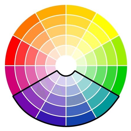
- SPLIT COMPLEMENTARY COLOUR SCHEMES
Split complementary colours are based on the complementary scheme, however instead of using the colour directly opposite, you look to the colours either side of it. This variation offers more options for interior styling, providing rooms with more contrast.
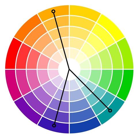
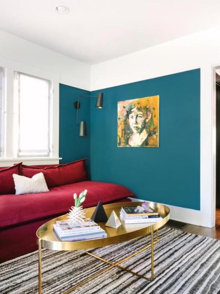 Split Complimentary Colour Scheme – teal as the primary colour, red as the secondary colour & yellow / gold as the accent colour.
Image Source: caitlinmurray.com
 Split Complimentary Colour Scheme – blue, orange & a pop of yellow.
Image Source: stylebymillyhenderson.com
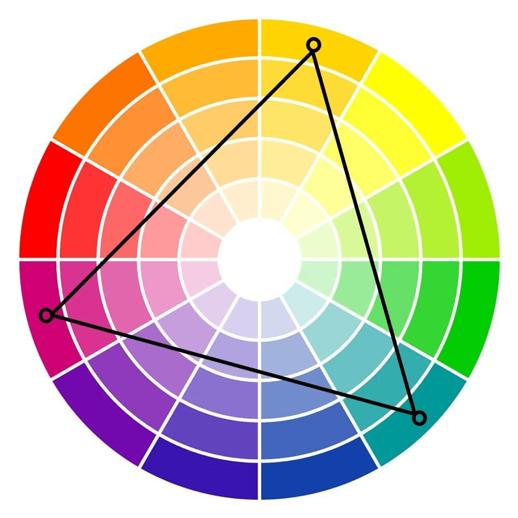
- TRIADIC SCHEME
The triadic is another 3-colour combo in the shape of a triangle where the points of the triangle come together to form the triadic combination. The key with this colour scheme is to find 1 colour you really want to use, then locate the other two colours adjacent to the split complementary colours.
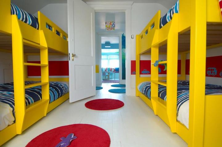 Triadic colour scheme using yellow, red & blue.
Image Source: www.homeedit.com
- TETRADIC COMBINATIONS
Taking it up a level in complexity, is the tetradic colour combination involving colours that are equidistant apart, using 4 colours instead of 3. You can find a tetradic combination by placing a square on the colour wheel and choosing the colours at each corner, or by choosing two opposing sets of complementary colours.
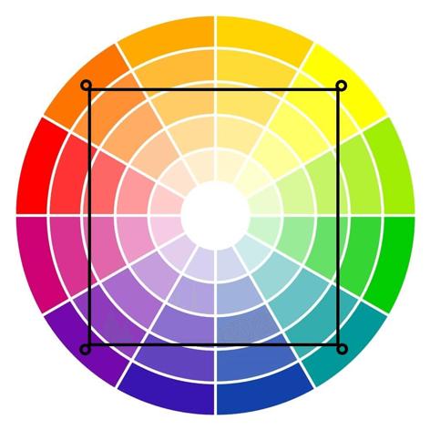
Tetradic colour scheme using shades of purple, orange, yellow & green
Image Source: www.i.pinimg.com
So…. when it comes to strategically choosing your paint colours, it’s fair to say – it’s basically a game of spin the wheel!
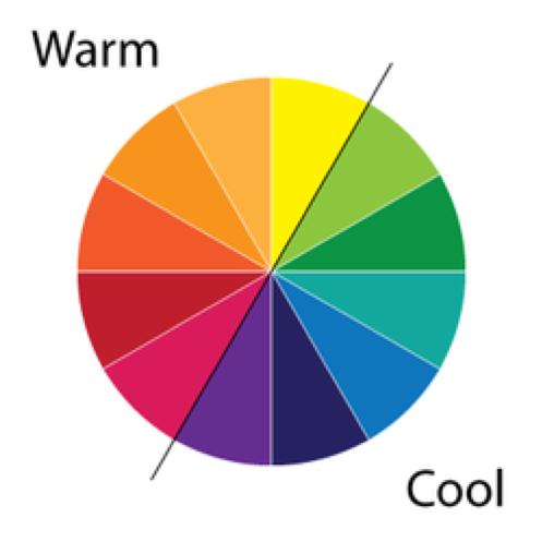
COOL VS WARM COLOURS
Now, we’re not done yet. Besides knowing which colour combo’s naturally work together, you’ll also need to know that colours are generally categorized into 2 categories – “warm” or “cool” colours. Warm colours sit on 1 side of the colour wheel with cool colours on the other side.
Warm colours tend to make spaces “advance inwards” whilst cool colours “recede outwards”, affecting the perception of depth in a room.
A warm paint colour on your ceilings can make them look lower whilst cool tones can make them appear higher & lighter.
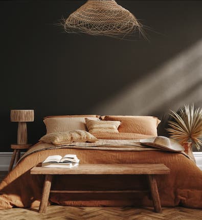
Warmer colours such as reds, oranges & yellows tend to trigger emotions of happiness, reminding us of the heat & sunshine. So, they’re good colour choices for social rooms such as your lounge room or kitchen, where you want to stimulate conversation & a sense of activity.
On the other hand, red or orange is not a great colour for bedrooms, where the opposite effect is required. Here you might want to choose a colour from the other side of the wheel, the cool colours that sit on the blue / green range. These create a sense of serenity (which is what you want in your bedroom), reminding us of calming natural elements like water & the sky. They’re good options for bedrooms, bathrooms & your home office. Just be careful – stay away from yellows & greens in the parts of your bathroom where you plan to put on makeup. These colours can make your skin take on a green or yellow tint in the mirror.
Before you paint any rooms in your home, it’s important you consider your:
- Rooms size;
- Ceiling height;
- The feeling you want to create in the room.
then decide if a “warm” or “cool” colour palette will work best. It’s also possible to mix warm & cool paint tones in one room to create certain effects. One way to effectively do this is to choose one wall for a warm colour & leave the rest of the room in a cool or neutral colour to balance it all out. This adds a touch of warmth without overdoing it.
KEY TIPS – WARM COLOURS
- Can make a space feel like its advancing towards you so can make rooms appear smaller but cozier & more intimate.
- Always use warmer colours for rooms that are more spacious. This will make your rooms feel more inviting.
- A long narrow room can feel “squarer” by painting the narrow end of the room in a warmer tone.
- If you’re painting a room that’s smaller in size which is crowded with furniture & belongings, warm colours will make the room feel more cluttered.
KEY TIPS – COOL COLOURS
- Great colour choice for making smaller rooms feel larger / more spacious such as small bathrooms, bedrooms & living areas.
- Avoid using cool colours in rooms that are already large as it will make the room look & feel sparse (especially if you don’t have much furniture in the room).
- Can create a soothing effect in a space, replicating a feeling of nature that brings the outside in.
WHITE
Now a quick word on the colour WHITE. It’s one of the most popular colours used in interior design. Why? It’s always a safe bet & a great blank canvas for all your other furnishings & styling items. But of course, there’s a thousand shades of white. Confusing, eh?
Just choose a cool or warm white, depending on what feeling you want to evoke in each room. It’s the same as buying light bulbs – cool white or warm white bulbs? The cool whites can be a real mood killer, something you’d have in a police interrogation room whereas warm warms are softer / moodier.
THE 60-30-10 RULE
Last but not least, interior designers use the rule of 60-30-10. That means, when choosing your colour scheme in a room, use 60% of a dominant colour, 30% of a secondary colour & the final 10% in an accent colour. Ideally, that’s no more than 3 colours in a room or it can look too busy.
Here’s how it works.
60% of the main colour includes things like your walls, your sofa, the major colour of your rug or flooring. In a kitchen that would include your cabinetry & splashback. The 60% is really the things that take up the most visual space in a room.
30% of colour will appear in your furniture, textiles, lighting, etc. To keep the room interesting, you want to vary the tones of this colour, so it’s not just all the one shade.
The remaining 10% is for pops of colour in your knick-knacks, picture frames, candles, a floral arrangement, throw cushions… the little things that are easy to swap in & out at the end, to finalise your look.
HELP IS AT HAND
Fortunately, most of the major paint companies recognise that the average joe-blow struggles with paint colours. Just jump onto their websites (Taubmans, Dulux, British Paints, Porters & so on) or into your local Bunnings stores & grab their free brochures which list their most popular colours including their best cool & warm colours.
Finally, remember natural light has a huge impact on colour, which is why you should always paint a white sheet of paper & tape that to your wall, before you buy any of your paint. View it at different times of the day, before you commit to your final colour.
Last but not least, colour is affected by other colours next to it. So for example, if your room has a lot of wood detailing in it, it may distort the appearance of your paint colour. That’s why painting that test patch first, is a smart move before you buy your paint.
Okay, that’s it for a high-level introduction to the theory of paint colours. Let me know if it’s given you some food for thought & a bit more confidence to go out & select your paint colours, just that bit more strategically.
Much love,
Cherie x

The best explanation of color I’ve read! I finally get the wheel Thank you x
Thanks Kerryn for your lovely feedback, glad you enjoyed the Blog. Cherie Crew x
Great advice Sheree and thank you. I do have an average knowledge of colours but with you explaining in detail brought back my memories of days at Carine Tafe, WA where I passed my diploma of many fields, drawing being my most accomplished form along with design, art history, jewelery, pottery etc etc. Great memories. I am currently renovating in Perth and with your explanation of colours, I can now confidently and hopefully complete the task, being all warm white walls with artwork, furniture etc. I prefer colour to white, but will try and put a bit of hamptons blue in the living area.
Thank you,
Pat
Really informative – Thanks
Your welcome Kerry, Cherie Crew x
Hi Cherie
Thank you for explaining this in such detail. I now have a better understanding of colours.
Although I do struggle with my new apartment which has cool white walls throughout, brown timber look laminate in the living areas and charcoal colour carpet in the bedrooms. How do you know what is going to work with white walls (which I can’t stand btw and need to paint) and charcoal carpet?
Cheers
Tracy
Hi Tracy – In this instance, you’d apply the same principles of the 6 main colour combinations. Indeed your cool white walls may look a little sterile mixed with the timber & charcoal carpet. We’d probably suggest you go with a colour like Taubmans Pebble Bay Half strength to add warmth to your room. If you have good natural light in your rooms, this colour will work fine. If you don’t have good natural light, we’d suggest you go an off-white colour which won’t be as stark as a plain cool white & won’t make the room feel smaller. Alternatively send us a photo of your room on Cherie’s faceboook page http://www.facebook.com/renoforprofit as a private message & we can take a look & give you a quick recommendation. Cherie Crew x
An excellent article on colour and how best to use it etc, thanks Cherie for this.
Your welcome Barry, Cherie Crew x
Thanks Cherie! Sharing this with my mum also so hopefully she can do a lot of it herself 🙂
Your welcome Kelly, I hope mum enjoys the read! Cherie Crew x
🤍🖤🤍
This has been so very helpful on something I have always felt uncertain about. Thanks so much!😊
Your welcome Karen, Cherie Crew x
Thank you… finally I found a really good article for choosing colour.
Thanks Teddy, Cherie Crew x
That was very helpful. Thank you. It seems I’m doing okay so far with my paint choices (a mid-green on the walls of my bedroom with a blush pink print behind the bed head) and a red feature wall in the loungeroom (although, that red will be changed within the next year). I’m also trying to choose soft furnishings in colours that are both warm and cool (I’m a little bit eclectic).
Glad you found it helpful Gill, your project sounds exciting. Cherie Crew x
Hello Cherie, Thank you for the great information!
Your welcome Maureen, Cherie Crew x
That is a brilliant and clear explanation. Thank you for sharing this helpful information.
Thanks Michelle!