A sense of space in a small place
Apartment renos can be tricky … and the smaller the space, the cleverer you have to be.
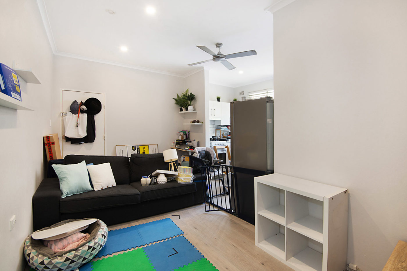
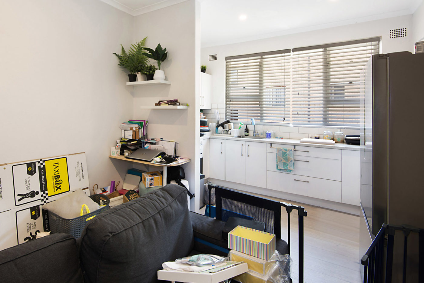
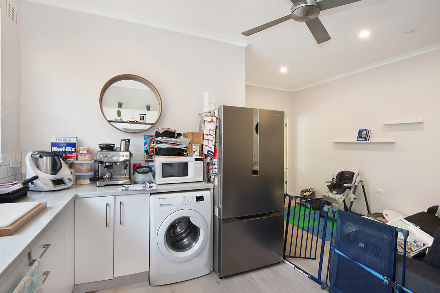
Getting Amy and Cary’s 40 square metre 1 bedder ready for sale was a challenge. They were bursting at the seams – from the moment you entered the front door, to the cluttered bathroom, and everything in between. With a tiny $5K budget, the solution was to pick our battles, work with what we could, and add storage in every room.
If you’re getting a petite pad ready for market, there are loads of ideas to steal in this 3-day reno project.
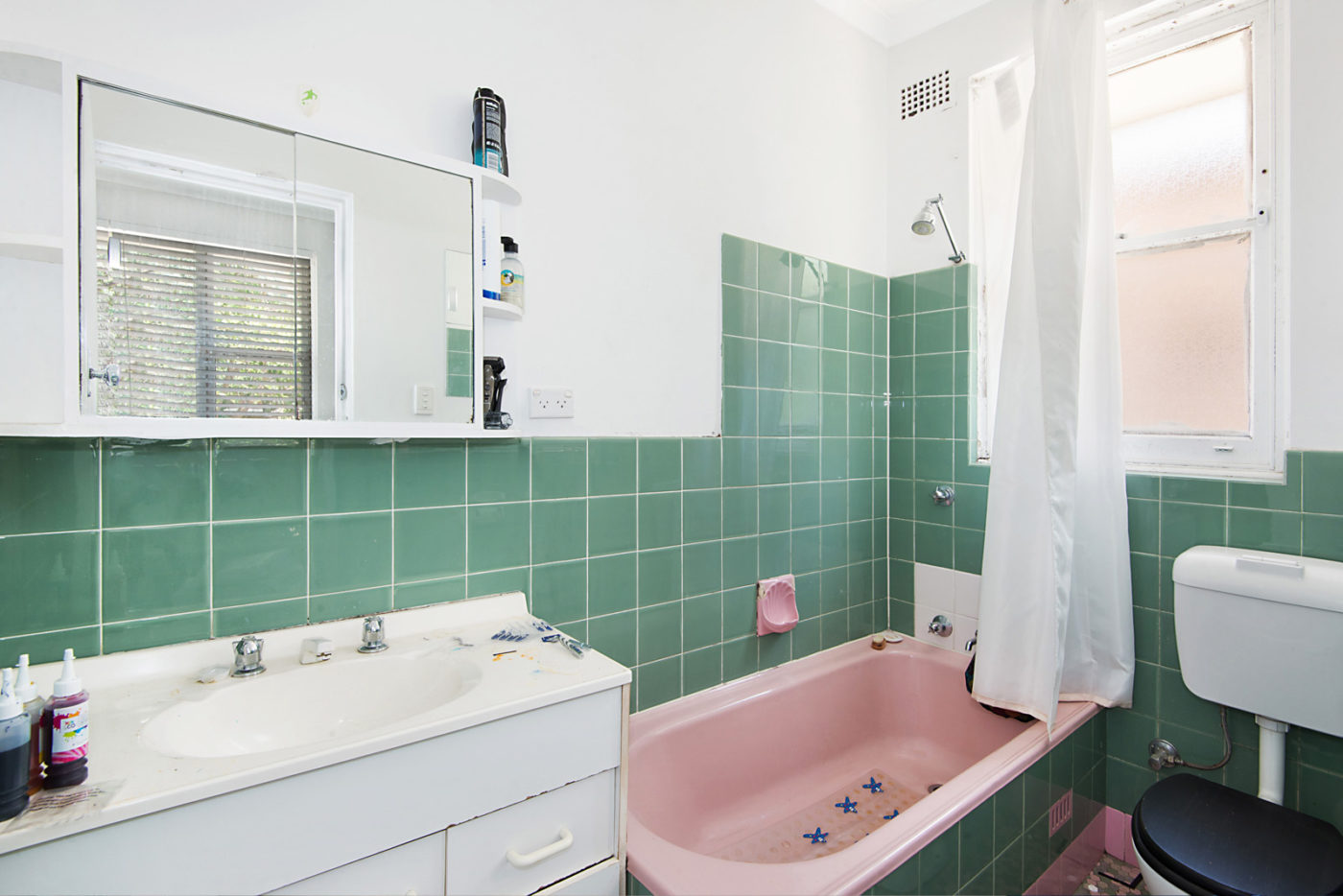
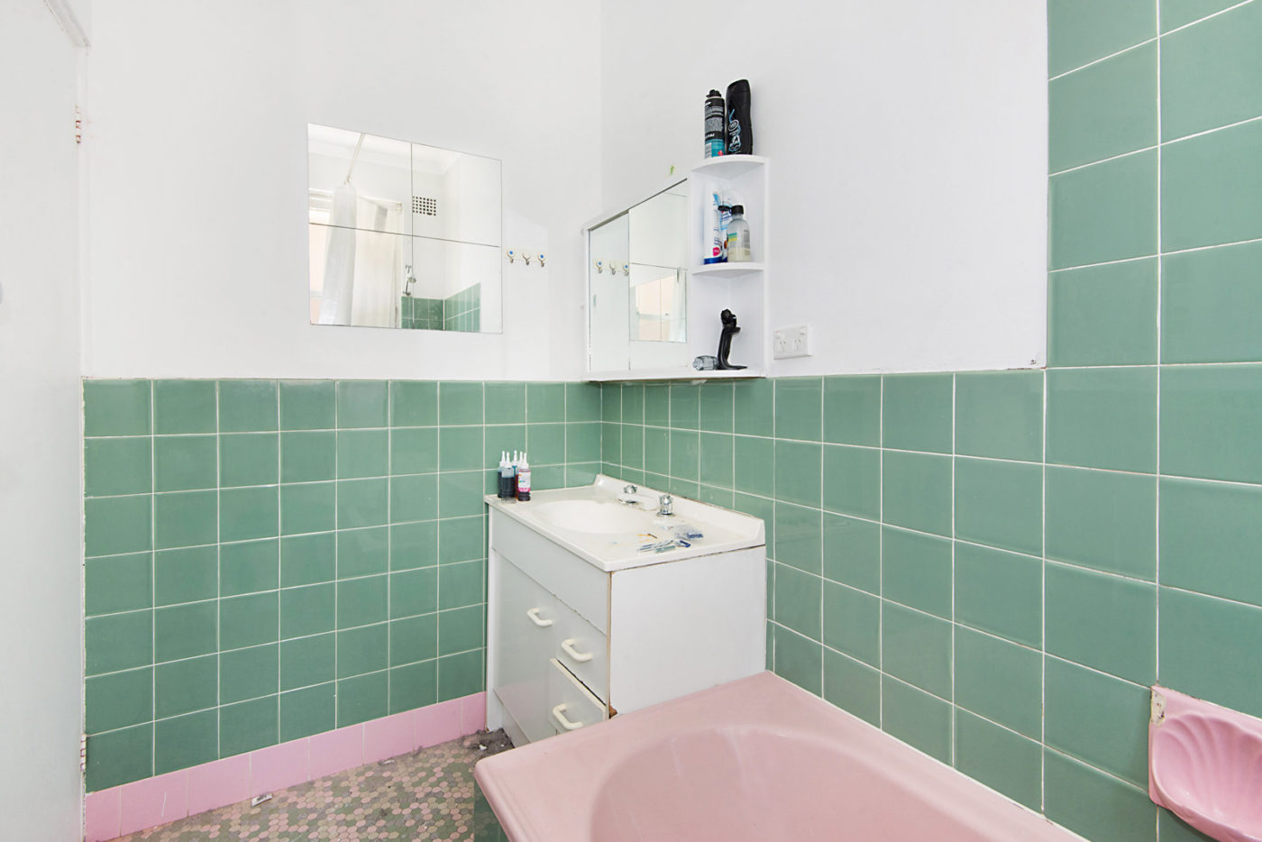
Amy and Cary purchased their Mortdale NSW apartment pre-kids, and always intended it to be an investment rather than a long-term home. They made inroads into a revamp, with fresh flooring, a kitchen reno and neutral grey paint throughout. But when their first baby came along, the project was paused and the clutter took over. Not sure whether to sell up or rent the place out, they set aside $5K to upgrade the dated pink and green bathroom and add much-needed storage.
From the outset, I knew the budget wasn’t going to stretch to a new bathroom, but it was the area that needed the most work. So, I started there and used it as the inspiration for the colour palette and design throughout the rest of the apartment.
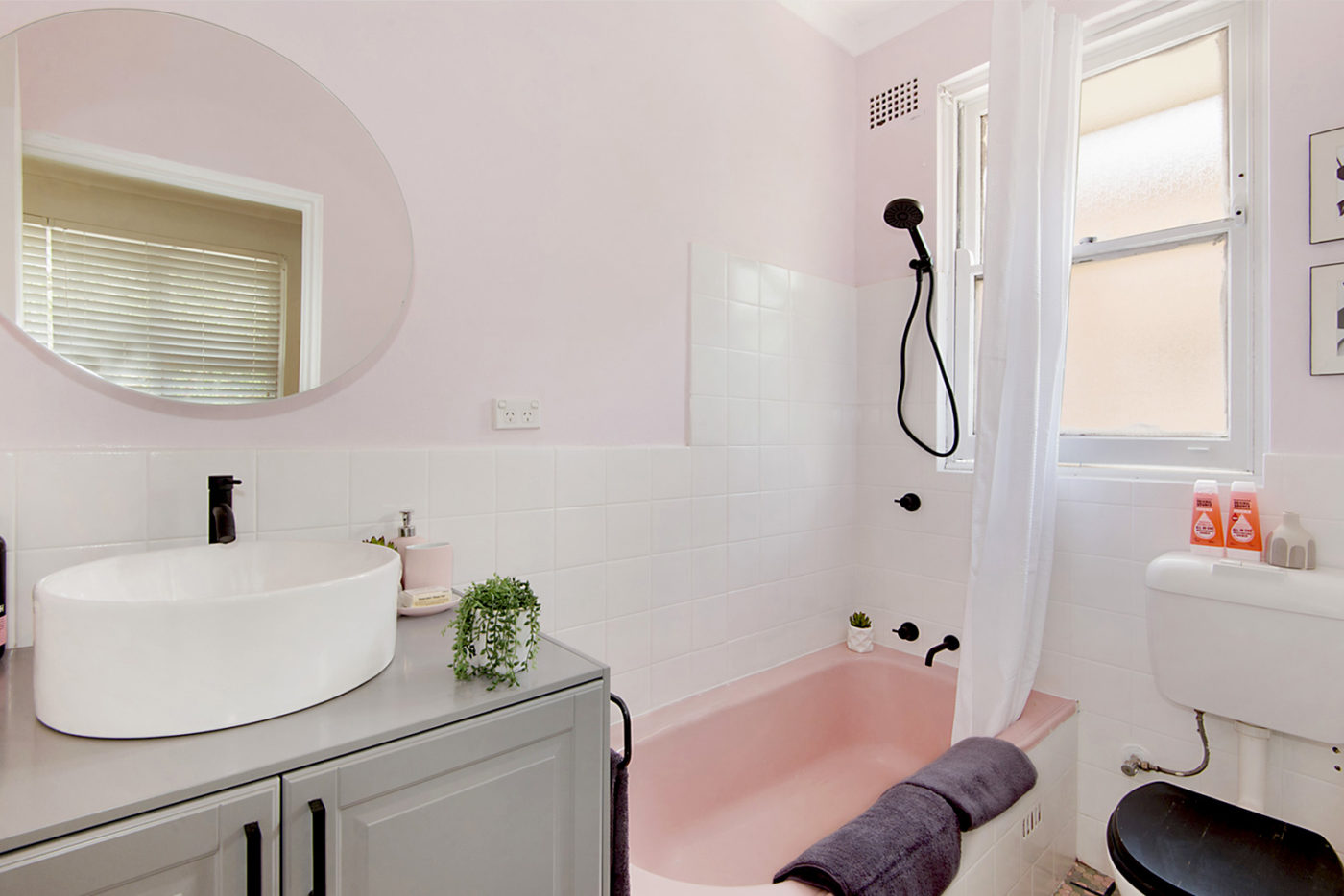
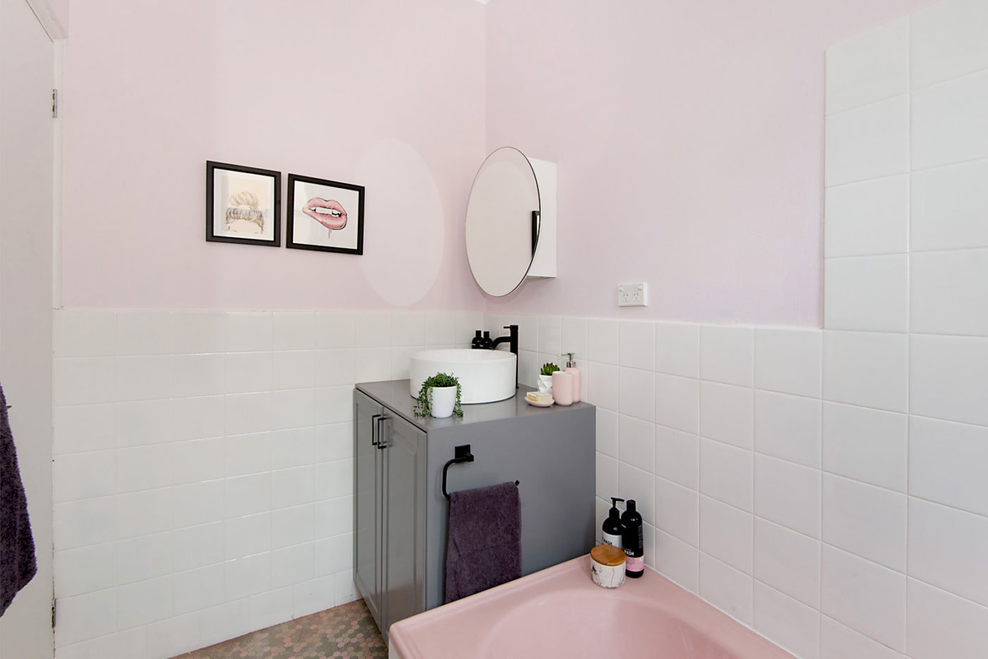
The bathroom’s pink and green scheme was hot in the ’60s when their apartment was built, and strangely enough, it’s had a comeback – albeit in more muted hues. So rather than banish the pink tub or the green and pink floor tiles, I decided to work with them, tile painting the green wall tiles only. Blush pink walls pick up on the theme but keep in bang on trend, and black accessories add a sharp, modern edge. The old vanity was replaced with a deeper model and the round mirror above hides more storage behind.
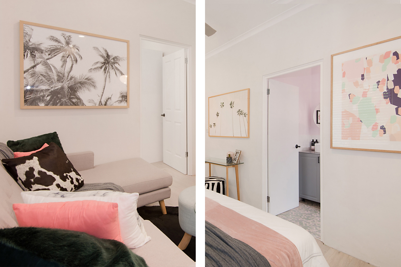
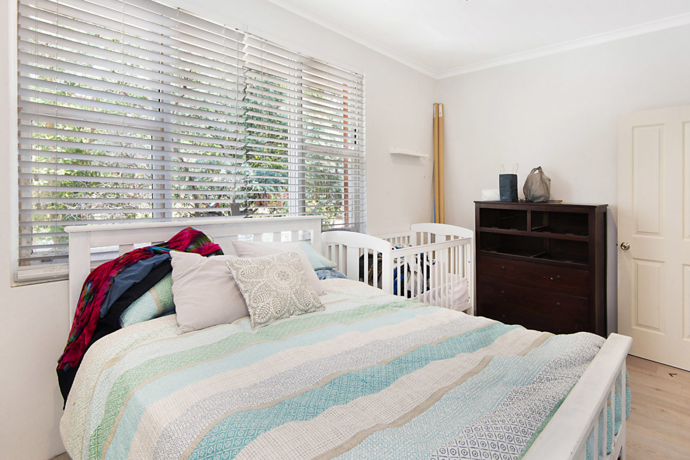
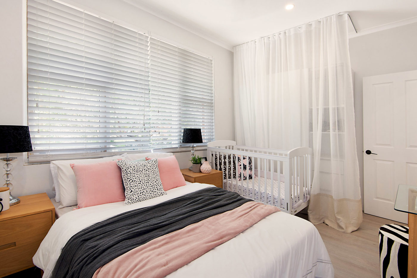
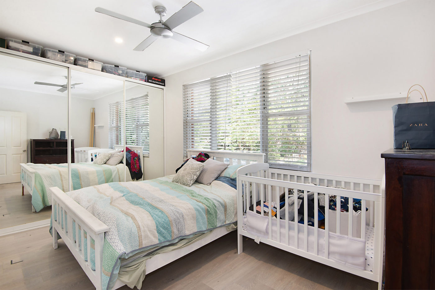
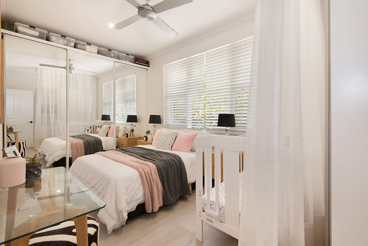
In the bedroom, the mirrored wardrobe wasn’t enough for ‘baby makes three’, so I added a flat pack robe from Bunnings on the opposite side. To soften the sharp edges and prevent a ‘Hall of Mirrors’ feel, I decided against matching the mirrored doors with the new wardrobe and instead draped a sheer curtain on a curved track to conceal the storage. The reflection in the old mirrored robe doors is now a soft billowing curtain, instead of yet another hard surface.
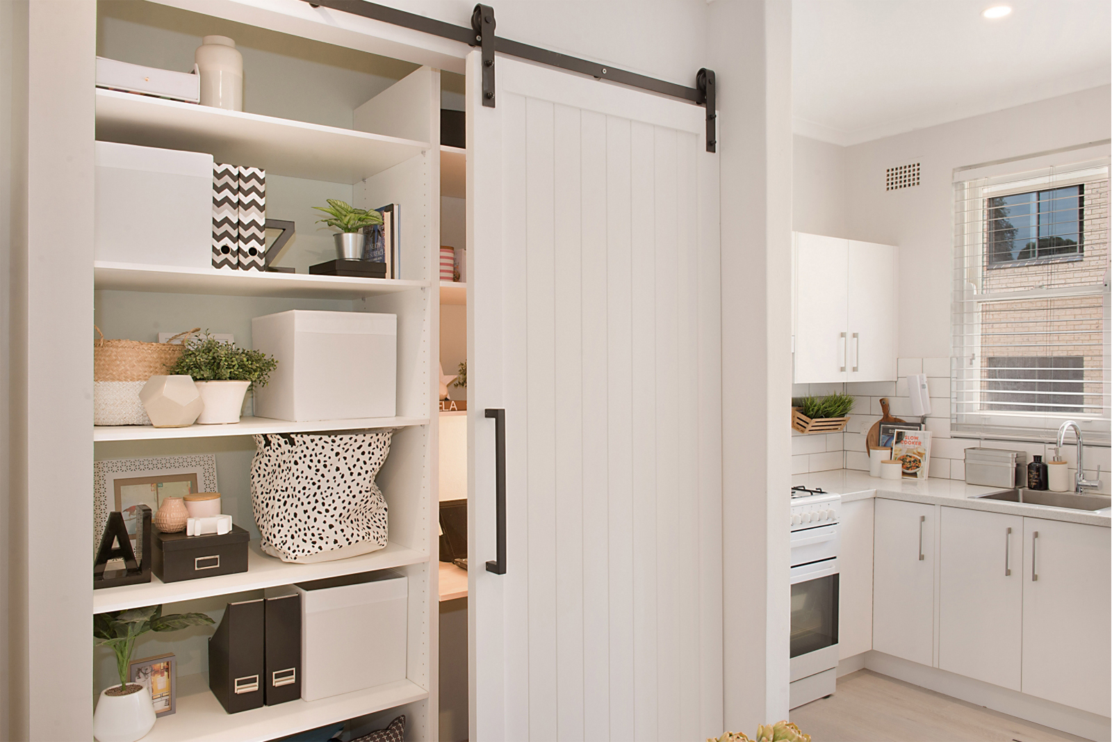
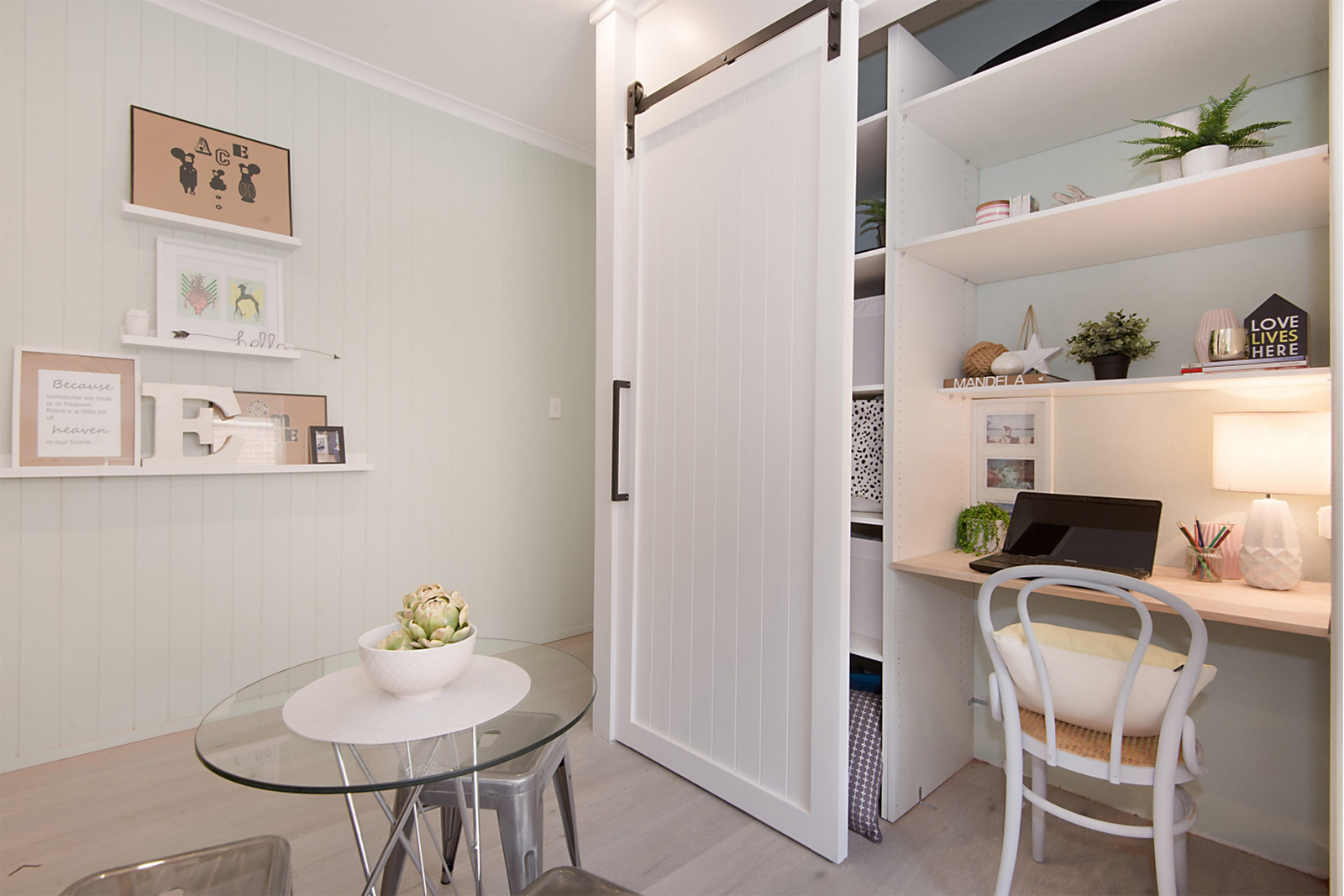
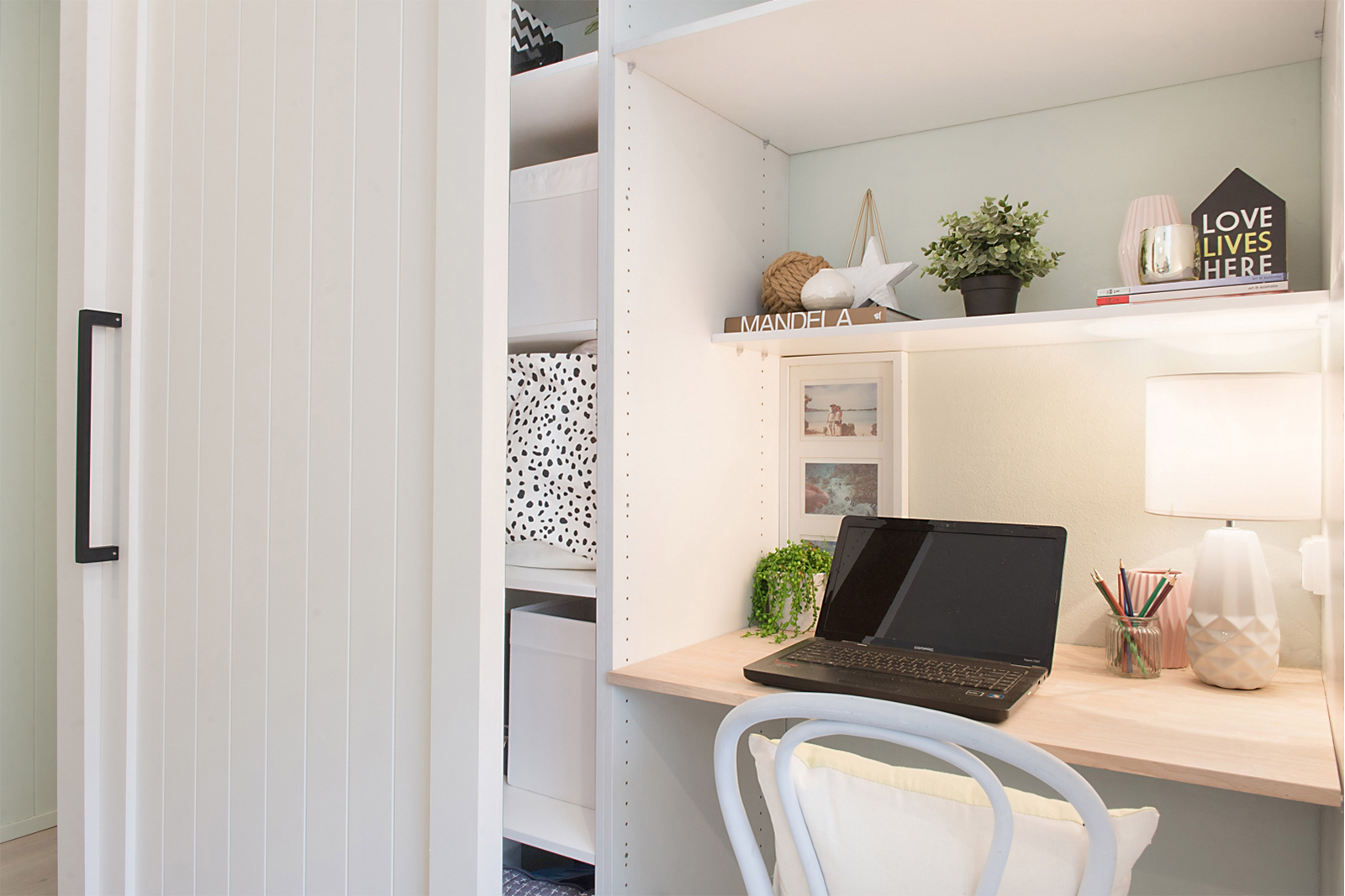
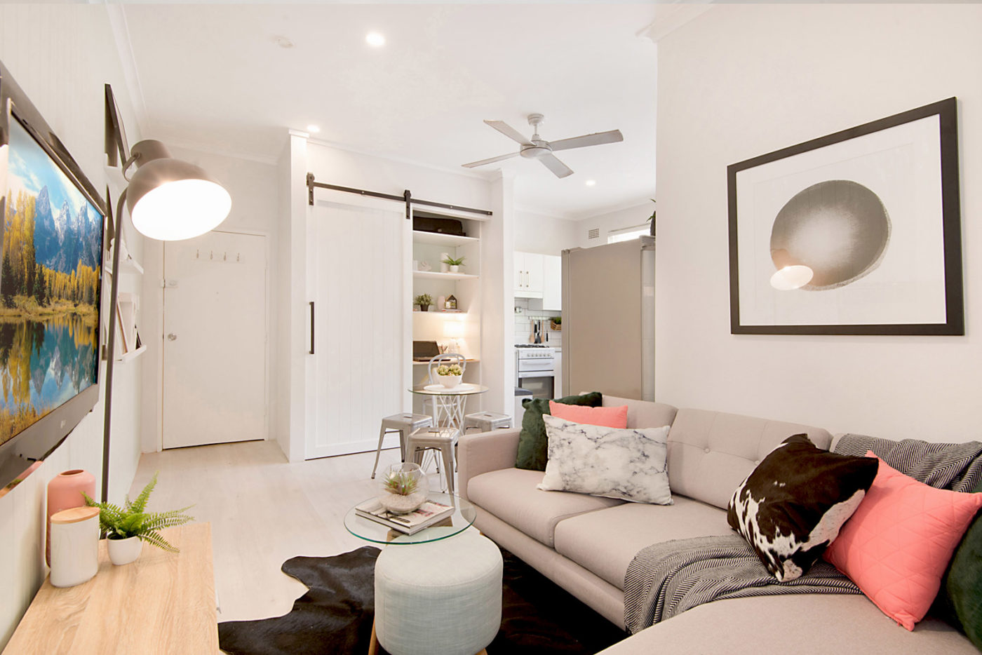
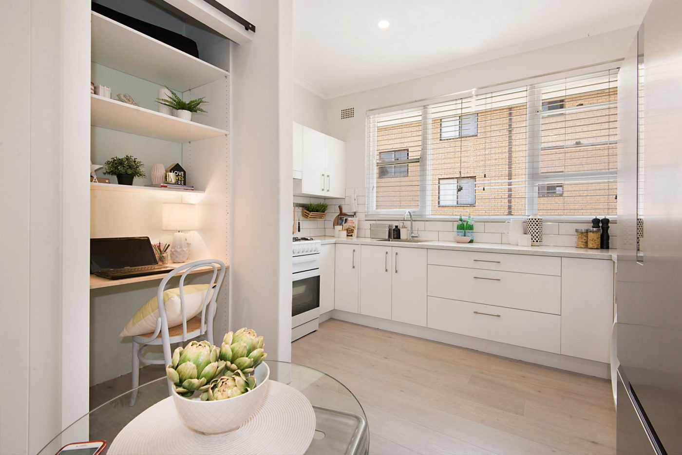
The living room is where we had a lot of fun! Amy and Cary had built an open office nook, but it was overflowing with paperwork and clutter. It was more of a dumping ground than a workspace. My solution was a built-in office and shelving space that can be concealed or revealed by a sliding barn door. The barn door fittings were inexpensive and off the shelf from Bunnings and the door was detailed by my carpenter using VJ (vertical joint) paneling, which we repeated on the living room wall leading to the bedroom.
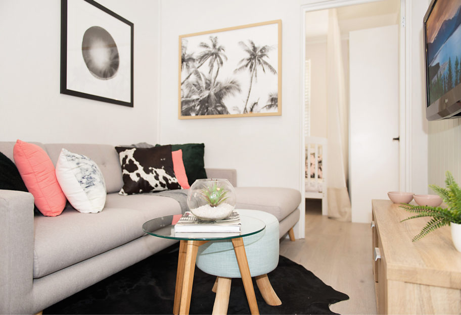
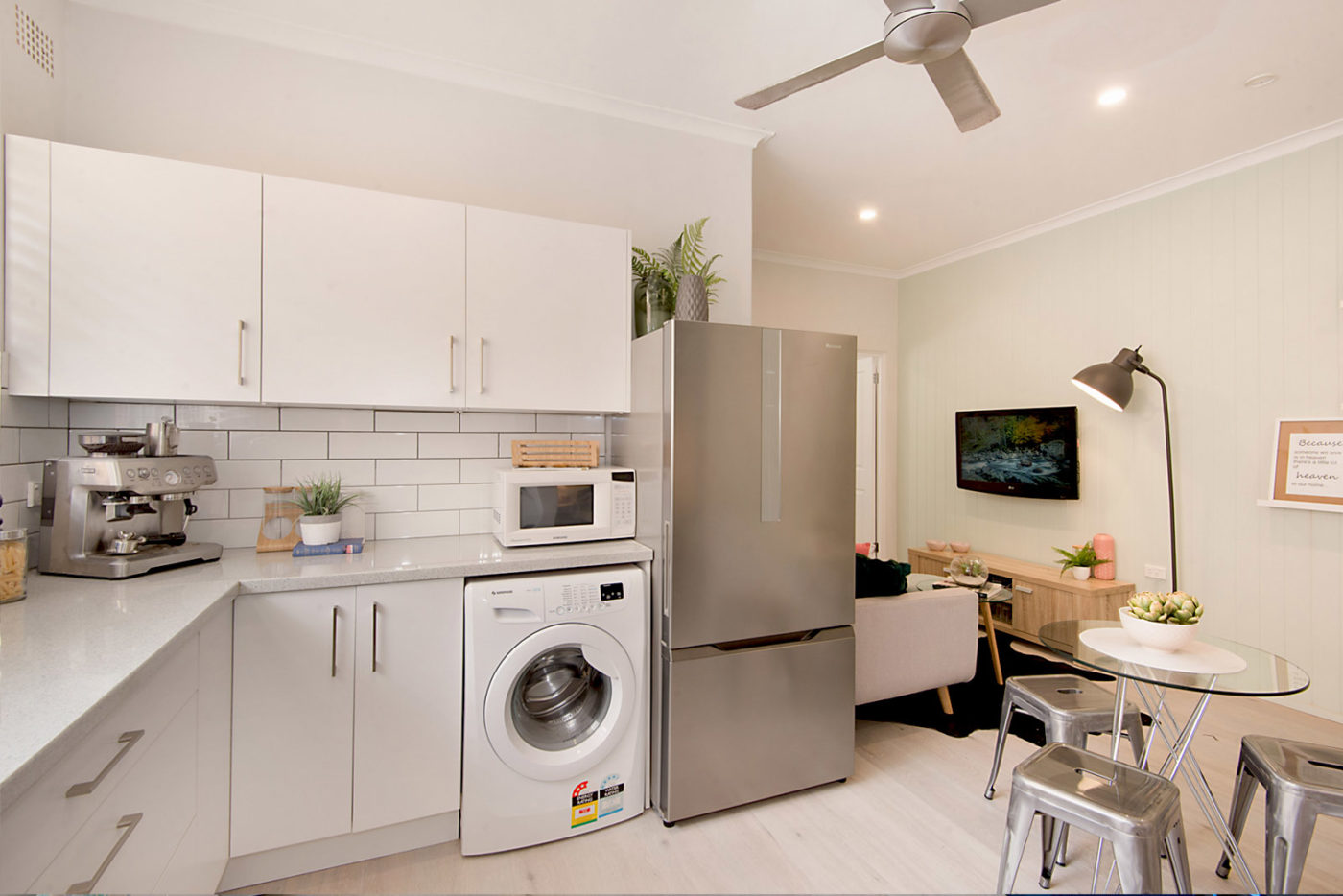
Rearranging the living room furniture and placing the TV on the longest wall, allowed for a better flow and made the room feel twice the size. We painted the paneled feature wall a soft mint green as a nod to the bathroom floor tiles.
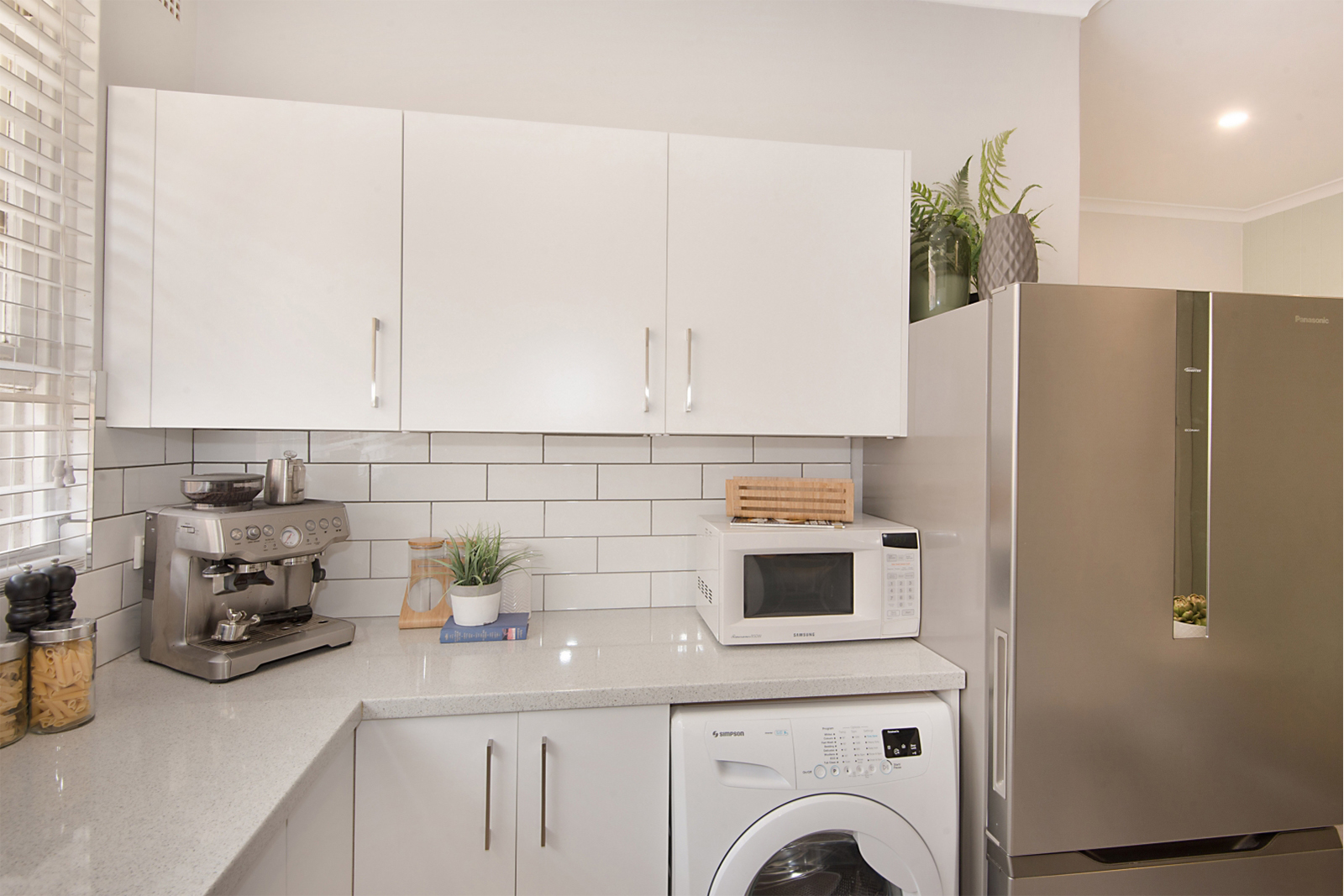
In the kitchen, Amy and Cary had already done the hard yards with an earlier renovation by Freedom Kitchens. All I had to do was add more wall-mounted cabinets and move the clutter off the benchtops with some clever storage solutions. The subway tiled splashback was extended to meet the new cabinetry. And as Amy and Cary had picked such a classic scheme to begin with, these additions were easily matched to the existing kitchen.
The styling was young and playful. Palm tree prints in the living room and bedroom, and quirky posters in the bathroom came from my favourite source for affordable art, Urban Road.
We went just slightly over budget, but the result was a knockout. From cluttered and unfinished … to light, cheerful and market ready – Amy and Cary’s home is now more appealing to potential buyers or renters. And we managed a value uplift to the property of just under $25K. Not bad for three days work!
IDEAS TO STEAL:
- Hide your office nook with a sliding barn door
- VJ (or vertical joint) paneling is a great alternative for a feature wall and gives rooms the illusion of height
- Add wall-mounted kitchen cabinetry to remove clutter from kitchen benchtops
- Minty hues pair well with blush pinks for a fresh colour scheme
- In small spaces make sure furniture placement enhances movement through rooms and doesn’t block it
- Conceal storage behind floor to ceiling curtains to soften the look
- Don’t ditch your retro bathroom, try to work with its character instead
- Use tile paint to update dated bathroom tiles
- Swap out old chrome and brass bathroom fixtures for matte black for an instant update
- Carry your matte black theme throughout with matching door handles and black framed art
PROPERTY VALUATION:
Property Value (before renovation): $465,000.00
Renovation Spend Total: $5,017.65
Renovation Timeframe: 3 days
Property Breakeven Point: $470,017.65
Property Value (after renovation) $495,000.00
Net Profit: $24,982.35
PAINT PALETTE:
- VJ Panelling: Taubmans Endure Acrylic Low Sheen in Colour: “Highland Meadow” in ¼ strength tint
- Doors & Trim: Taubmans Enamel in Semi Gloss in Colour: “Crisp White”
- Bathroom Walls: Taubmans Endure Acrylic Low Sheen in Colour: “Ceramic Pink”
Scroll below for more inspiration for your small space reno.



Hi Cherie and Fabulous RFP Team,
I’m halfway through my first project since the excellent boot camp in Sydney last December.
I would have spontaneously combusted by now without Justine’s calm and expert advice. She is such an encourager, this support service is outstanding.
Please know that if I’d known there was going to be a master class in Geelong tomorrow, at least 2 of my family (maybe more), would have attended.
I hope you get enough numbers to consider doing it again.
Love from your biggest and only Warrnambool fan,
Sioban xx
“Absolutely love the transformation! Such clever use of space and light—it’s amazing how much bigger and brighter the apartment feels. Inspiring work!”