


My Heritage House Renovation.
Last Saturday night on Channel 9, you may have tuned in to watch my latest TV renovation; a heritage house in Drummoyne, Sydney (about 6kms out from Sydney’s CBD) on our new show, Space Invaders.
In this episode, I tackled just 3 rooms in the home – a sunroom being used as a home office & dining room (all in the one room), a lounge room & a teenage boy’s bedroom.
Renovating a heritage house sure can be tricky. Before you pick up any tools or consider what colour you’ll be painting your walls, you’ll need to first identify the age of the house to get a true appreciation of what features are original & which ones aren’t. In this case, we were dealing with a 1920’s Californian Bungalow.
According to Wikipedia, the Californian bungalow style was particularly popular in Australia from 1913 onwards. This period coincided with the rise of the Hollywood film industry which popularised American clothes, furniture, cars & houses …
In Australia, the concept of the bungalow as a cheap & attractive form of permanent suburban housing for the masses was stimulated by a variety of economic & social factors at the time. Having a similar climate to that of California, the designs also reflected the requirements of Australians who needed to cater for relatively warm summers & mild winters.
Interior wise, Californian bungalows have a simple living room, entered directly from the front door, as well as a smaller kitchen. The focal point of the living room is almost always the fireplace & the living room often has a broad opening into a separate dining room. All common areas have cozy atmospheres. Though the ceilings are lower than in homes of the Victorian period, they often feature redwood beams.
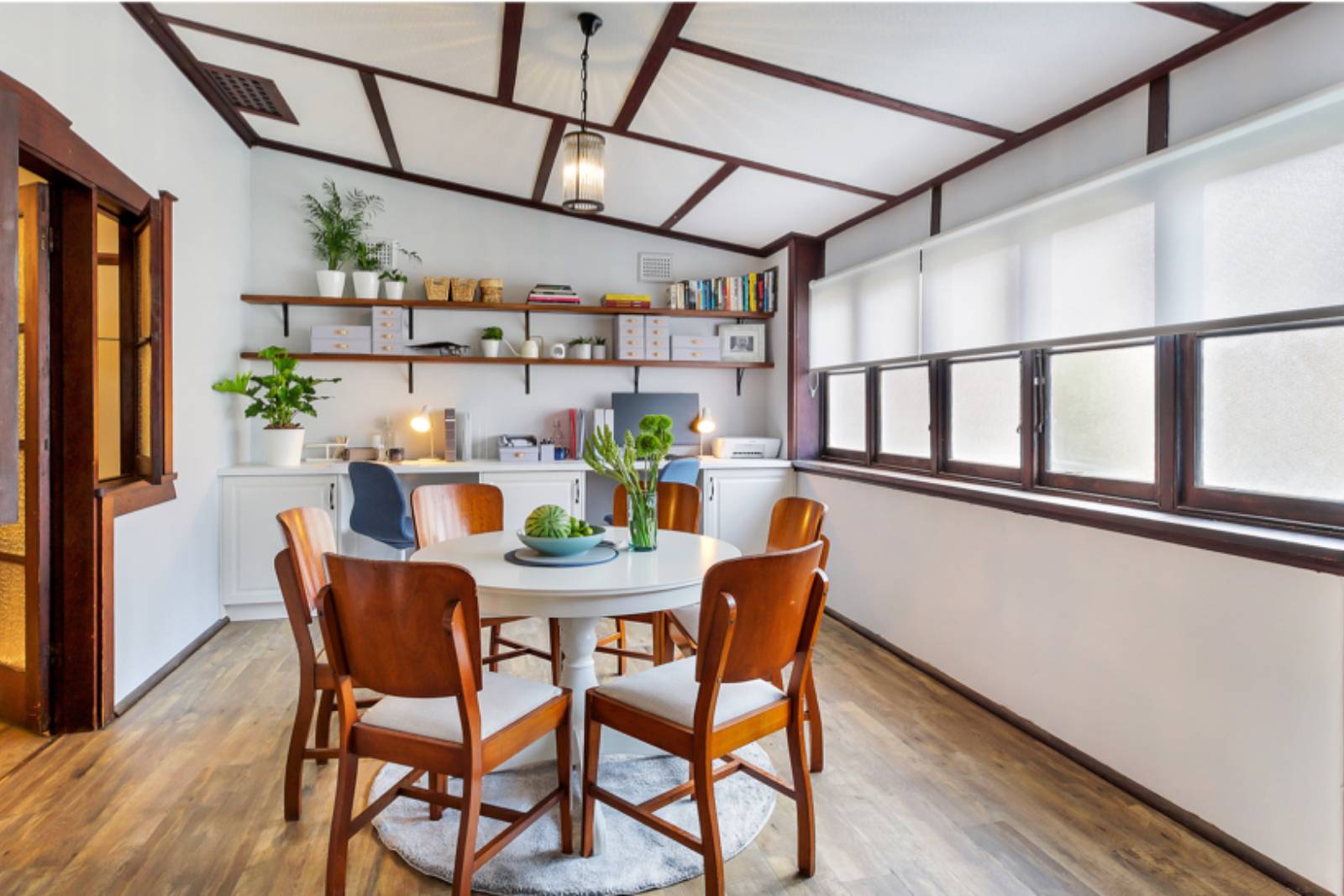
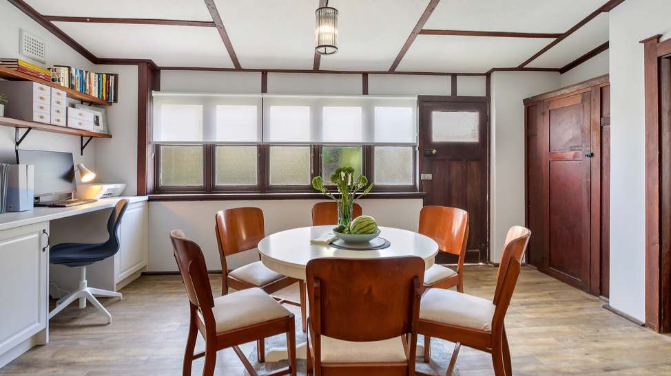
THE COMBINATION DINING ROOM & HOME OFFICE
As for this property, it’s been described above to a tee. At first glance, you’d walk in the front door & go “oh, I need to get rid of all those horrible brown / red trims”. Many renovators would see all those trims as a perfect opportunity to lighten everything up with a few licks of gloss white paint. Nooooo! It would be such a terrible shame to do so.
In all reality, there are 2 occupants in this home – single mum Liza & her 15-year-old son Fletcher. Life is hard & she’s been doing her best to raise her son solo. You can’t blame her for letting things get a little unmanaged. Life gets in the way & you just run out of time to do many things as a full-time working mum.
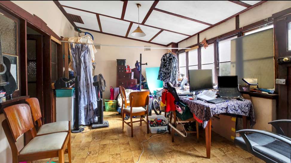
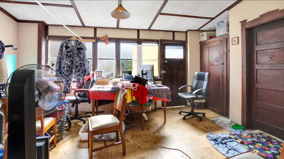
With the global pandemic seeing Liza work full-time from home, her dining room suddenly became her home office. It’s unusual to have a dining room & home office all rolled into one, but if there’s no other space in the house, that’s the way it needs to be.
One of the biggest problems I saw with this room, was the fact there was no damn storage. If you don’t have cupboards to tuck everything away, where does it go? On display of course!
When looking at what’s wrong with this room, it’s simple to the trained eye – no storage, dated colour scheme, vinyl flooring that’s questionable & a rather ordinary ceiling light. You could argue there’s no window furnishings but on a rear sunroom, they aren’t considered an essential.
So, here’s what I did …. Instead of painting over all those brown trims, I worked with them instead, retaining & respecting the architectural past of this property. I chose a wall colour (Taubmans “Thin Ice”) that complemented the original brown trims. I replaced the vinyl floor tiles with the Gerflor Senso Rustic Self-Adhesive Floor planks in “Walnut” colour (available from Bunnings) to add to the heritage vibe.
3 x 600mm Kaboodle base cabinets professionally installed by my carpenter, created the base for the new office on the only wall in the room that had no obstructions like a window or doorway on it. I deliberately chose the Kaboodle cabinetry fronts in the alpine profile in Antique White colour to make sure the home office didn’t look too modern in the space. I laid a long length of laminate benchtop over the cabinets to create a 2-person workspace, perfect for Liza & Fletcher.
To tie all the white of the home office cabinetry into the room, I lugged myself to the local timber yard, picking up 2 big 40mm thick slabs of spotted gum timber (cost $335) & had my carpenter install them overhead. A few licks of walnut stain tied the shelves in nicely to compliment the brown trims elsewhere. It’s a perfect combination of the old mixed with the new.
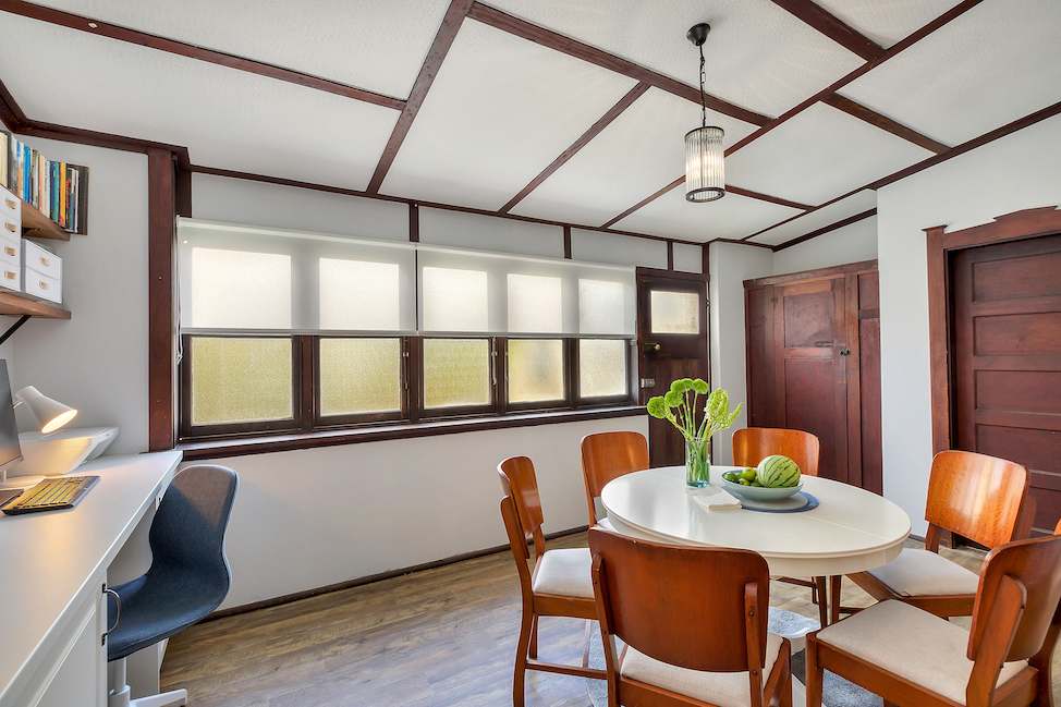
I finished off by installing a gorgeous heritage style light from Beacon Lighting that now illuminates light all around the room, instead of casting light downwards in the old solid glass shade. New roller blinds in a translucent fabric let light stream in.
The old rectangle dining table was donated & a new round table installed for better circulation around the room. I kept Liza’s dining chairs but simply recovered them with new fabric from Spotlight for just under $30. Those dining chairs have been passed down through the family so it was important they stay.
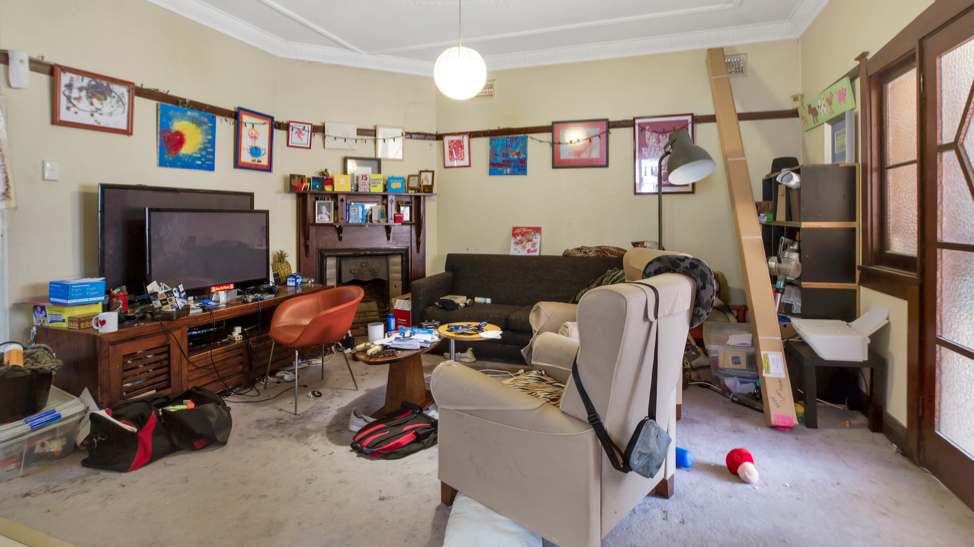
THE MAIN LOUNGE ROOM
This room has a lot of good stuff going on, it’s just visually cluttered. Those brown trims have resurfaced again in the picture rails, door frames, architraves & the fireplace surround. The carpet on the floor was an unsightly addition in desperate need of removal. No amount of steam cleaning was going to help it.
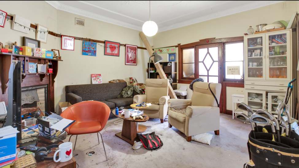
Apart from the things I’ve already pointed out, there’s just way too much stuff in this room. When you walk into the room, you don’t know where to look. There’s no theme or style in the room. Everything is placed here & there with no apparent sense of direction.
This room truly was a breeze to correct. Keeping all the hard fixtures & fittings in place, my superpower ingredients here were paint & flooring. I extended the vinyl self-adhesive floor planks in walnut from the dining room into the lounge room as well. I kept all the timber trims & painted the walls in Taubmans “Stormy Shadow”. As this is the central room in the house, I made the colour slightly darker to the other rooms painted in “Thin Ice”.
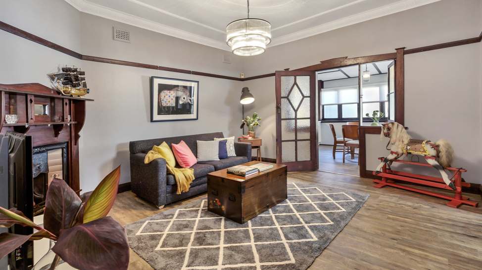
You can see from the photos that I elected to use the same family of lights throughout the rooms, simply scaling the size up or down depending on the size of the room. These lights were from Beacon Lighting. They’re a little on the pricey side but they do a fine job at leading your eye to something beautiful as soon as you walk through the room. They also flood the room with a good dose of light being clear crystals.
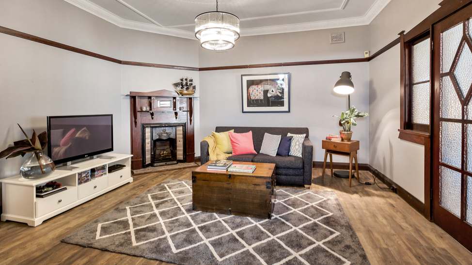
Working on an extremely tight budget for this house (as I do with all the episodes in Space Invaders), one of the biggest changes is the removal of the clutter & the re-organistion of the furniture, much of it still the homeowners’ pieces. In an ideal world, the sofa would have been directly opposite the TV but in this room, it just wasn’t a possibility. Putting the sofa opposite the TV, would have restricted the access to the home office / dining room. The other wall (not seen in this picture) had a large doorway opening onto the kitchen. Sometimes in life, you can’t win everything! At any point in the future, Liza & Fletcher can easily inject 1 or 2 single armchairs into their lounge room to provide extra seating for when guests come over.
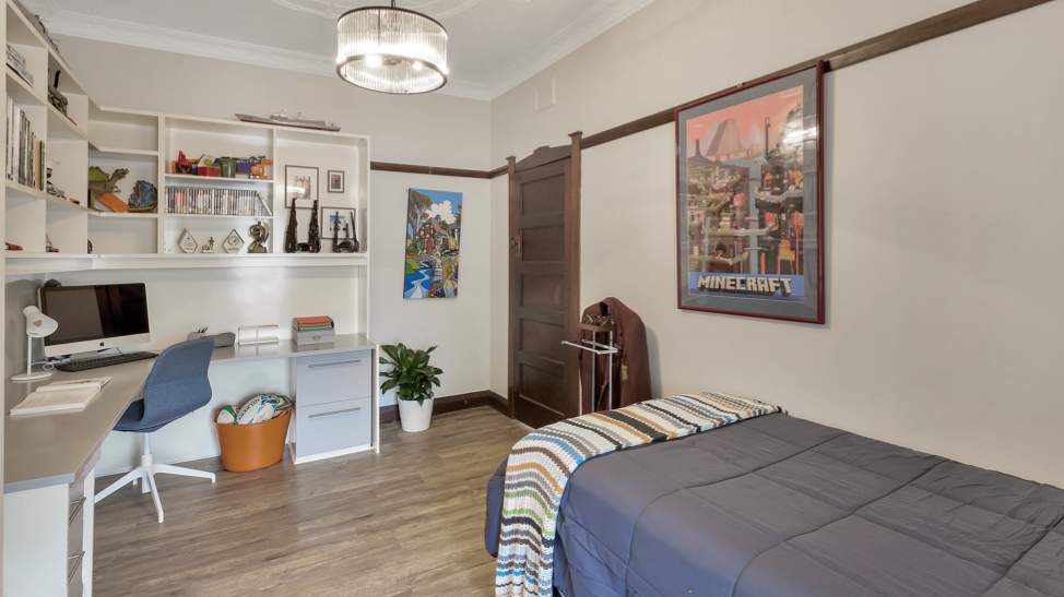
FLETCHER’S BEDROOM
The words “teenager” & “tidiness” are 2 things that normally don’t go hand in hand. At first glance, poor ‘ole Fletcher could be given a bad rap. Many of you would say “show him how to clean” but on closer inspection, we can’t completely blame him.
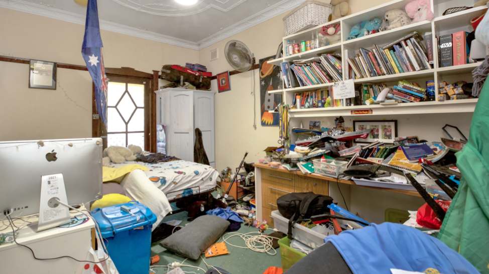
Fletcher’s room certainly looks a mess. He’s got this big bank of desk cabinets that are about as practical as they come. As soon as I saw this room, I knew they would stay. Why rip out something that makes perfect sense? You remove it, you’ll have an even greater storage issue. It should come as no surprise then that I simply painted the desk & shelves with a fresh lick of White Knight Laminate paint in Taubmans “Stormy Shadow”.
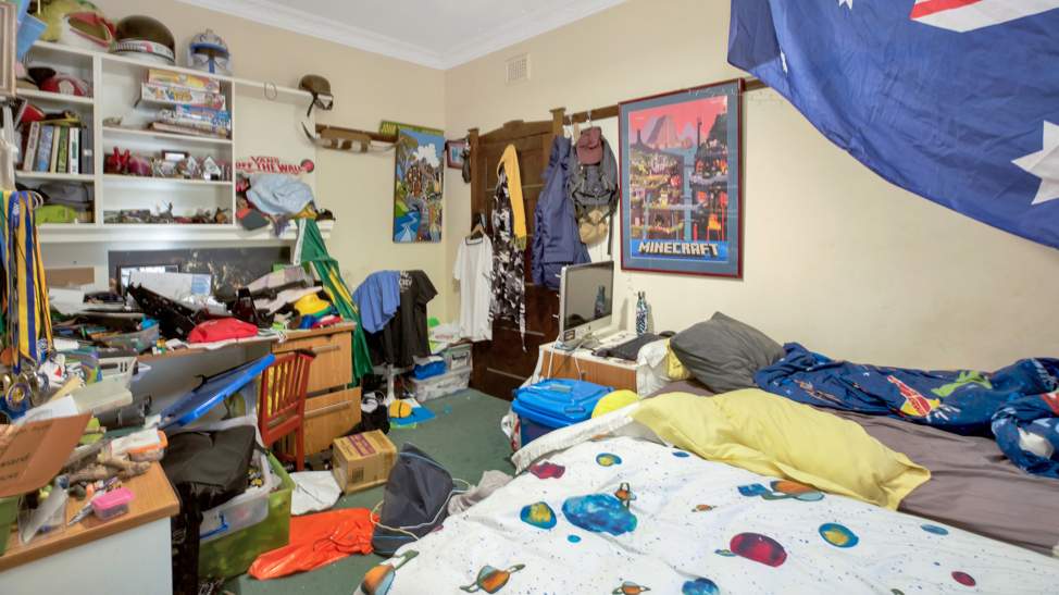
If you’re good at playing spot the difference, you’ll see that gorgeous heritage style pendant has made its way into this room for design cohesion between all the rooms. The grungy green carpet was the first thing to land in the skip bin & I followed through with the vinyl floor planks once again.
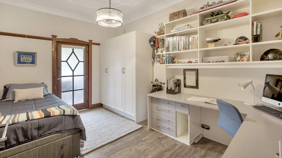
In all reality, the biggest issue in Fletcher’s room was lack of wardrobe space. His tiny 600mm width wardrobe simply wasn’t enough for all the clothes a teenager accumulates. Where does he put his socks, undies, T-shirts with such limited storage? Well, anywhere else he can. To solve this problem, I installed 2 flatpack wardrobes from Kaboodle. They’re super easy to assemble (if you want to save money) & got my carpenter to professionally brace them to the wall.
Fletcher did a fine job in letting go of most of his childhood toys, books & games, freeing up a lot of space that naturally makes the room so much lighter & airier. By removing the clutter, his bed can now be pushed to the left side of the wall, allowing access to the verandah which was inaccessible before.
One thing is for certain with the renovation of these 3 rooms; none will win design awards. Some of you might look at these photos & cite the rooms to be a little on the “plain” side & that’s a.o.k by me. If I’ve had a far larger budget, there would have been endless possibilities to ramp up the wow factor. But this show is different to all other renovation shows … it respects that the average Aussie out there generally, finds it tough, just to make ends meet.
I hope this renovation shows that when working on a tiny budget, anything is possible if you stop & think about what’s right & wrong within a room first. Paying respect to the old girl that this house was, keeping her intact & just freshening her up with some smart cosmetic changes was all it took to make this home feel so much better.
TUNE IN THIS SATURDAY NIGHT!
If you’ve got a kitchen that’s seen better days, you won’t want to miss Space Invaders this Saturday night at 7.30pm on Channel 9. You’ll get to see how I renovated this way out there 1980’s kitchen for less than half the cost of a brand-new kitchen.
If you miss the episode, don’t stress either; you can still watch it on 9Now anytime after the show airs & I’ll naturally write a similar commentary on it next week. Enjoy!
Much Love,
Cherie x

Cherie you have the Midas touch – you always do well and I love how you turn homes into beautiful places. I wish you could one day come home in Brisbane and help me make my old home look good. Thank you for your wonderful work. I always look forward to your programs and the advice or tips you give
Thanks June for your lovely feedback, Cherie Crew x
Great job! I jut wondered why you didn’t steam clean the the two cream armchairs and place them opposite the sofa for the extra seating in the living room.
Hi Louise, Liza was happy to let go of the 2 armchairs which were quite worn & bulky to allow for more flow from the lounge room into the dining/office. Liza & Fletcher may get a couple of extra chairs in the future to provide extra seating for when guests come over. Cherie Crew x
Hi Cherie
Amazing what a lick of paint, new affordable flooring & a good declutter can do. The rooms look fresh, so much larger & the whole space has a
sense of calm.
I have a 1940’s bungalow with a half done kitchen. If you ever need a cheap kitchen project, don’t hesitate to get in touch.
Love your work.
Paula
Thank you for you’re lovely feedback Paula, Cherie Crew x
Great renovation journey! As a painter, I love seeing careful attention paid to those beautiful heritage features. Preserving the character often means using gentle prep methods and historically appropriate paint colors. It’s amazing how a fresh coat of paint can enhance all those intricate details while staying true to the home’s original charm. Thanks for sharing your experience!