Transforming a Space, Transforming a Life: Sandra’s Story
Hi ,
For over 3 decades, Sandra has lived in a house that never truly felt like home. Following her husband Ron’s passing a year ago, the sense of belonging and comfort that should have emanated from the walls of her residence, seemed more distant than ever. The house, dark and depressing, was cluttered with memories and objects that no longer served her present or her future.
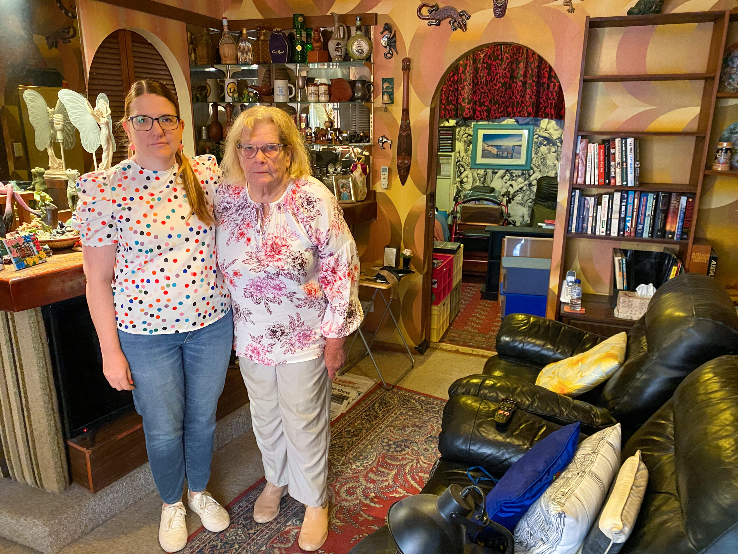 Sandra in her home with daughter Denise, pre-renovation.
Among Sandra’s & Ron’s belongings, were 70+ frog statues & over 200 table tennis trophies, a testament to past achievements but now reminders of a time and space she’s no longer involved in.
Sandra’s home was more than just a physical space; it was a reflection of her inner world, which over the last year has been shadowed by loss and loneliness. The overwhelming clutter and the trophies scattered throughout, spoke volumes of her past but whispered very little of her future. It was clear that for Sandra to move forward, to find joy and purpose again, her environment needed to change. Her home had to transform from a mausoleum of memories, into a canvas of possibilities.
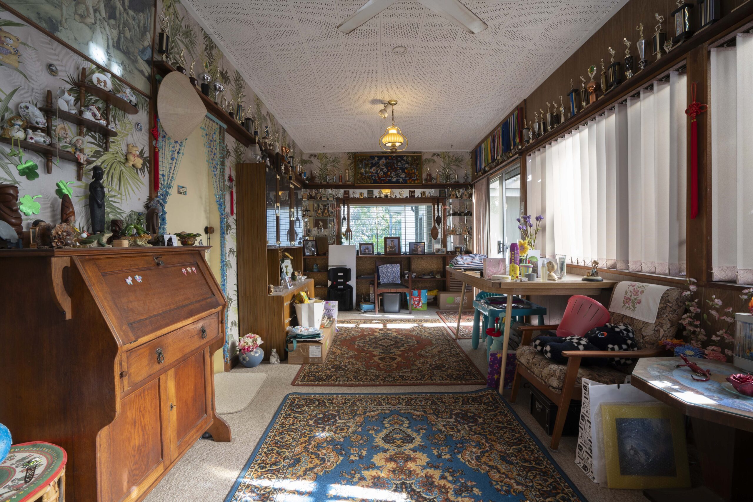 Before – The living room was long & narrow with no practical seating.
The decision to renovate 3 rooms in this home was not merely about altering a physical space; it was about acknowledging Sandra’s grief and embracing her need for a new beginning. The renovation focused on 3 key areas – the living room, dining room & an old bedroom, which was repurposed into a sewing / come arts & crafts room. This wasn’t just a change of scenery; it was a carefully planned transformation that aimed to reflect Sandra’s true personality, her love for pastel colours, and her need for a rejuvenating and inspiring environment.
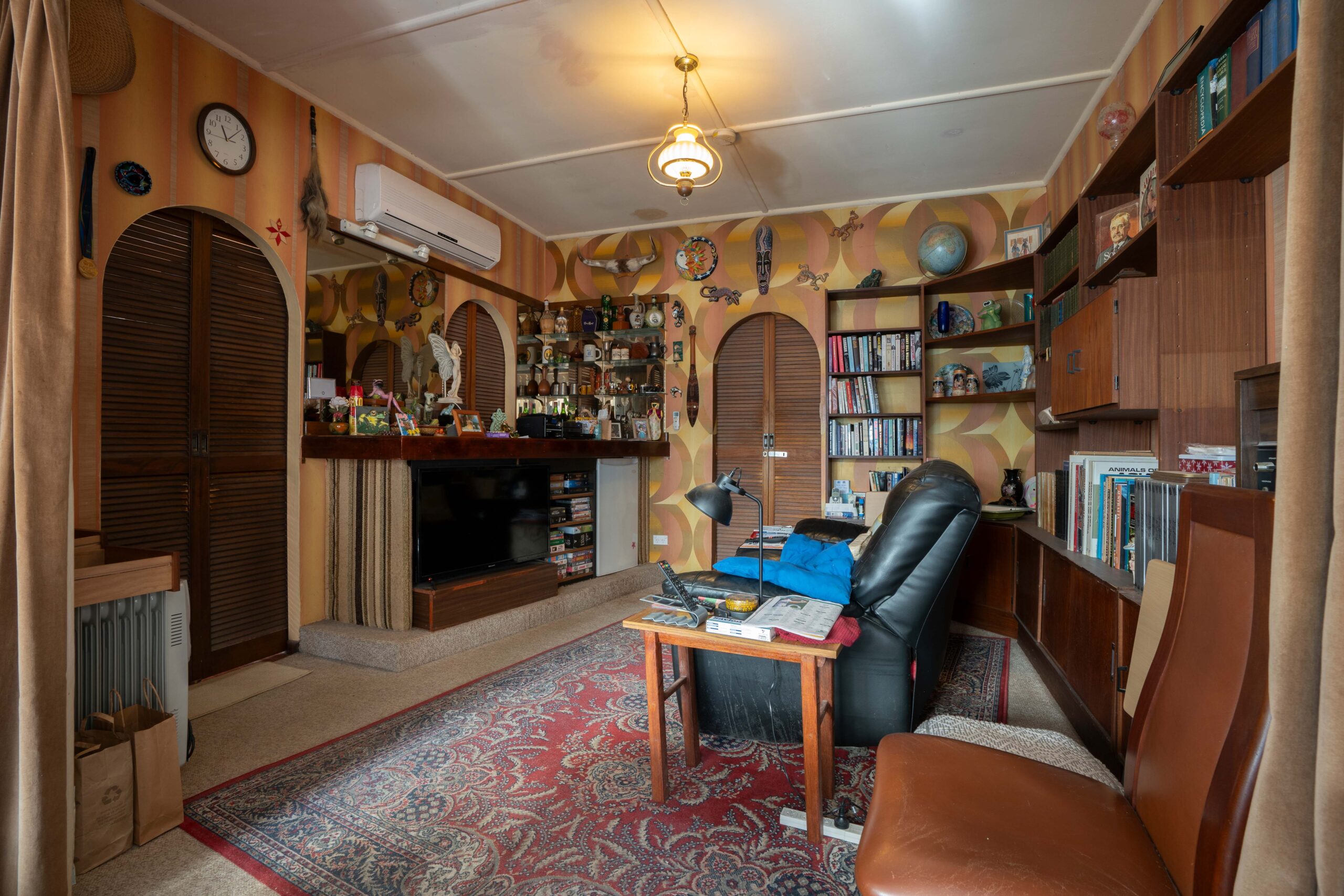 Before – Meals on the couch are not ideal for this dining room.
THE LIVING ROOM
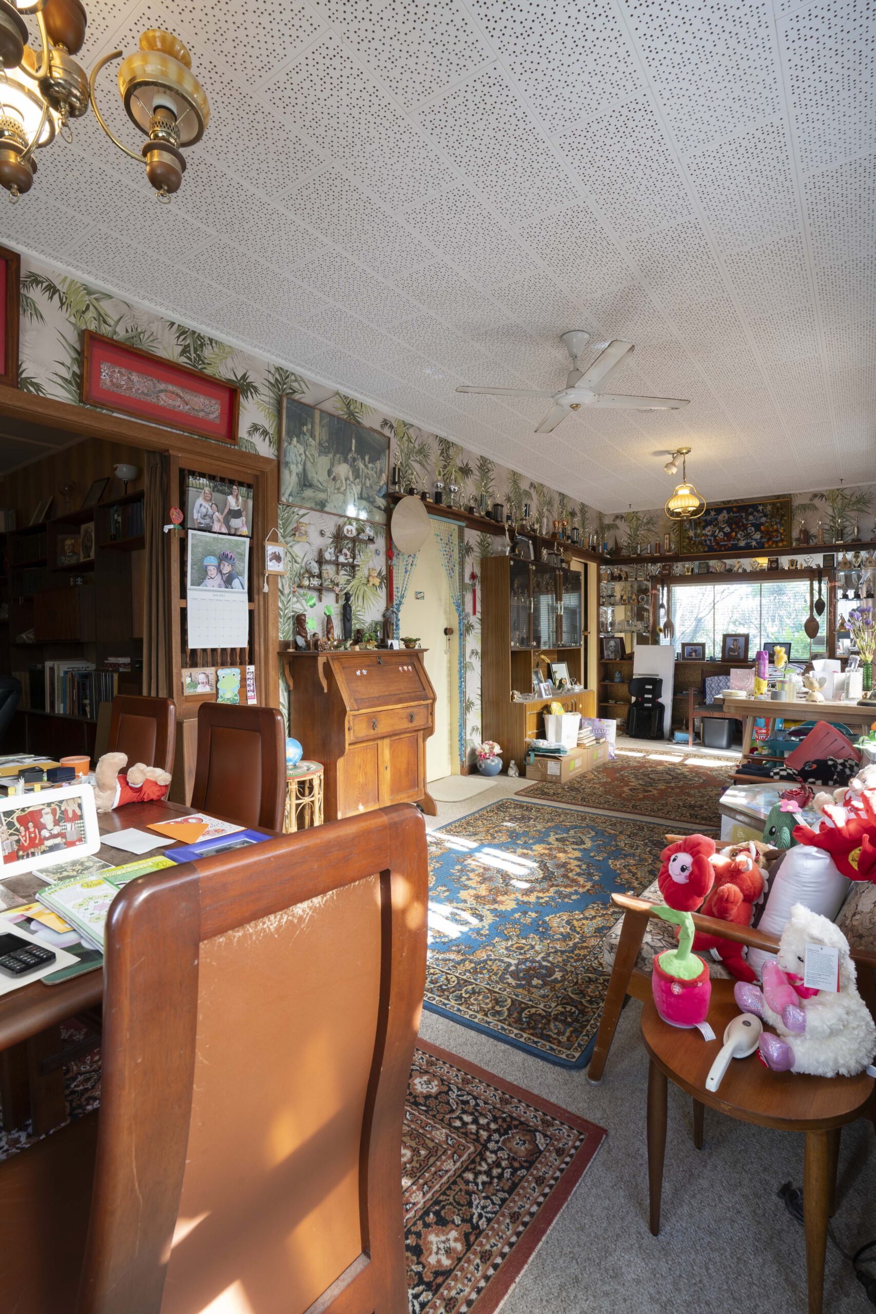
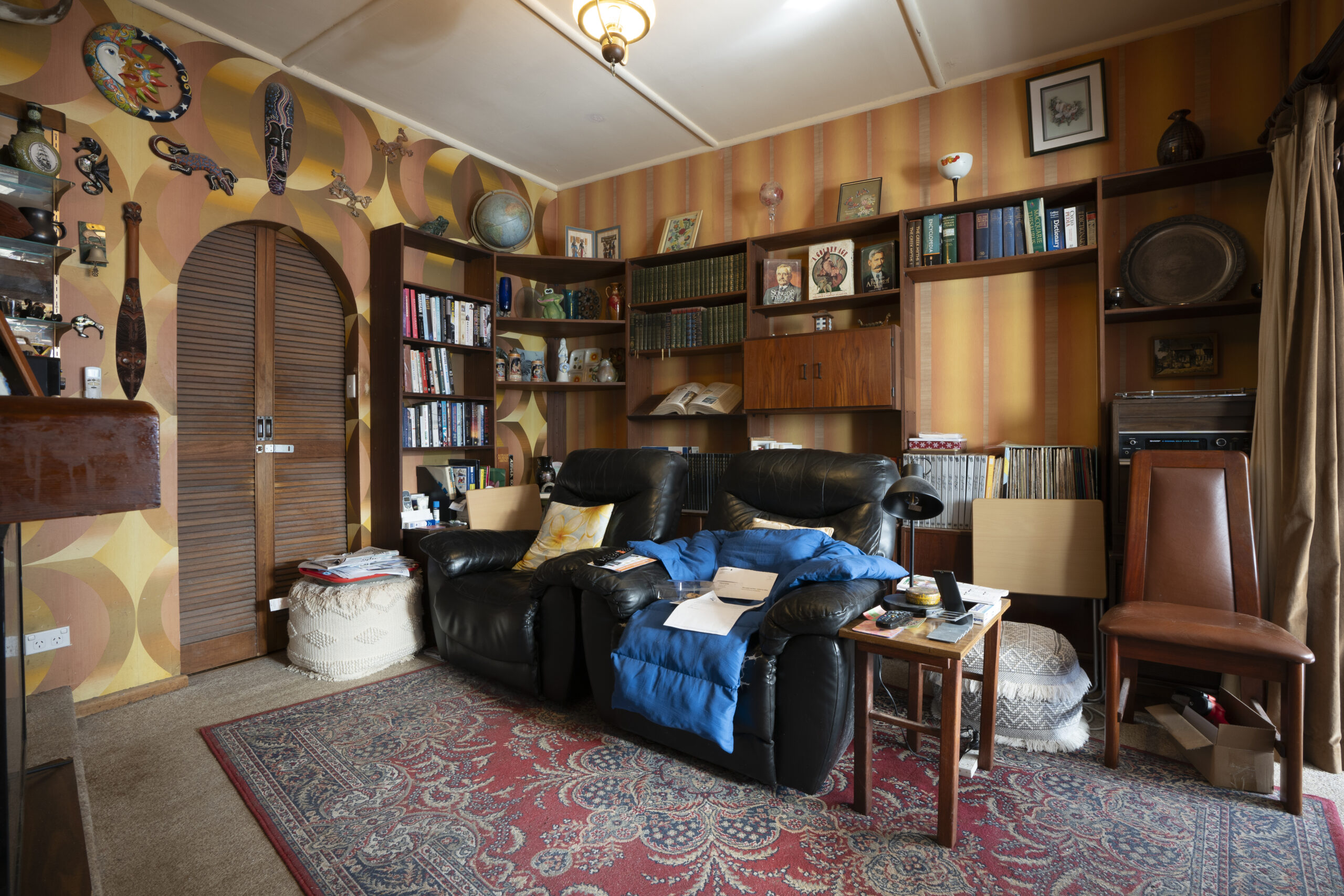
You don’t need to be a rocket scientist to work out this space needed a serious reno. The room appeared to have a mix of decor styles making it look outdated and extremely non-cohesive. A renovation would instantly modernise the space, making its new style more consistent.
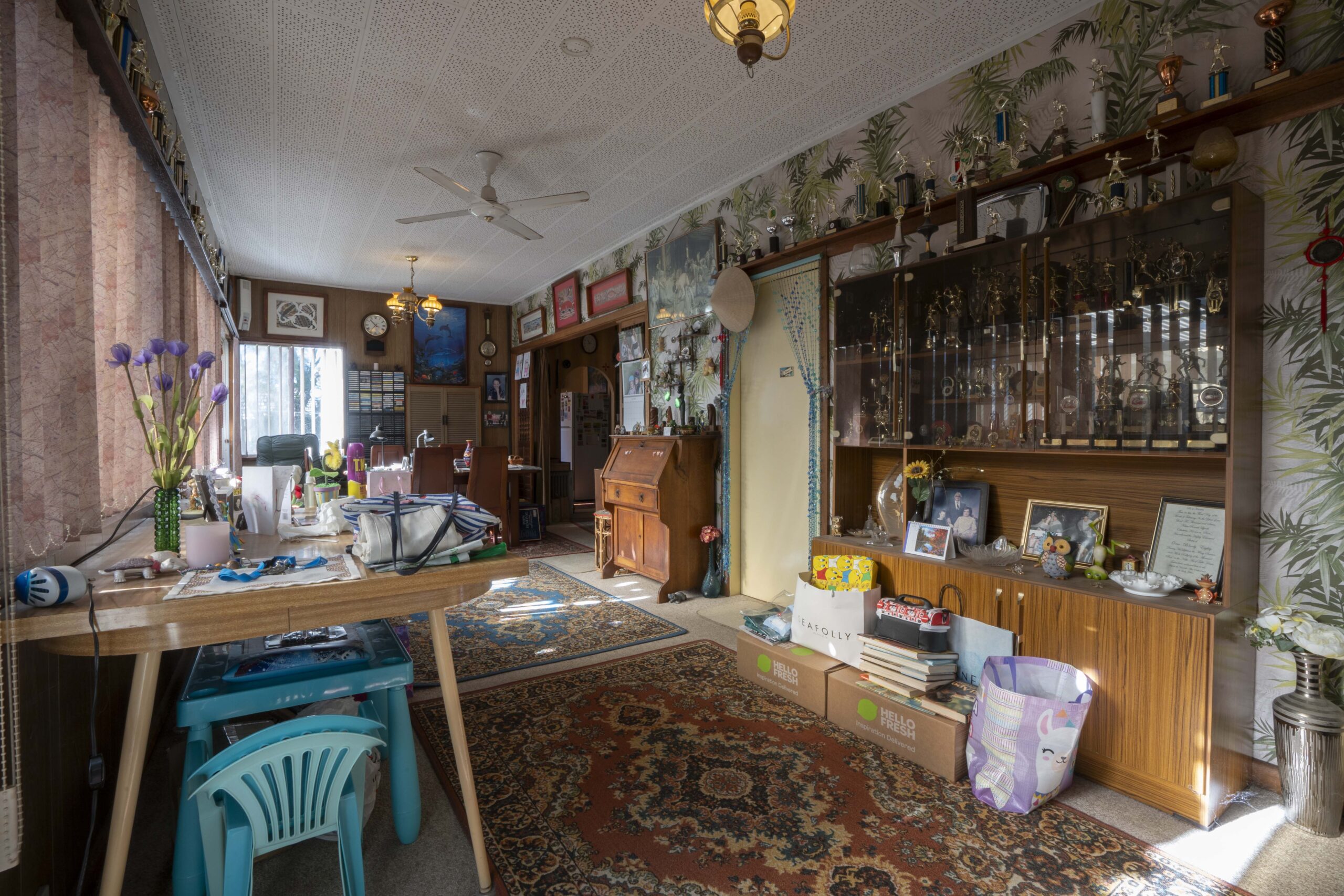 Before – The cluttered lounge room had dated décor & a clash of décor styles.
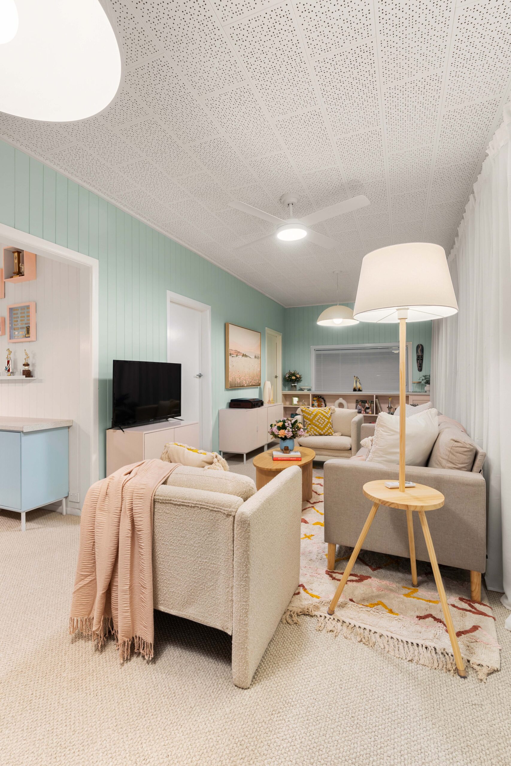
Looking at the walls, there’s a sea of trophies, ornaments & mismatched artworks which make the space feel cluttered. A lack of practical storage solutions also means everything is on display. My decluttering co-host Peter Walsh is a big advocate for tucking many of your possessions behind closed doors, so your rooms feel more spacious and organised. Off-the-shelf cabinets & bookcases from Kmart (all screwed together for extra stability), now mean Sandra can still keep lots of her cherished possessions but not have “everything” on full display.
In this room, the arrangement of furniture seemed somewhat haphazard, with mismatched tables and chairs making the space feel terribly disconnected. New sofas & furniture, (again from Kmart) fit the space better and now provide a practical seating area where visitors can sit in comfort.

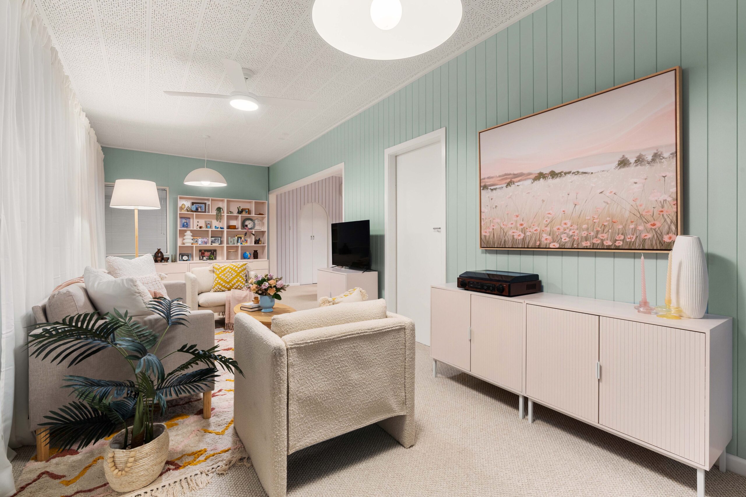
While the room has one side of windows and therefore good natural light, the artificial lighting was limited to a few old-fashioned ceiling fixtures. In this renovation, I added a new ceiling fan & 2 big ceiling pendants from Beacon Lighting to create a brighter & in particular, safer environment for Sandra. More light in the room (especially at night), means the chances of falls are minimised, something you need to be highly conscious of, as you get older in age.
As for the flooring, the carpet was worn and slight discoloured. My natural reaction was to install floating floorboards, however, as Sandra lives by herself, I elected to install new carpet instead, which makes for a far softer landing should she experience falls in the future.
Let’s look at the walls and that very specific style of wood panelling with the tropics inspired wallpaper. It probably looked quite cool back in it’s day, but isn’t so fabulous nowadays. Easycraft’s VJ100 wall cladding sheets were added straight over the top of the wallpaper, which made the reno so much easier, especially as the wallpaper didn’t want to come off. After an hour of hot soapy water, then a heat gun, I gave up and got my chippies to install the VJ panelling straight over the top of the wallpaper. Problem sorted!
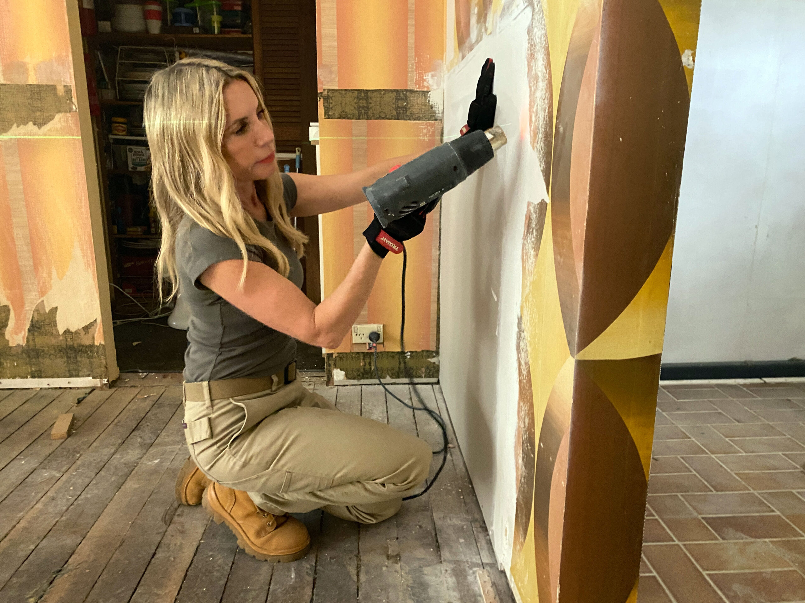 Wallpaper can often be tricky to get off!
With the walls clad, it was time to paint. The colour scheme chosen for Sandra’s new space was inspired by her love for pastels: Taubmans “Surf Spray” for the main wall colour with Taubmans “Ice Cream” on others. These colours weren’t just aesthetic choices, but also for the psychological effects they’ll have on Sandra as well. Pastel colours are known for their calming and uplifting qualities, which is exactly what she needs. The softness of Surf Spray & the sweetness of Ice Cream create a harmonious and comforting environment. These colours bring light and openness into this previously dark room, turning them into an area where Sandra can feel at peace and inspired.
THE DINING ROOM
Those arches! Work with them or rip them out? Three is a lot in one small room but I elected to keep them & simply remove the dark timber louvre doors instead. I replaced those with the sleek Hume Doors PRE-1 doors, painting them white so they draw your eye to the arches, but not in a distracting way.
 Dining Room – before.
This room once again, was visually cluttered and lacked a cohesive design, which can be overwhelming and aesthetically displeasing. The mix of patterns, objects, and colours creates visual noise rather than harmony, and the space was screaming out for a better organisation system. Reducing the number of items on display and opting for a more neutral palette, more in Sandra’s desired colour scheme would significantly improve the room’s appeal and functionality. The old bar had become nothing more than a dumping ground for more ornaments, so was demolished to create space for a functional dining table. Christmas dinners with the family can now become a reality again.

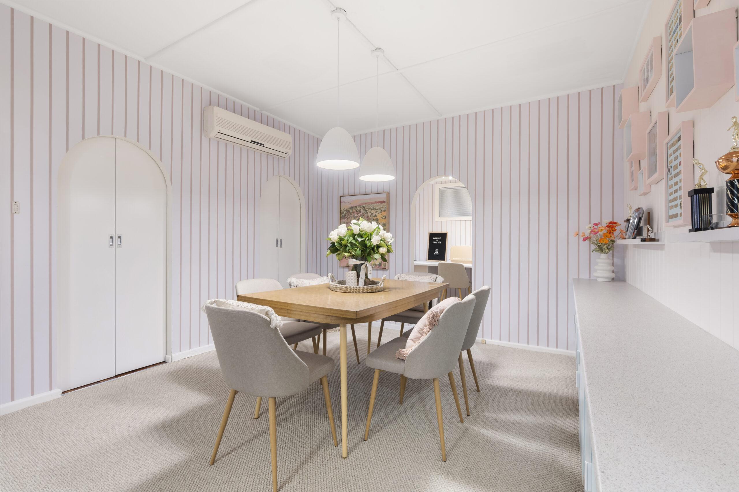
One of the biggest changes in this room was wallpapering two of the walls in the Pink Stripe Wallpaper from Luxe Walls. This instantly continues the pastel colour theme throughout the room & makes the space feel fun & fresh, something Sandra desperately wanted. The carpet from Flooring Xtra was also continued through to the dining room, primarily for Sandra’s personal safety. Normally I’d never install carpet in a meals area but in this instance, safety was paramount. I choose a carpet that was a bit more resistant to stains and more easily cleanable, should any mishaps occur.
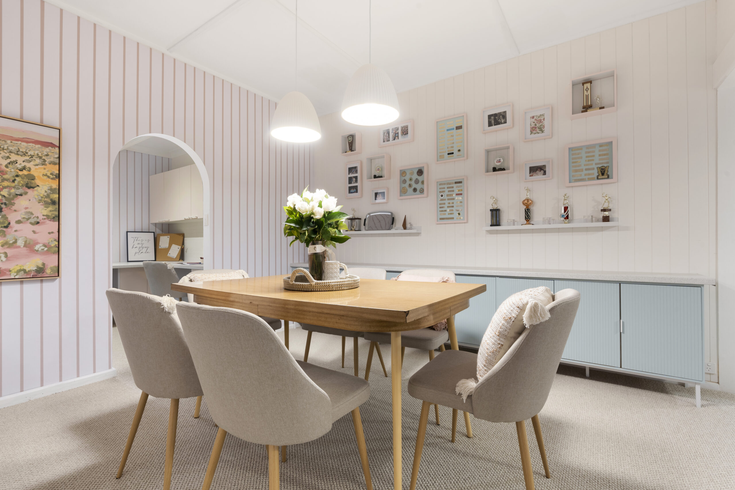
To create practical storage in the dining room, another bank of Kmart’s Isla buffets were braced to the wall & painted in Taubmans “Limonge Pink”. A 3.6 metre long Quartz Stone Laminate benchtop by Trademaster was placed over the top of all the cabinets to create a practical area for plates of food to be placed on, when the family do come over. This wall of cabinetry now looks like custom made cabinetry, even though everything is off-the-shelf products! My cohost Angie Kent, created a wall of fame in memory of Sandra & Ron’s combined achievements. New shelving was installed & the trophies she decided to keep, positioned proudly on this wall. New art frames now contain the metal plates from many of the trophies she decided to donate. This wall now keeps her past memories alive but those objects are no longer dominating her home.
THE OLD BEDROOM
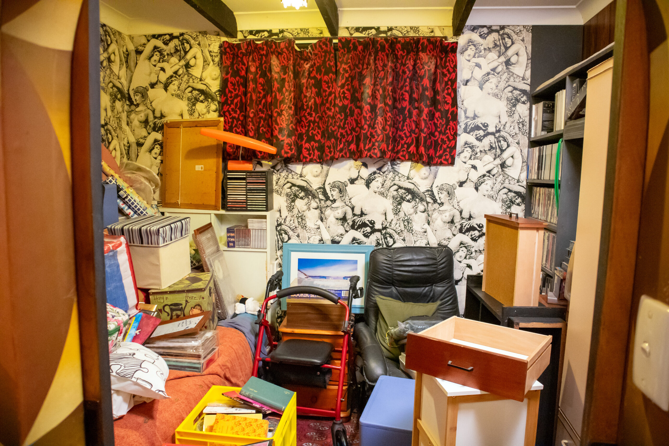
I’ve seen a lot in my days of renovating however I must say, that wallpaper is one of the more interesting ones. I didn’t know women had such perky boobies in ancient times. Look closely at the wallpaper and you’ll know what I mean. 😊
 Bedroom before – with its interesting wallpaper.
This room was tiny less than 3.5 metres wide by 3 metres the other way. This old bedroom of Sandra’s husband, had been shut tight ever since his passing. It was a hard room for Sandra to venture into, stirring up memories, good & bad. It served no real purpose and the equally interesting curtains made the space feel gloomy.
The transformation of this old bedroom into a sewing and arts & crafts room was particularly symbolic. This space was re-designed to become a sanctuary for creativity and connection. It was here that Sandra could channel her emotions and memories into crafting beautiful sewing & knitting creations. Moreover, it became a space where she could bond with her two grand daughters, teaching them the crafts she loved and in turn, enjoying their youthful energy and perspectives. This room, filled with one of her favourite pastel colours pink, has now become a source of joy for her. I ordered Kaboodle’s new “Candy Floss” cabinets through the Special Order desk at Bunnings & teamed the cabinets with the same wallpaper in the dining room, to create a room that even Barbie would be jealous of.
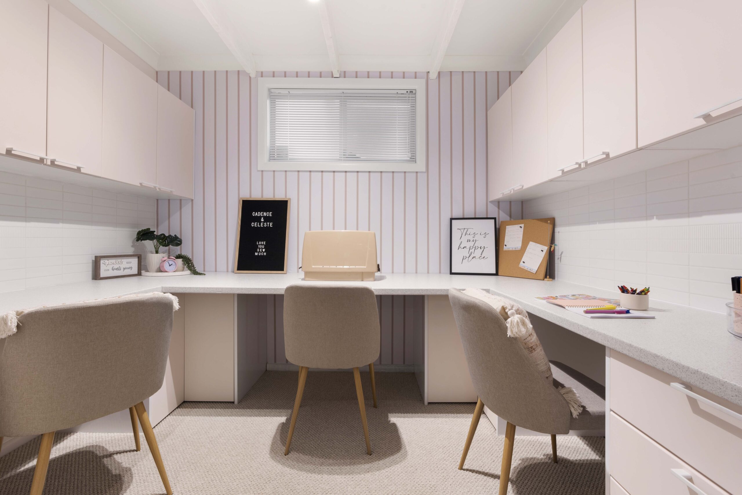
In just 2 short days & a lot of hard yakka, the renovation of Sandra’s 3 rooms was complete. This reno was more than just a series of cosmetic changes, but a journey of healing and rediscovery. Each choice, from the colour scheme to the repurposing of rooms, was made with Sandra’s emotional well-being in mind. The clutter was cleared, not just to create physical space but to make room for new memories and experiences. The table tennis trophies, once scattered reminders of the past, were respectfully reorganised, symbolising Sandra’s ability to honour her past, while making space for her future.
In transforming her home, Sandra found a renewed sense of self. The house that once felt foreign and suffocating, now mirrored her inner light and resilience. It’s become a place of comfort, creativity, and connection—a true reflection of Sandra’s spirit. Through the thoughtful renovation, Sandra’s home finally felt like her own, a sanctuary where she could embrace her past, live her present, and look forward to her future with hope and joy.
All up, the full retail cost of renovating these three rooms including all the new furniture, artwork & rubbish removal costs came in at $33,892. Of this, $11,128 went to all trade labour invoices at normal market rates & $22,764 for the purchase of all construction materials, fixtures & fittings and property styling items.
Broken down a little further (as I know many of you love to know these details 😉), all the new lighting & electrical upgrades came in at $5,164, all the new sewing room cabinetry, wall panelling, benchtops, general building materials & all the carpentry labour consumed $10,770 of the budget, paint & painting labour was $5,070, new carpet in 2 large rooms including installation $3,600, wallpaper supply & installation $3,151, rubbish removal costs $750 & new furniture, artwork & property styling items at $5,387.
 On set at the end of the renovation with happy smiles from Sandra & daughter Denise.
Lastly, Sandra’s story is a powerful reminder of the profound impact our environment has on our well-being. It underscores the importance of creating spaces that not only reflect who we are, but also who we aspire to be. As Sandra’s home transformed, so did she, emerging from the shadows of grief into the light of a new chapter, surrounded by the soft hues of her renewed world.
As always, if you have any questions on this renovation, be sure to ask them in the comments box below & my team or I will answer them promptly for you.
Until next week,
Cherie x


So beautiful and inspiring!!! Absolutely love the colour theme and the price looks very appealing and doable!!
Thank you Kate. Glad you liked this renovation. Cherie Crew x
Such a great renovation and episode to watch. You could see the homeowner so happy in her new space. Great work Cherie and team.
Thank you Emily. Yes, Sandra is now very happy in her new space.
So bright, colourful and pretty now!! Love it <3
Thanks Jo! Cherie Crew x