An Unrenovated Coastal Gem
When faced with an unrenovated seaside house, there are a dozen different styles that would have suited a coastal gem like my Byron Bay holiday home. From nautical to contemporary, Hamptons to Scandinavian, the list goes on … For me, it had to be mid-century, my personal favourite.
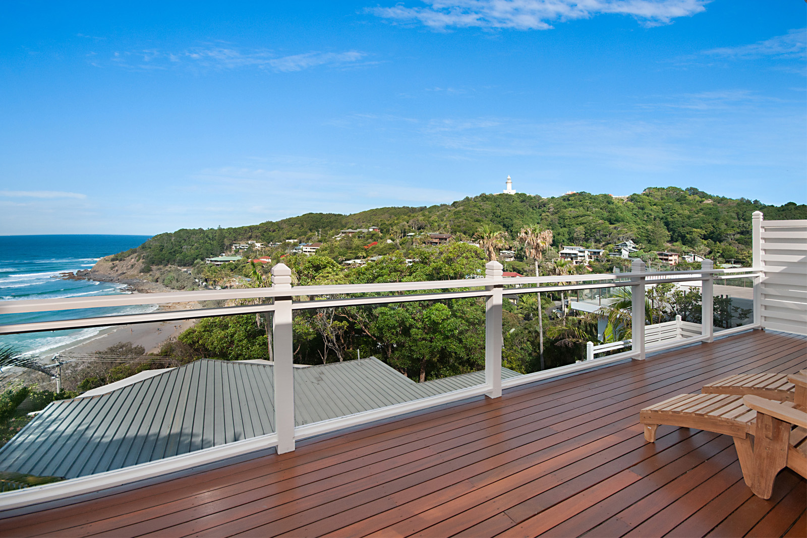
Buying this picturesque holiday house high up on the cliff, overlooking one of Byron Bay’s most famous beaches was definitely a departure from my usual property strategy. With a high purchase cost & mediocre rental returns at the time of purchase, it’s fair to say it’s a property that makes no financial sense at all. Sure, I live & breathe renovating for profit every single day but a lot of things are not about money, right? What this property does give me is joy, something you can’t place a value on. My point here is that in your lifetime, you may just stumble on a property that you absolutely fall in love with. When is it ok to buy a property that doesn’t financially stack up? Simple answer: only when you’ve accumulated other properties that will deliver enough passive income to see you through in your retirement years. Buying a property that financially doesn’t stack up any time before you’ve accomplished this, can be portfolio building suicide.
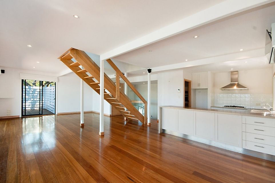
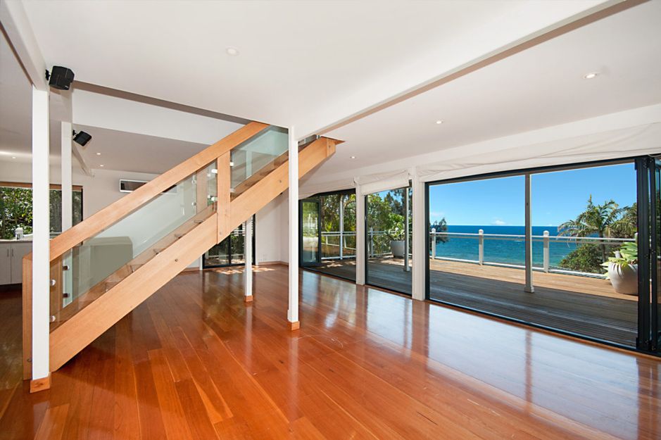
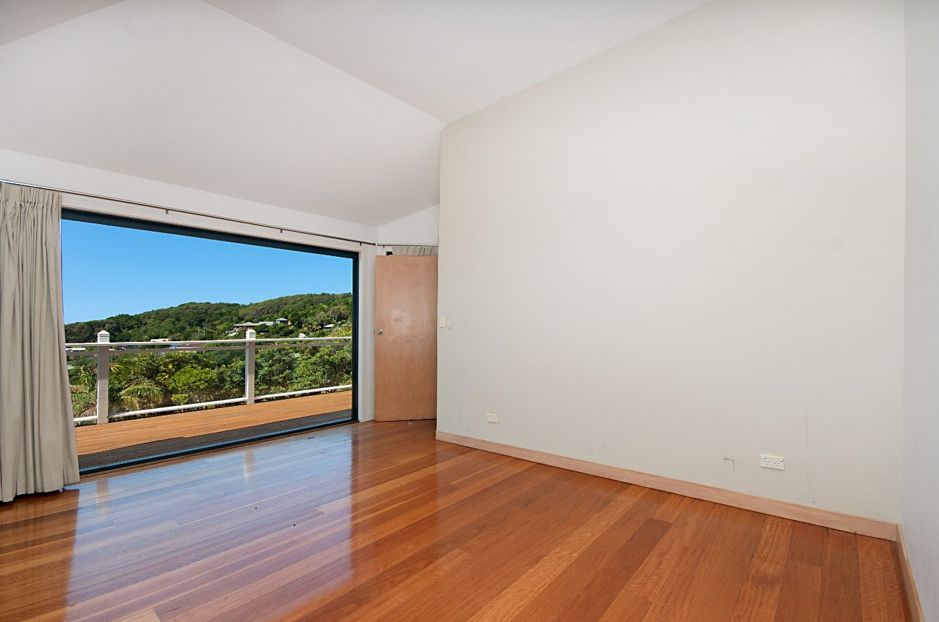
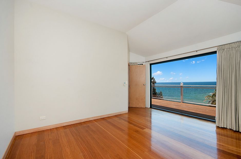
With its dreamy location overlooking Wategos Beach, breezy, open-plan layout & huge decks that create the perfect indoor / outdoor connection, the only thing missing from my holiday home was an updated appearance.
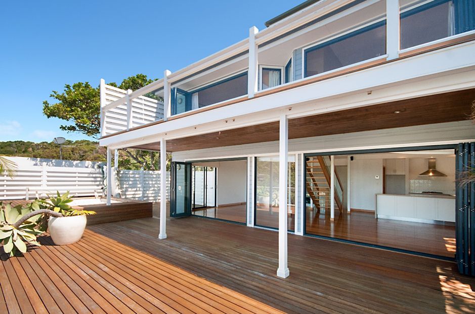
Whilst not an overly large home, what it did have was good structural bones. Presenting as a completely blank canvas, the all-white interior whilst nice, lacked warmth & texture & was void of any real personality.
THE COSMETIC SPRUCE UP
The good thing about this property was it just screaming out for some cosmetic updates & a bit of property styling. First on my agenda, was internal & external painting. Outside, a nautical combination of Dulux Western Myall & Dulux Natural White works beautifully with the wide, open decks & blue ocean vistas. It was a bolder colour scheme that worked much better than the predictable pale blue colour that was there previously, lacking contrast.
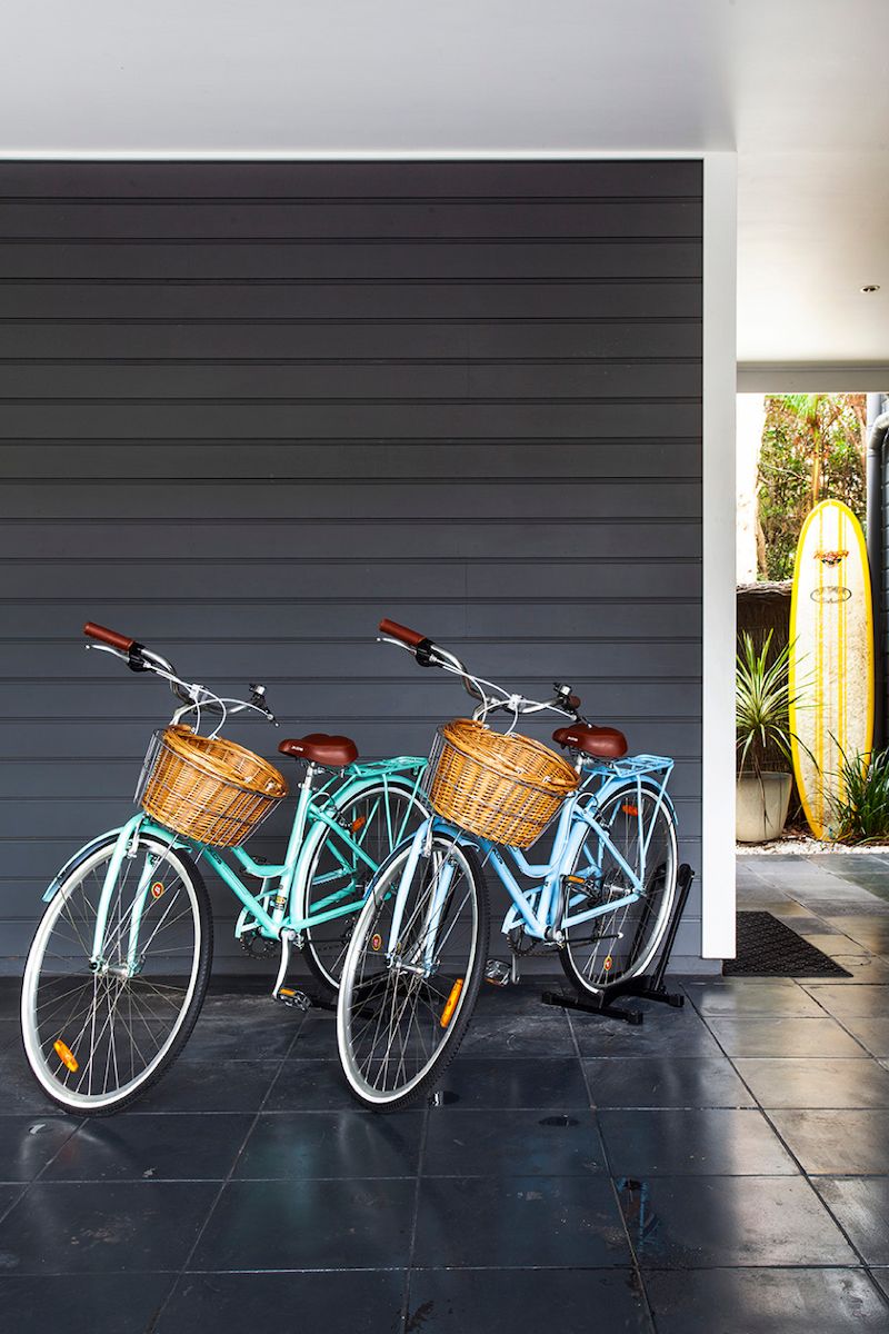
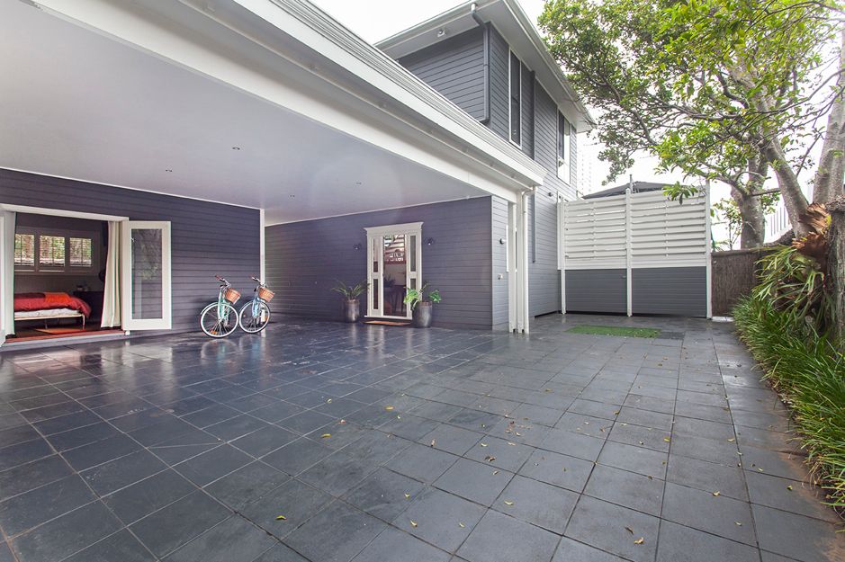
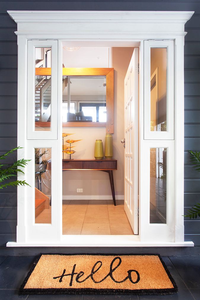
Every home deserves a nice entrance & this was achieved, simply through painting & a cute doormat with potted plants either side of the door.
The internal entrance to the house was given some warmth with a few coats of Dulux half strength Linseed & a modern yet vintage inspired wallpaper installed to 2 of the walls for much needed texture. In a regional location, I shouldn’t have taken for granted that wallpaper installers being a more specialist trade, would be readily available!
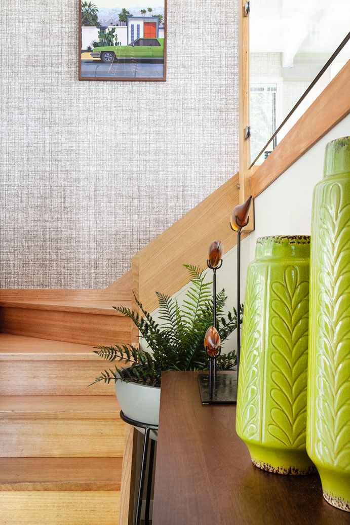
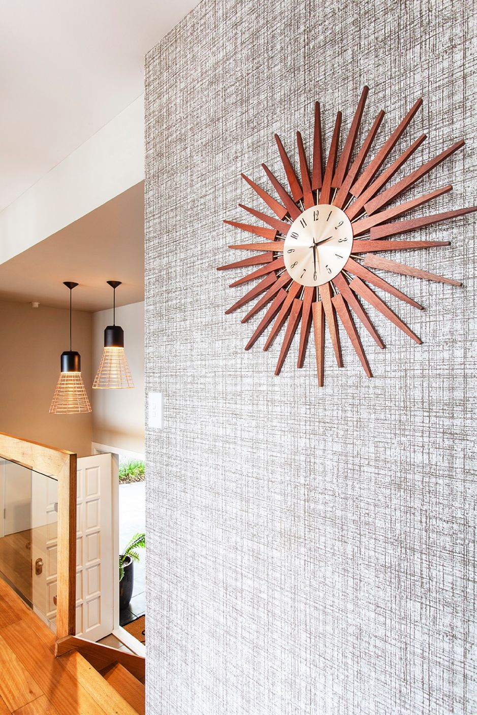
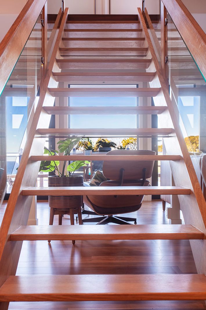
As for the stairs leading up to the 2 king size bedrooms on the upper level, all was needed was a bottle of Spray N Wipe! With the open treads that didn’t block the views to the ocean, they made sense. As the saying goes, “if it aint broke, don’t fix it!”.
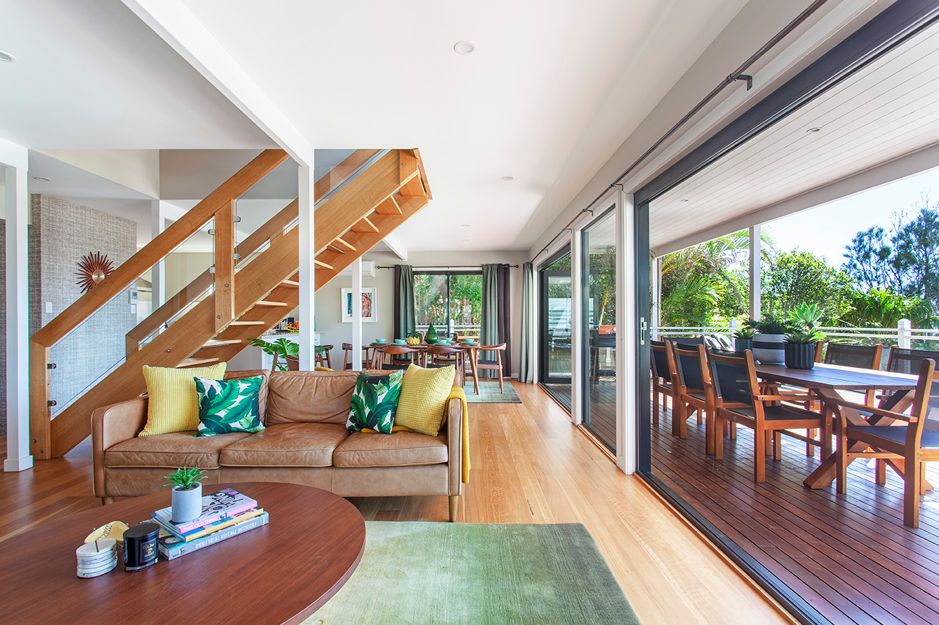
The floorboards were in ok condition when I bought the property but were at the stage of probably needing a good sand & polish in a few years’ time. Easier to get that done when you have no furniture in your house so it was something I elected to do straight away. The floors were sanded & sealed with 3 coats of satin polish by a licensed floor sander. Definitely a job best left to the professionals if you’re after a flawless finish.
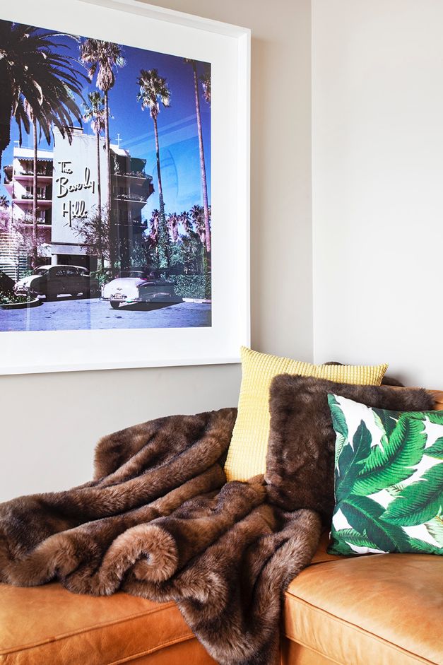
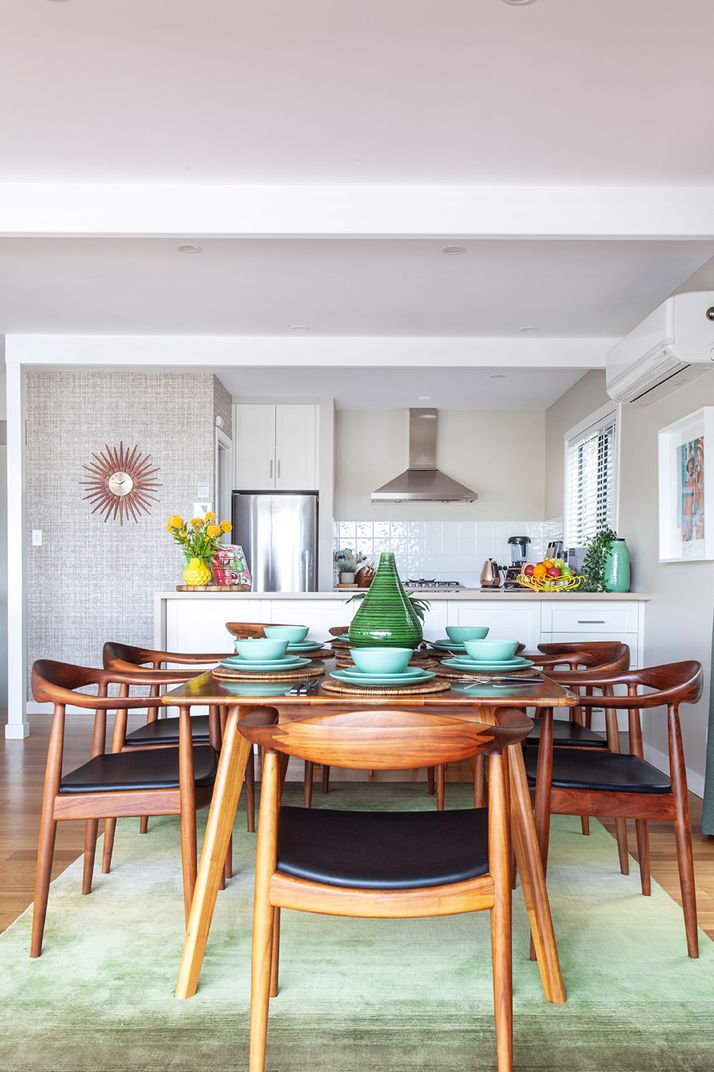
The great thing about this property is that it didn’t need major cosmetic or structural surgery in any of the rooms. As the photos show, for the most part, the addition of furniture, artwork & styling accessories made such a huge difference.
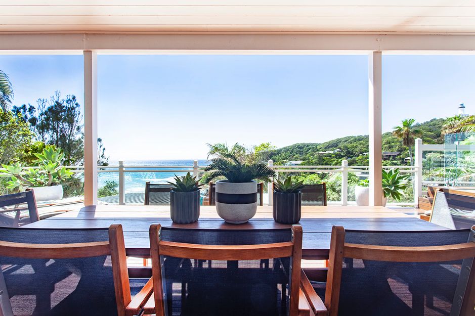
One area that I did invest in was the outdoor furniture. Being a seaside location, exposed to often wild elements, I invested in robust teak furniture from Woodbury Furniture that only requires a light sand & oiling once a year.
A big cost saver in this house was the fact that the kitchen had already been done at least 5 years earlier. Nothing more than a bit of styling added & my job was done. Bonus!
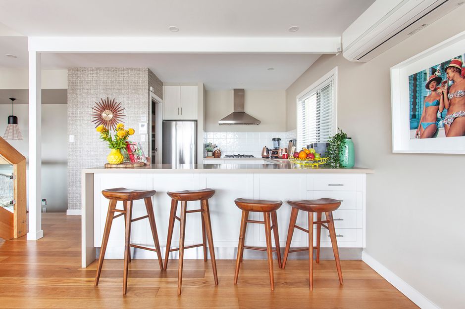
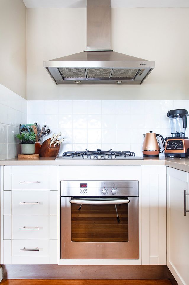
Time for the 2 bedrooms upstairs … again, the beauty of buying the right property is that you don’t need to spend a fortune re-engineering everything.
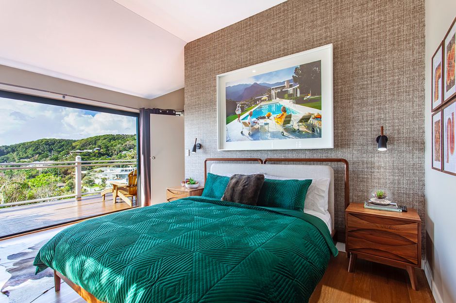
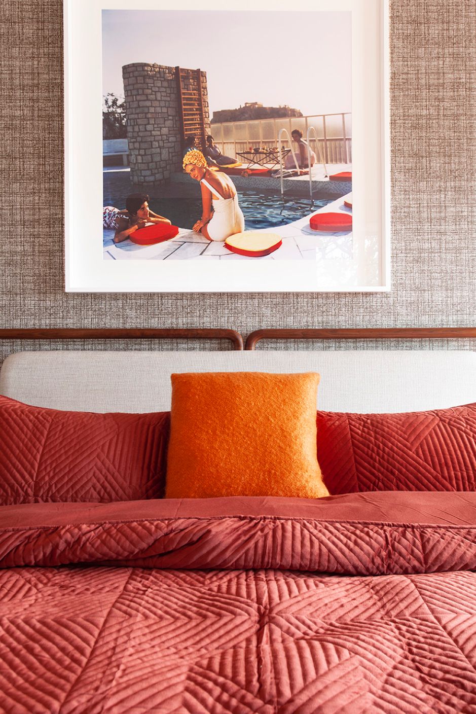
You’ll see that I continued the same wallpaper downstairs to the upstairs bedrooms for design continuity. Los Angeles 1960’s photographer Slim Aarons prints were used extensively throughout the house that help pull the mid-century style together in a modern way. My preference would have been to get all the artwork frames made in walnut but stock unavailability & a crazy price tag to do so, rendered that idea down the sink.
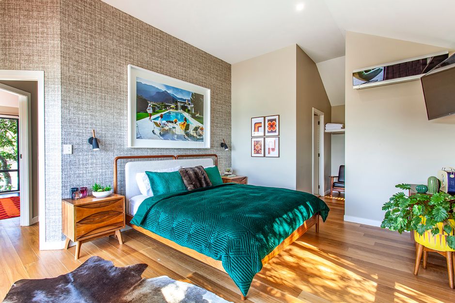
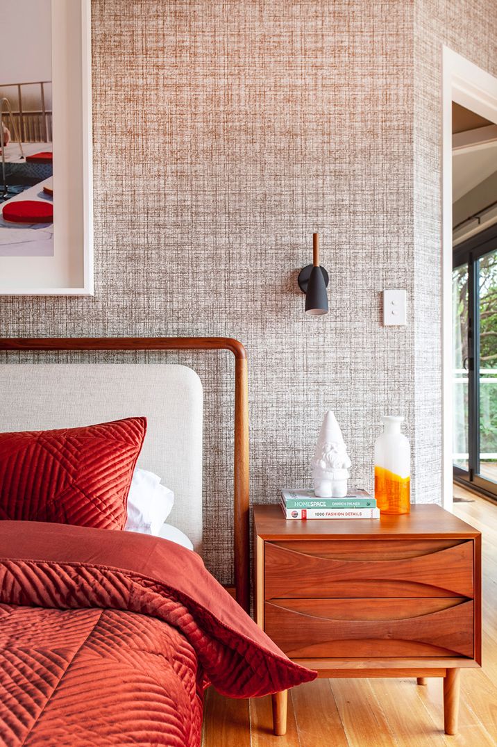
Simple wall lights that didn’t compete with the wallpaper were added over the bedside tables that swivel towards the bed to provide task lighting when needed. Mid century inspired furniture from Icon By Design help keep everything on theme.
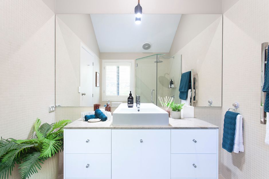
A neutral ensuite that already existed, strategically had a small 900 x 900 mirror taken off the wall above the vanity & a large wall to wall mirror installed instead that made the room appear so much larger. Colourful, plush bath linens & a potted plant complete the look.
Bedroom 2 upstairs was a mirror image of Bedroom 1 with its own ensuite as well. In true mid-century style, I decided to go with browns, reds & oranges, an unusual colour palette but one reminiscent of the 60’s era.
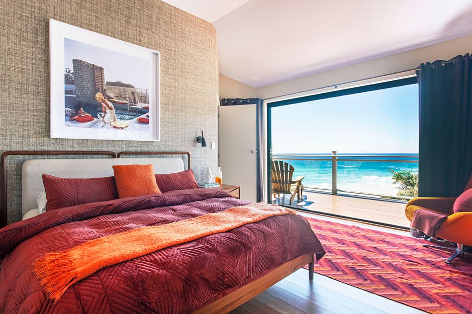
Outside, the deck underwent a sand & oil. New furniture was added & a much needed glass safety fence was installed around the large, recessed spa. Whilst it looked better without a fence, aesthetics don’t come into play over anyone’s personal safety.
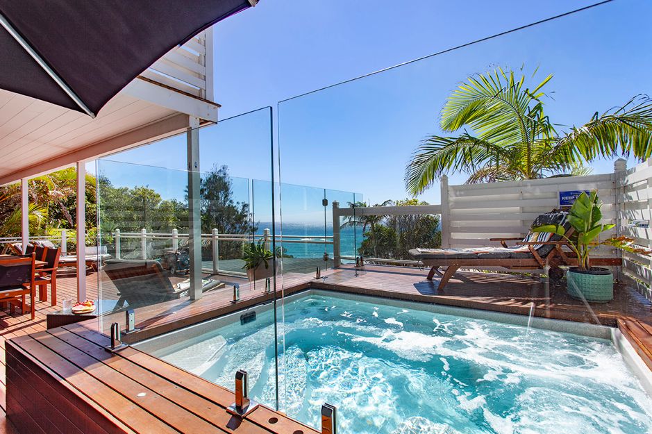
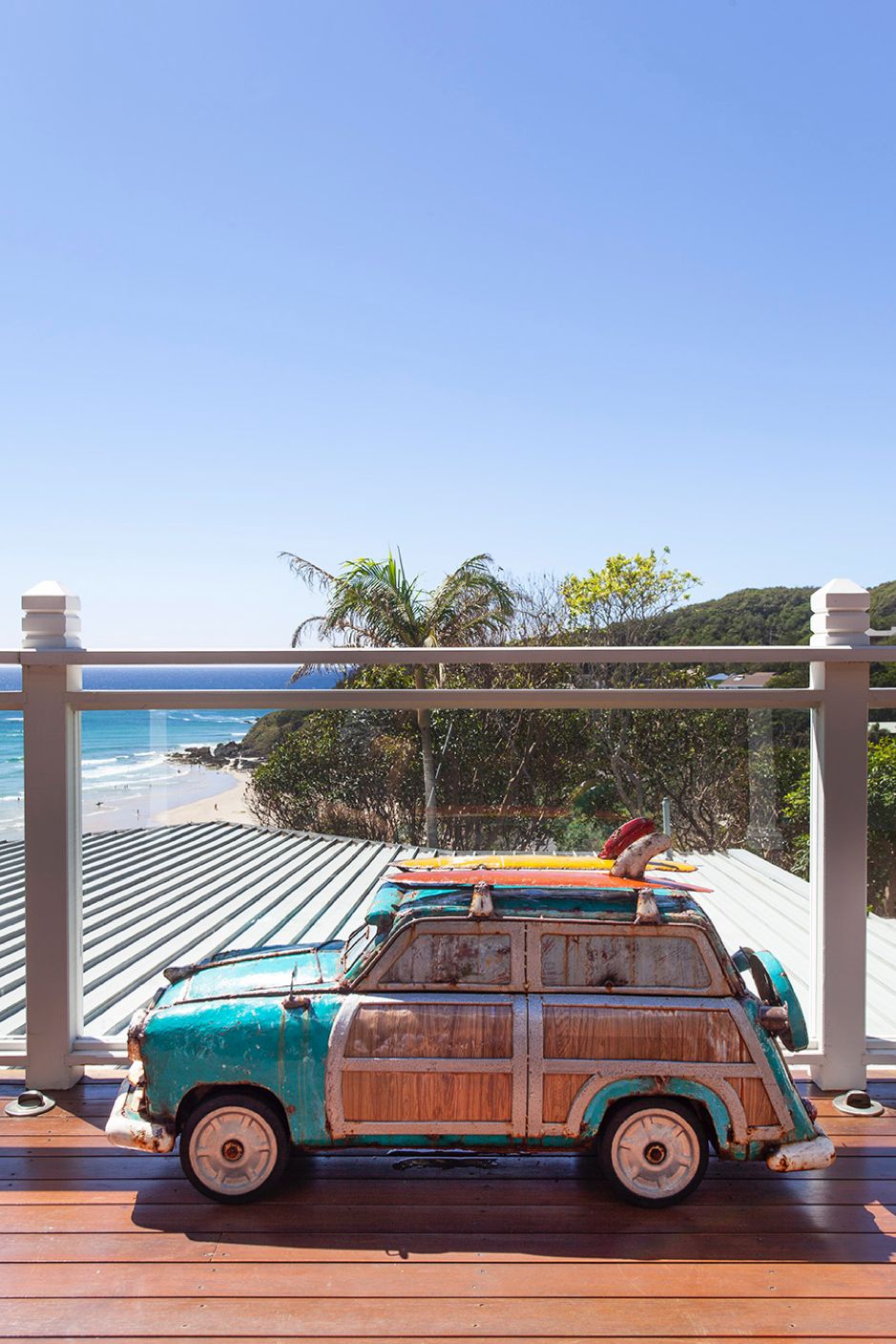
How did I correct the fact the property was such a cash cow that made no financial sense at all? I converted it to an Airbnb rental property instead, giving me the option to use the house when I want but still have income coming in when I’m not. While some of you will be quick to pipe up & say that Airbnb properties take away all the local rental properties, we also can’t overlook the fact that this Airbnb creates a decent amount of employment for numerous people in the local region. From the co-hosts who look after the property on a day-to-day basis to the cleaners, the lawn maintenance man, the local pool cleaning company, the local laundromat & the local businesses who supply some of the fresh produce & supplies that are supplied to every guest that checks in. The way I look at it, if there’s little to no local employment in an area (especially a regional area), people will struggle paying any amount of rent anyway.
When I bought the property, the thought never occurred to me to rent the property out on Airbnb. By default, it became my first real Airbnb property back in 2016. I spent the next 3 years making silly mistakes that even a savvy property expert like me, should not have made. One such example…buying good quality Sheridan sheets when I should have bought commercial grade sheets from a hotel supplies company! Normal residential sheets don’t last long when they’re going through commercial washers & dryers every couple of days. After 3 years of learning these sorts of things the hard way, it prompted me to develop my Airbnb For Profit course so others could avoid the same pitfalls. It doesn’t matter if you’re renting your whole investment property out or just a spare room in your home, you’ve got to know what you’re doing on Airbnb to truly make it a profitable exercise. Be sure to check my Airbnb course out by CLICKING HERE.
SHOP THE LOOK
If you love the look of retro & coastal merging together, then shop the look with these key furnishings:
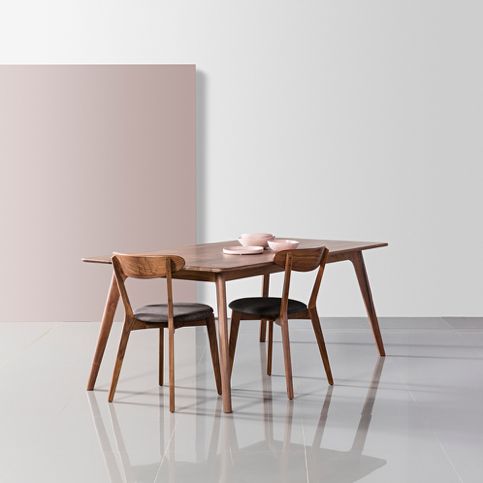 |
Magnus Solid Walnut 6-Seater Dining Table
Supplier: Icon By Design CLICK HERE for product link. |
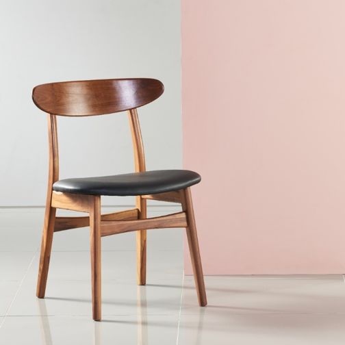 |
Astrid Dining Chair with Black Leather Seat
Supplier: Icon By Design CLICK HERE for product link. |
 |
Wallpaper: Harlequin Orla Kiely brand
Product Name: Scribble # 110426 Supplier: Annandale Paint & Paper |
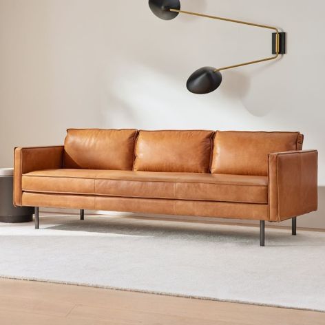 |
Sofa: 3-Seater Axel Leather Sofa
Supplier: West Elm CLICK HERE for product link. |
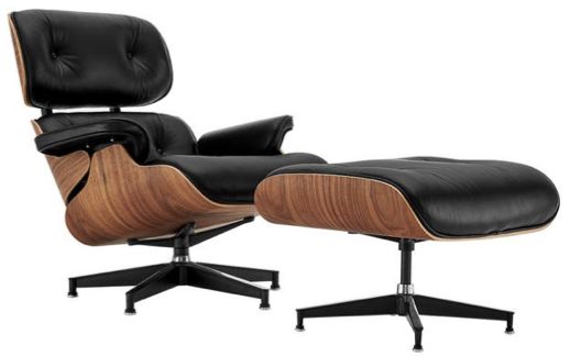 |
Replica Eames Lounge Chair & Ottoman
Supplier: Matt Blatt CLICK HERE for product link. |
Would love to know what you think.
Much love,
Cherie x


Cherie,
It’s absolutely stunning.
Fiona
Thank you so much Fiona, Cherie Crew x
Always enjoy your work, Cherie. Very nicely done and I empathise with a ‘love’ project.
Thank you so much Rowena, have a beautiful day! Cherie Crew x
I never considered putting Mid Century with Coastal but it really works here. This property is iconic. Thankyou Cherie
Your welcome Mary, so glad you enjoyed the read! Cherie Crew x
Cherie, I think you aced it, hon! Love the overall finishes, mid-century-modern furniture, with just enough Scandi-to-Coastal decor mixed in. By the way, those white framed prints are actually a much better choice (imho), by helping the beach-side house maintain a fresh ‘n clean look! So nice when resorting to 2nd option becomes the ‘winner’! Thanks for sharing (and) inspiring!
Thanks Carol for your lovely feedback, Cherie Crew x
I thought it looked very practical with nice clean lines.
Would love to see what you would do with a little beach house that has old style sash windows and lots of them that arnt working that well anymore!
Thanks Lynne, Cherie Crew x
It was so refreshing to see that you did something different other than the usual “All White/Neutrals” and Cane Coastal Furniture. Your decorating here is 👌🏻 It’s Timelessly styled now for all seasons in a Coastal environment. No need to double up on linen for change of seasons, another Win Win. I love it.
Thanks so much Dale for your lovely feedback. Definitely change out the linens to suit the seasons, have a fantastic day! Cherie Crew x
Thank you for this post! It’s exactly what I needed.
Thanks Izolacja, glad you’re enjoying our blogs. Cherie Crew x
Thanks for the helpful tips. I’m excited to implement them!