


Cherie’s Hampton’s Inspired Apartment Renovation
Howdy,
Well, it’s finally here – the first episode of Space Invaders, Season 3 aired last night on Channel 9. Over the next 10 weeks, I’ll try my very best to send you a quick email each week showing you the before’s & afters of all the rooms I renovated in each episode & why I made certain changes. Hopefully, these images provide some inspiration for you & get your creative thoughts flowing for what you can do to your place, if it needs renovating.
Let’s kick Episode 1 off – this was a renovation for homeowners Bec & Julian who owned a standard size 3-bedroom apartment in an oceanside suburb. It was a standard apartment layout – long hallway running the entire length of the apartment, with all the rooms stacked to one side. Being so close to the ocean, the homeowners wanted a Hampton’s inspired look, aka lots of blues & whites with a beachy touch of class.
Like most family homes, this apartment was chock a-block full of things in all the wrong places & everything on display that shouldn’t be. With more of us living in apartments & smaller houses due to housing affordability, you’ve got to be smart about what you do & don’t keep & how that is stored effectively in your home. The simple addition of off-the-shelf cabinets from Kaboodle & Fantastic Furniture solved most storage problems in this property.
Whilst the apartment had good bones & was of a decent size, we can’t ignore the fact that it desperately needed some brightening up. Being a ground floor apartment, natural light wasn’t in abundance & a lot of things were looking just plain old tired.
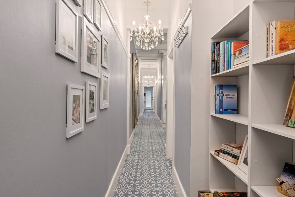
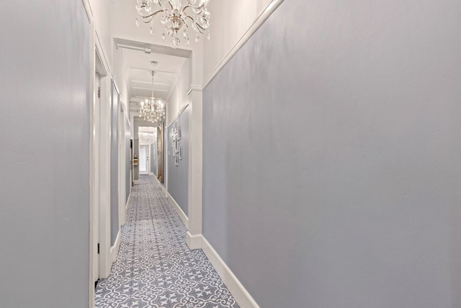
HAGGARD HALLWAY
The first space to tackle was the hallway. As soon as you walked in the front door, the clutter hits you in the face. Boxes stacked on top of each other are not the most attractive decorator items & pose a danger to any little ones. With so much stuff stacked in the hallway, it also made the spine of the apartment feel small & cramped.
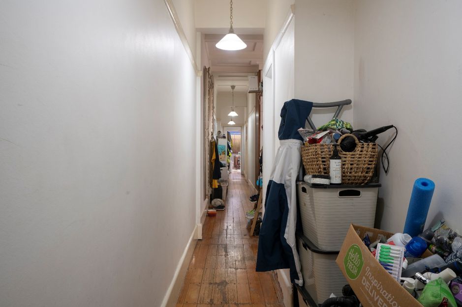
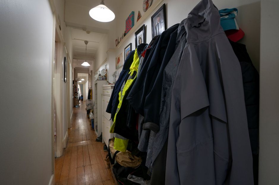
Bec & Julian’s home was built in the 1930’s & has lots of beautiful traditional features like the picture rails, high coffered ceilings & decorative casement windows which you would never rip out. They add character & value to the property so it was essential they stay. Working with these, the walls were painted in a pale blue / grey colour up to the picture rails with crisp white paint overhead. This makes the hallway look less boring but also doesn’t overpower the space. Treasured photos that were stacked on the floor & in boxes, were arranged in an informal way to keep things casual & 2 simple bookcases from Fantastic Furniture were added that provide practical storage.
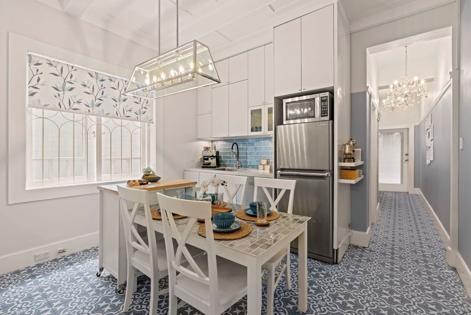
Let’s turn our attention to the floorboards … everyone loves real timber floorboards but unfortunately these ones, on closer inspection, were damaged in spots. To amp up the wow factor in this apartment, I decided to install the Majorca Palm Springs tiles in Blue Matt from Beaumont Tiles. The pattern & colour of the tiles helps achieve the Hamptons look & they really lighten up the floors that help brighten all the rooms within the property generally. The cheap, old pendant lights were replaced with sparkly new chandeliers from Beacon Lighting that give off way more light & also add extra traditional charm to the apartment (who doesn’t like a bit of extra bling, eh?).


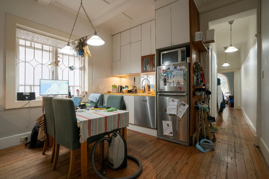
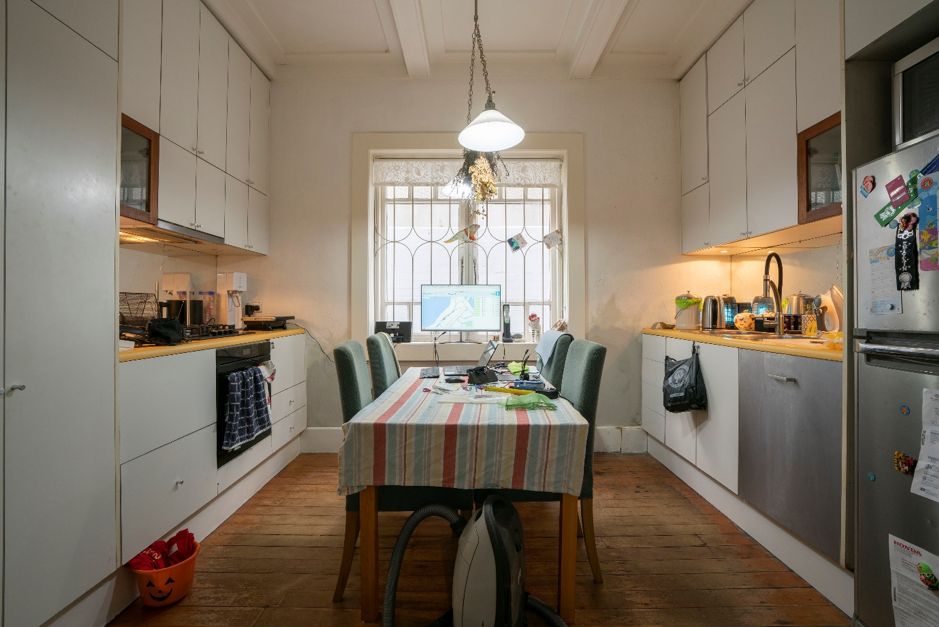
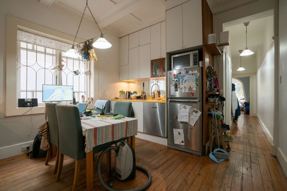
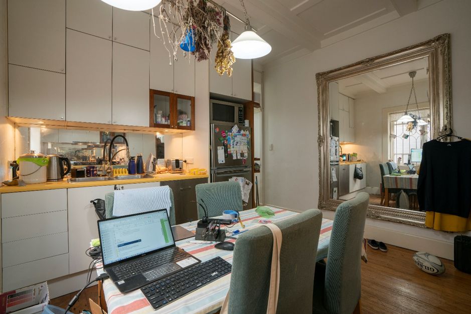
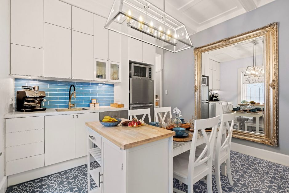
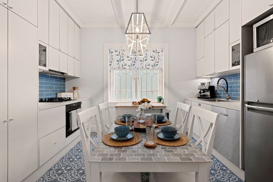
DAZZLING DINING & KITCHEN
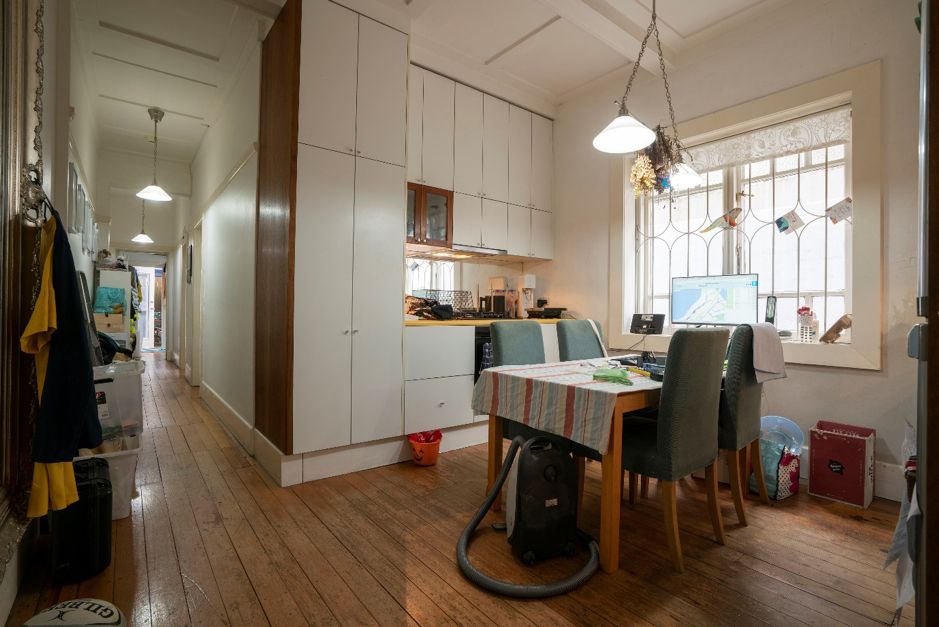
In this home, the kitchen was a little weird, almost 2 galley style kitchens directly facing each other. What took it up another notch in craziness, was the mirrored splashbacks that directly faced each other.

Mirror on mirror is never a good thing so I didn’t have to think twice about covering those in clear contact adhesive, putting my elbow length, kevlar gloves on & smashing them off with a hammer & chisel. Dangerous stuff but hey, someone’s gotta do it! I installed a gorgeous pale blue subway tile (also from Beaumont Tiles) to help build the look of a Hamptons inspired space.

In all reality, the existing kitchen provided fabulous storage with all those overhead cupboards going all the way up to the high ceiling. A good scrub & clean of the cabinets did wonders & I painted a few of the old timber cabinets in White Knight Tile & Laminate Paint, rather than replacing them.
Yellow is such a fun, happy colour but man, not on your benchtops! Rather than ripping them out & potentially opening a can of worms, I called in my trusty friends at Granite Transformations who simply placed a thin 8mm layer of real granite, straight over the old benchtops. Simple!

I kept the stunning oversized wall mirror as it really suited the style of the house & it worked brilliantly to bounce light around from the window opposite. The new Southhampton Pendant from Beacon Lighting gave off way more light than the old fitting & added even more heritage charm.
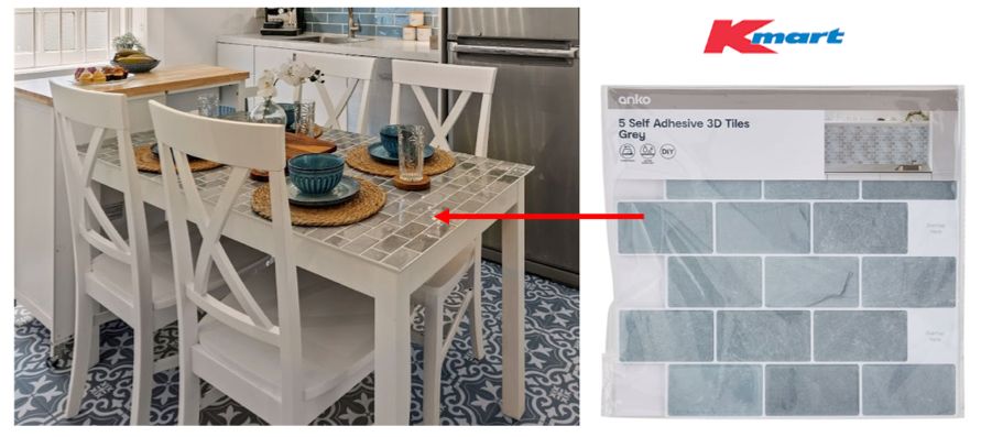
You might have also noticed the old dining table – structurally in good knick, right size for the room, albeit, just a little tired looking. My fellow co-host, Angie Kent upcycled it, painting it white with White Knight’s Tile & Laminate paint. Kmart’s DIY Self Adhesive 3D Tiles were installed straight on top, making the table look completely brand new (even though it’s not).
I added 4 x Newhaven chairs to the table & paired it with colourful dinnerware accessories, also from Kmart. These low-cost effective changes, working with the existing kitchen (not against it), meant I kept more money in the kitty to spend on other areas of the home. It’s now a nice, functional kitchen for the family to cook, sit & eat.

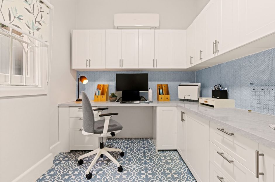
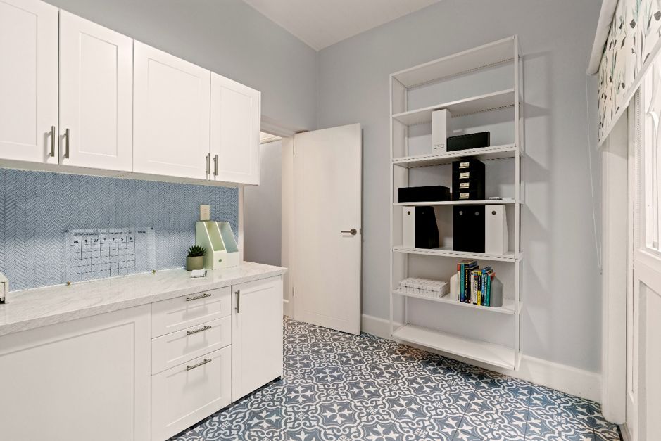
ORDERLY HOME OFFICE
Let’s be honest, installing a few bookcases in the hallway, wasn’t going to solve all this family’s storage problems. Plus, if you hadn’t already noticed, the kitchen dining table was being used as a home office which is never an ideal situation.
The spare bedroom (bedroom 3) in the back of the property was the perfect spot for me to create a dedicated home office. It gets more natural light than all the other rooms which helps with productivity & general wellbeing.
Once all the clutter was out, I grabbed all the room measurements then hopped straight into the Kaboodle 3D planner, designing the office space, using off the shelf, flat pack cabinets, straight from Bunnings, which I got my chippies to install. Once installed, a Bellato Grey laminate benchtop from Trademaster was cut & installed straight on top.
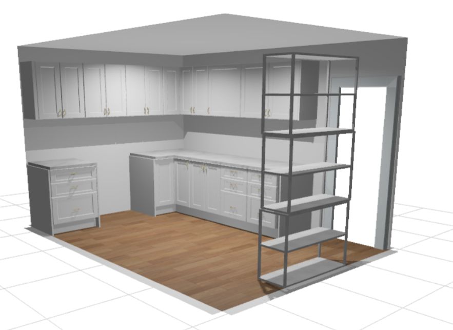
Designing an office with Kaboodle cabinets is great because it gives you the flexibility to choose what sort of storage works best for you. There’s also no long leadtimes waiting for cabinets to be manufactured. Plus, if you join my Home SuperSaver group, you’ll get a very nice discount off all your Kaboodle cabinets moving forward.
For Bec & Julian, I chose a mixture of base & wall cabinets plus I made sure I left a decent gap in the bottom cabinets to create a desk area. To add a bit more colour, I added herringbone tiles as a splashback. Now they have plenty of room to store their work things as well as the linen, toys & various other items that were clogging up their hallway. Everything is behind closed doors & now finally out of sight!


COZY KIDS ROOM
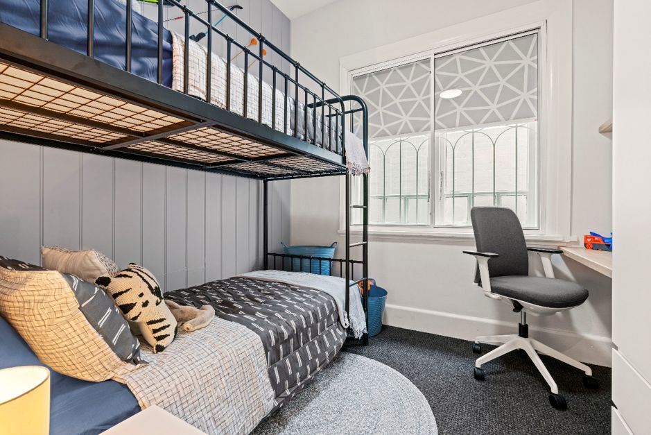
Now onto the final room … Bec & Julian’s son, Caspar, needed his own space to play & sleep that felt safe. The tiny second bedroom (2.8 metres x 2.5 metres) was dominated by a wardrobe that wasn’t even deep enough to fit a coat hanger (what’s the point?). A weird floating cupboard on the other side of the wall consumed a lot of space for no real purpose.
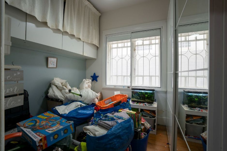
I tasked my chippies up with ripping all that out & I replaced it with a compact wardrobe from Fantastic Furniture which fitted snuggly behind the door. Whilst this may look like less storage, it’s much more functional & also allows space for a built-in desk.
It was also a must-have that Caspar have a second bed in his room for friends to sleep over so this was achieved by adding an open style bunk bed that keep the air & floorspace visually clear. VJ wall panelling was added to one wall to make the room look more interesting & the whole room was painted in colours which stemmed from the Kmart bedding. A printed roller blind from Wynstan adds a fun pop of personality to the room. Now, young Caspar has a safe space, he can call his own!

All up, this renovation cost $50,802.51 for all the materials, labour & furniture at full retail cost. Of this, materials accounted for $21,025.35 & labour at $29,777.16. The uplift in the property value was $150,000 exactly, resulting in a net profit of $99,197.49.
I did this reno in 3 intense days (yes, you need to move fast when you’re a TV renovator) but any average joe could easily do this reno over a month or 2 comfortably. The end result? Apart from the financial gain, a practical & beautiful home that suited the family & the history of the building. Tune in at 7:30pm on Channel 9 next Saturday for Episode 2!
As always, if you have any questions on this episode, be sure to ask them below & my team or I will answer them for you. Until next week…..
Much love,
Cherie x

There are no arrows to swipe so I can only see the before pics …
Hi Gillian – the before pictures are in the top of each room description. Then at the end of each room section, the photos are repeated with the after image if you slide the arrow left to right. Let me know if you still have any troubles viewing the after image. A few other people have had the same problem. CB x
Hi there, l watched the first episode of Space Invaders. The renovation was amazing, beautiful job. I see you only have before photos could you send the after photos. Thank you, again wonderful, amazing job. 👏👏😊😊
Hi Georgia,
You may have not noticed the arrows in some of the pictures. You click on the arrow and slide it left to right to reveal the before & after reveal pictures. Let me know if you still have troubles viewing the after pics. CB x
Once again another fabulous job.
I bet the owners are over the moon!
Just a question about the tiles… were the tiles laid straight over the floor boards? If so was there special preparation?
Thanks.
Hi Linda,
Glad you loved the reno. You cant install tiles straight over the top of floorboards directly as timber floorboards naturally expand & contract. I installed a product called tile underlay down first, adhering it to the floorboards with liquid nails & nailing it with clouts (which are a type of small nail). Once the tile underlay was installed, you can tile straight over the top with floor tile adhesive. Once dry, the floors were grouted & all edges siliconed. Hope this helps! CB x
Can you please share the name of the paints you used on the walls ceilings and trims ?
Hi Tess,
All paint was from Taubmans. Colour on the ceiling was standard white. Above the picture rail, was “Crisp White”. The bluey / grey colour on the walls was “Kings Landing”. Happy painting!
CB x
Do you have a YouTube channel with before and afters?
Hi Graham – I post all my before & afters mainly on Facebook and via my blogs. Haven’t fully quite mastered YouTube yet. Blame that on spending too much time on a reno site & not enough on a computer! 😉 CB x
Bloody wonderful, just gets the juices flowing, love your work!
Awwww.. thanks so much Jock for your very sweet comment. CB x
Beautiful job. We have just converted a shed to a habitable building. I don’t know exactly and worry about putting cupboards onto the gyprock walls. Our main house is brick and i never had a worry.
Hi June, You can anchor kitchen wall & floor cabinets into plasterboard walls however you need to make sure that the cabinets are anchored into the timber stud framing behind (not just the plasterboard). Hopefully your timber studs in the walls are spaced at 450mm not 600mm spacing which gives you more stud work to anchor onto. CB x
Love your work. You are so inspirational! You gave me, over the last couple of years, the courage to do some little renovations around my house. Thank you for your generosity.
Thank you Lili. Thats why I publish all the content I do, to help others. So glad its given you the courage to tackle your own house. You can do it! Send us the pics after you’ve finished, I would love to see them. CB X
Thank you Cherie,
It does look amazing. We are looking for our next project and I wanted to do a Hamptons inspired. Great ideas.
Awesome! Thanks for letting us know Kim. Good luck with your next renovation, I’m sure it will be great. CB x
I love the makeover – fabulous ideas! However, as the owner of a 100+ year old house with little storage, where did you put all the “stuff” that was in the hall, bedrooms etc. Surely throwing it all out is not an option? I don’t see any added storage space. My house always looks 100% better when I hide all the stuff that lives behind doors because there is insufficient storage.
Hi Kim – so glad you loved my renovation, thank you. The show Space Invaders is a decluttering & renovation show all rolled into one. The homeowners sorted through a lot of their things and donated about 80% of their stuff. As for the remaining items, I installed bookcases in the hallway & I installed a lot of cabinetry in the home office space that concealed all the homeowners belongings away behind closed doors, with plenty of empty storage cabinets still left over. Hopefully they never return to the level of clutter they had before. CB x
Looks great! What a difference! Two questions? What did the lounge area look like, and was there any space for guests to stay there?
Hi Jennifer, Bec & Julian’s lounge room was located at the front of the apartment. It was already renovated so I didn’t need to do anything to that room. In one of the early scenes of the show, when we meet the homeowners, you can see the lounge room. No spare bed for when guests come to stay but the sofa in the lounge room could be potentially changed over to a sofa bed for when guests do stay. CB x
if you “grab” the double headed arrow on the photos, you can slide it back and forth to see the befores and afters : )
Thank you Lana. A lot of people miss this! CB x
Lovely work. Surprised the blue/grey paint makes the hallway look bigger! What paint is it please?
Hi Angela – the paint is Taubmans brand and the colour on the walls was “Kings Landing”. Thank you for your lovely feedback too! CB x
What a great start to the new season, sucker for anything Hamptonsy, looked amazing! I would love to know more details about the tiles that were used in the new home office please?
Hi Melissa, Thanks for the lovely feedback. The floor tiles on the floor were these ones: https://www.beaumont-tiles.com.au/1232256-flourish-vintage-navy-blue-textured & the lighter blue splashback tiles on the wall were a pale blue mini herringbone edge mosaic tile however it looks like Beaumont Tiles no longer stock that particular tile. Hope this helps. CB x
We watched the show on Saturday- congratulations all on a great job! We were interested in what you did to the kitchen bench top with the granite overlay. The bench looked like it originally had a rounded edge which was squared off. Was the rounded edge cut off or did they just go over the top?
Hi Rochelle, thanks so much for your lovely feedback, so happy you loved this episode. The benchtop was supplied & installed by Granite Transformations & the rounded edge was squared off, Cherie Crew x
Fantastic transformation! Love it. Can you please let me know the supplier of the light fitting in the kitchen/dining? It’s stunning
Thank you
Hi Sofie – yes that pendant light in the kitchen is one of my favourites. Its the Southhampton 6 Light Pendant Light in Stainless Steel from Beacon Lighting. Sku Number: 030687.
Its currently on sale too so be quick! CB x
I love this one! Finally I see a house similar to ours. We have a 2br 1950s cottage in north brisbane and it’s a headache lol. Decluttering is solving most of our problems though. Our floorboards are similar. We need to cover to lighten up the space. I love the tiles you chose!! Our lighting, has the same cheap lights. I’m saving this one for inspiration. I’m super keen on those tiles. They’re so beautiful. 💖
Hi Tessa, thanks so much for your lovely feedback, so happy you enjoyed the read. Cherie Crew x
Is it a beautiful transformation and i love the simplicity of it. My favourite is the kitchen. It looks so bright and fresh. Well done.
So glad you loved my renovation Michelle. Thanks a million for taking the time to let me know this! CB x
Absolutely beautiful. My only comment would be that the bookcases in the hallway should be cupboards for books and for the parkas, coats etc that collect in the hallway, because the coat hooks will be a magnet for hanging all that stuff that was there before and it will look untidy again. Other than that, I just love this makeover.
Good point Lana! CB x
Can you tell me where you got the new blind in the kitchen? Thank you.
Hi Lana – certainly can. Its a roller blind from Wynstan. Just tell them Episode 2 of Space Invaders Season 3. CB x
Great job Cherie, I can’t believe you did that in 3 days, I wish the show came to Brisbane, maybe next winter when you want to get away. I’m a hoarder and have all the problems this make over had, I just don’t know where to start??? Sometimes I think I have to move out to be able to see what are the real issues. I love this show and think you not only transform houses but lives. Can’t wait for the next show!!!!
Cherie’s transformation of this Hampton’s-inspired apartment is awe-inspiring! The strategic use of colors, functional storage solutions, and clever design choices breathe new life into every room. A lesson in efficient renovations with a touch of coastal charm.
Thanks Harris! Cherie Crew x