


From Bland To Beautiful – Cherie’s 4 Day Reno
Hi There,
I hope you’re well! You may have noticed I’ve been a little quiet on the blog front for the last 4 weeks, having taken some time off to wind down & log onto life which meant taking my toolbelt off & putting the tools down. So, to make up for my absence, I decided to write a slightly longer blog this time, taking you on a bit of a journey of how I turned a dull, lacklustre property into a more functional home of greater beauty & inspiration.
In a world where our surroundings greatly influence our mood & well-being, it’s essential our homes are our living spaces that truly resonate with our own unique personalities & aspirations. We all know that feeling when you step into your home, but something doesn’t feel quite right. It lacks practicality, vibrancy & it fails to make you, feel like you.
Darren & Holly’s home in suburban NSW did just that. It was not a true reflection of their souls & left them feeling uninspired with a heavy sinking feeling, every time they entered it. Their walls were adorned with a monotony of plain white paint, furniture that has lost its lustre, a haphazard arrangement of toys & personal effects, making their space feel sterile & mundane. But fear not, I’m about to share what I did in each room that will hopefully give you some practical ideas for your own home & perhaps go so far to ignite your own passion for interior design. We’ve got a lot to get through so let’s get cracking!
THE LOUNGE ROOM
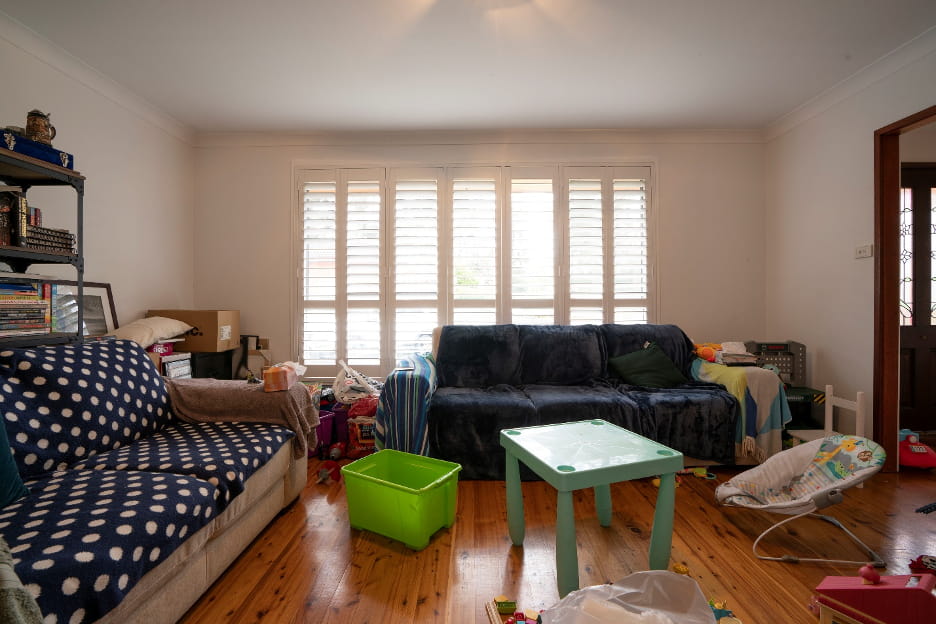
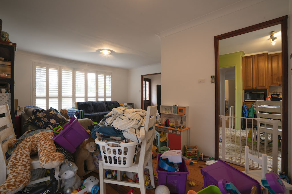
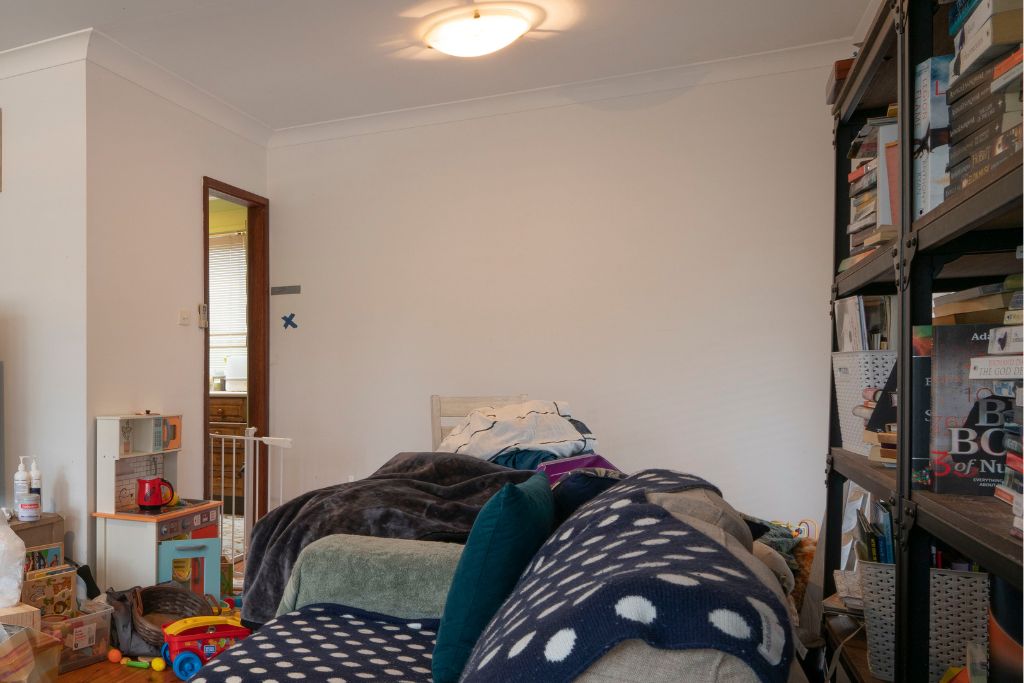
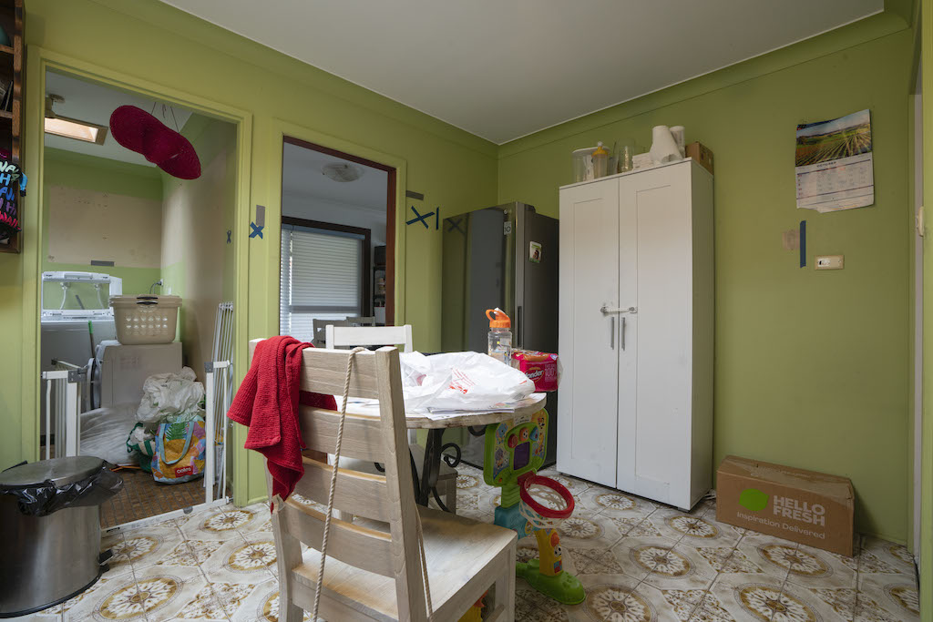
The first space you’re confronted with when entering Darren & Holly’s home is the living room. Completely overrun by toys & featuring impractical storage that left their whole life on display, it’s a visual mess that makes you go “arrghh!” The two large sofas visually dominated this room, eradicating any chance of squeezing a dining table in, for this family to sit & eat meals together.
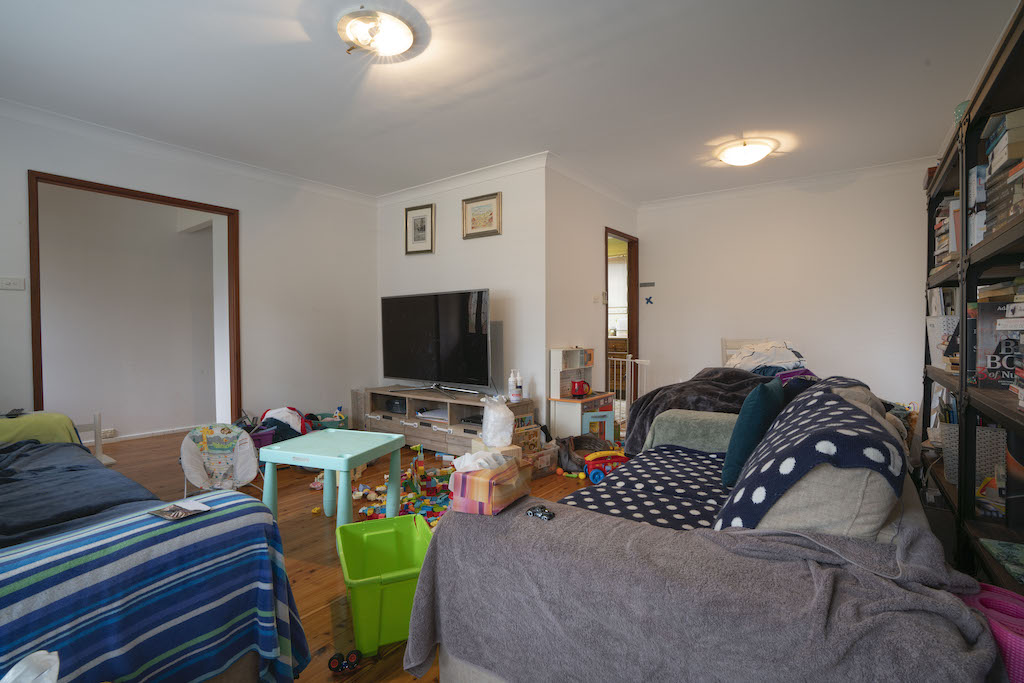
First up, the room needed a structural change. With the doorway into the kitchen being tucked around the corner, the kitchen felt very cut off from the living space, also making that part of the room unusable. I got my chippies to close up the old doorway & create a new wall opening, where the old TV unit was located. Whilst that all sounds easy enough in theory, in reality, that wall was load bearing. A quick phone call to my structural engineer got a small structural beam specified & a private certifier signed it off, once installed by my chippies. The wall change, all said & done, consumed about $3,500 of my budget.

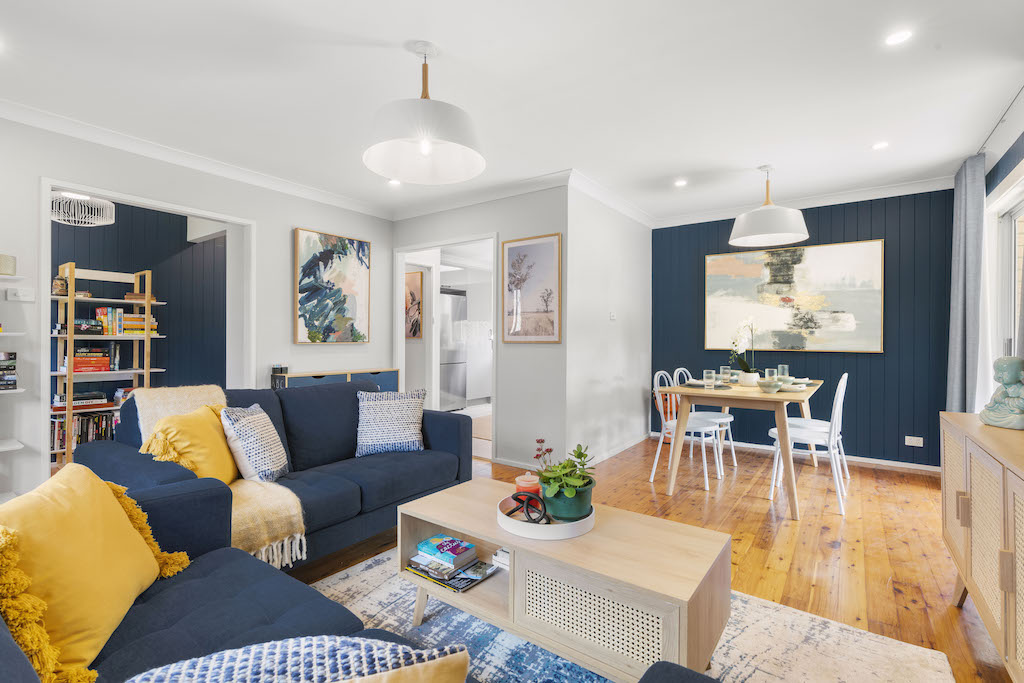
With the doorway moved, I was now able to create a much more practical furniture layout for this room. I moved the TV & orientated new sofas towards a new TV & storage wall. To give the room some much needed texture & visual interest, I added off-the-shelf VJ cladding from Bunnings to a couple of walls, direct in the line of focus when you first enter the room.
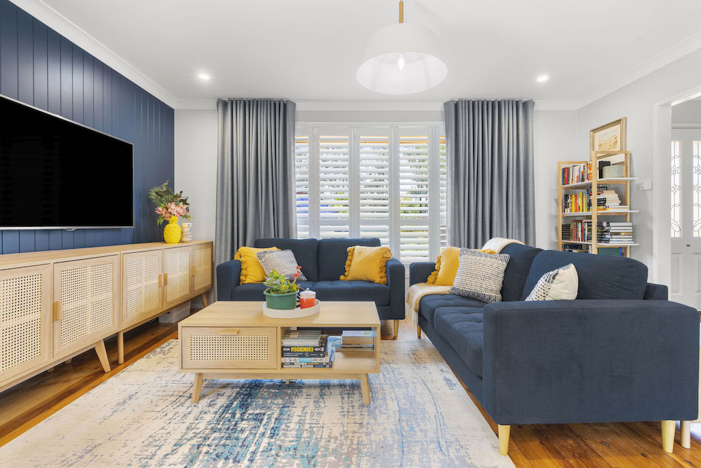
Homeowners, Holly & Darren’s favourite colour is royal blue so I used this as the design inspiration for the whole house. Royal blue can often be a bit bright for a wall colour so I took it a few shades darker & used Taubmans Elegant Evening, using it as the feature wall colour instead. Mixed with Taubmans Tundra Mist which is a pale grey colour, it’s a winning combination. A bit like mild & spicy all in the one meal!
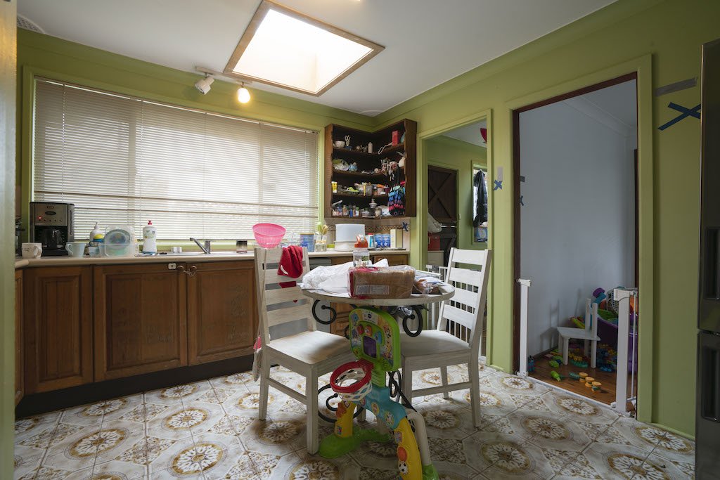
THE DINING ROOM
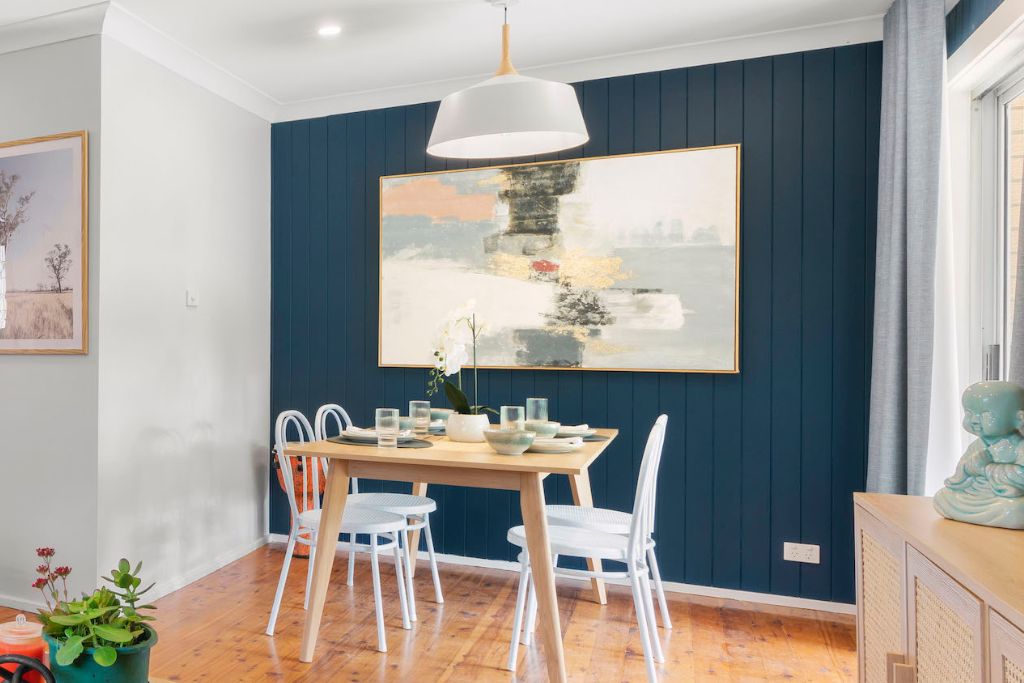
The former floorplan was in such a haphazard arrangement that it never afforded this family, the luxury of a dining room area. That doorway from the kitchen made absolutely no sense in its current position so this was closed in, to create a dedicated eating nook.
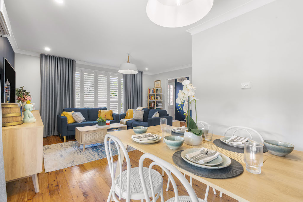
As their newly created dining room still sat in an open plan layout in their lounge room, I continued all the same colours throughout so the space felt connected & cohesive. New ceiling pendants add depth to the room & curtains help make the room feel fuller.
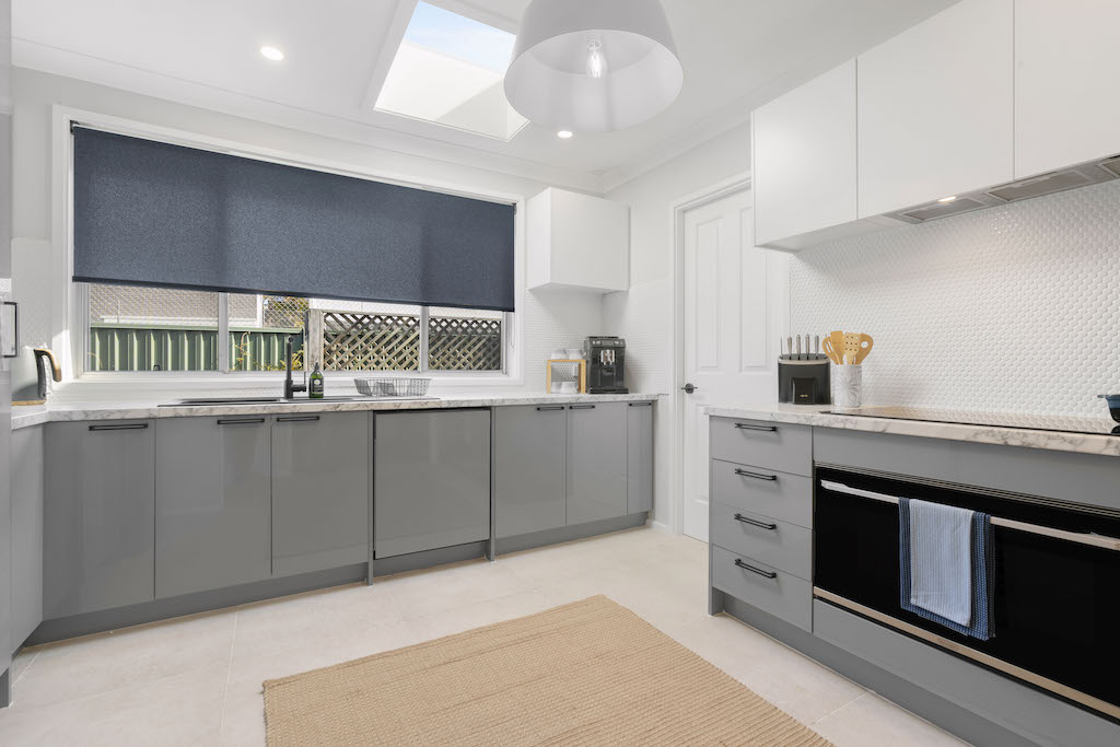
THE KITCHEN
Now onto the kitchen, which is up there with one of the daggiest kitchens I’ve ever seen. Crazy patterned 70’s floor tiles, timber bevelled cabinets, another pattern in the splashback & green walls – I didn’t know where to look!
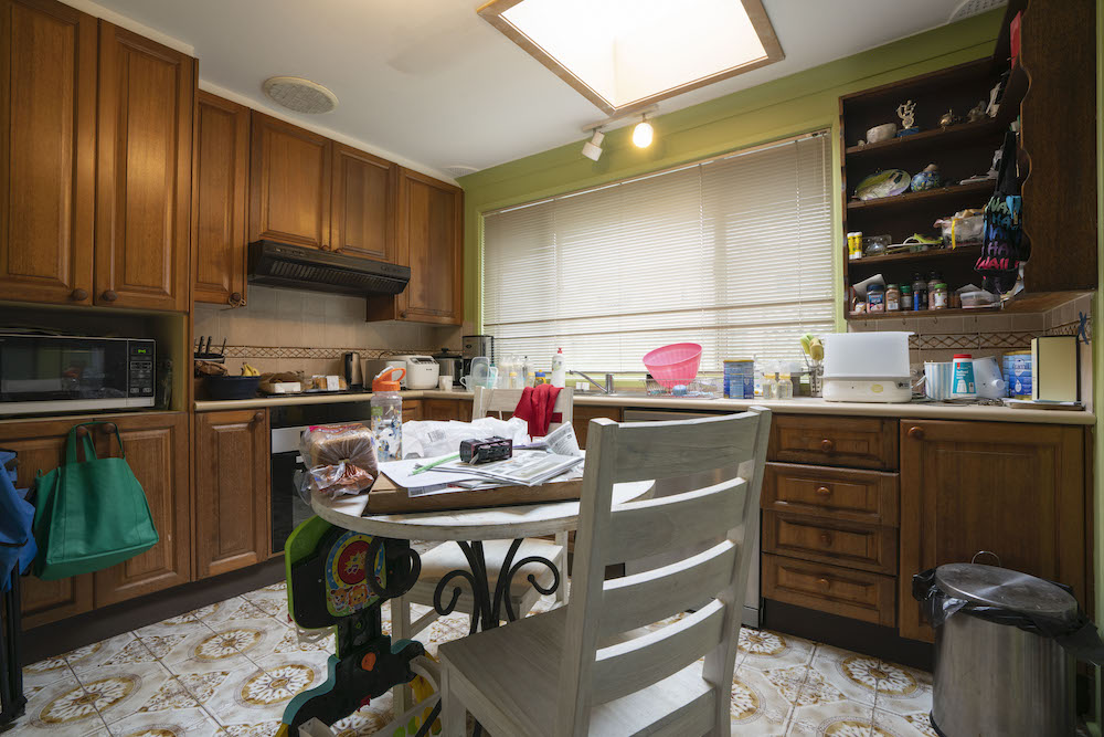
In all truthfulness, I could have cosmetically refreshed this kitchen & got an OK result but the layout would have still been fundamentally flawed. I made the decision to rip the old kitchen out & start again ….
When designing the layout of your kitchen, you want to group things based on 3 different zones;
(1) Food Storage (pantry & fridge)
(2) Cooking (oven & microwave)
(3) Cleaning (sink & dishwasher).
Lumping these things together makes it super seamless to move around the kitchen, plus closing in the doorway to the dining room, enabled me to reconfigure a new kitchen, utilising three solid walls, that integrated the fridge more strategically.

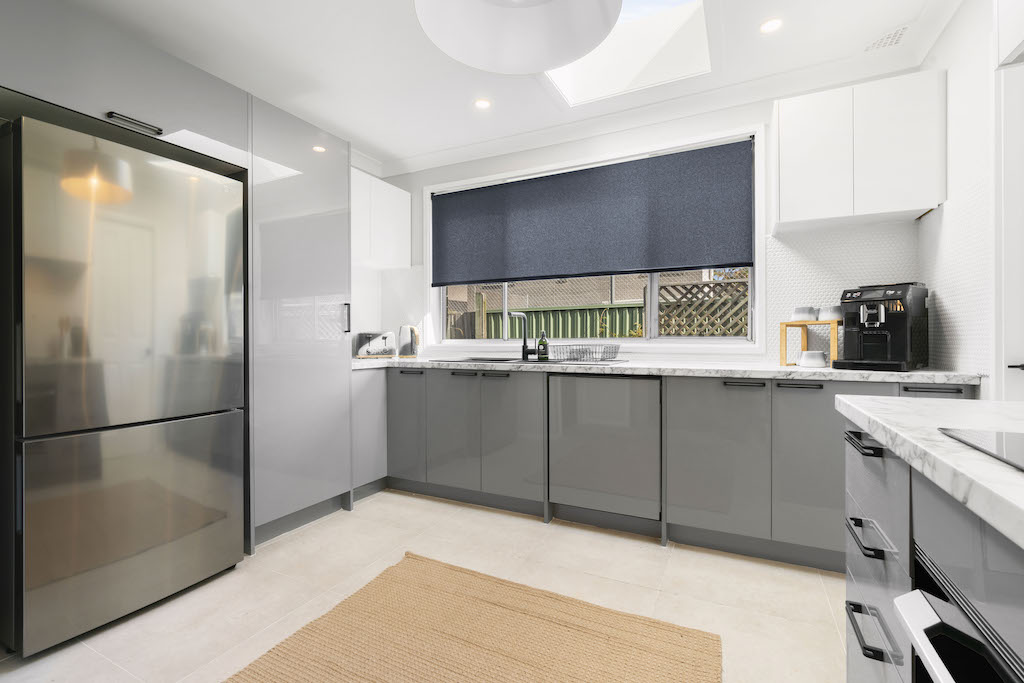
As I’m always renovating on a budget, my carpenters installed flatpack cabinetry from the Mitre 10 Principal Kitchens range. I chose the “Brighton Light Grey” gloss finish for the base cabinets to tie in with the cool tones in the living / dining room, but I wanted the kitchen to still feel bright & open so I chose white gloss cabinets for the wall uppers. A laminate benchtop was placed on top of the base cabinets that mimicks the look of marble, while white penny round splashback tiles give a softer touch to the room, helping the kitchen feel balanced. That dark blue feature wall colour in the lounge room, is now repeated in a new roller blind from Wynstan in the colour “Night Sky”.

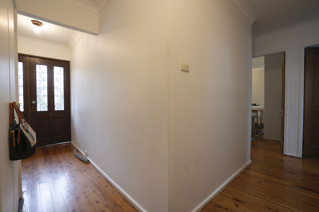
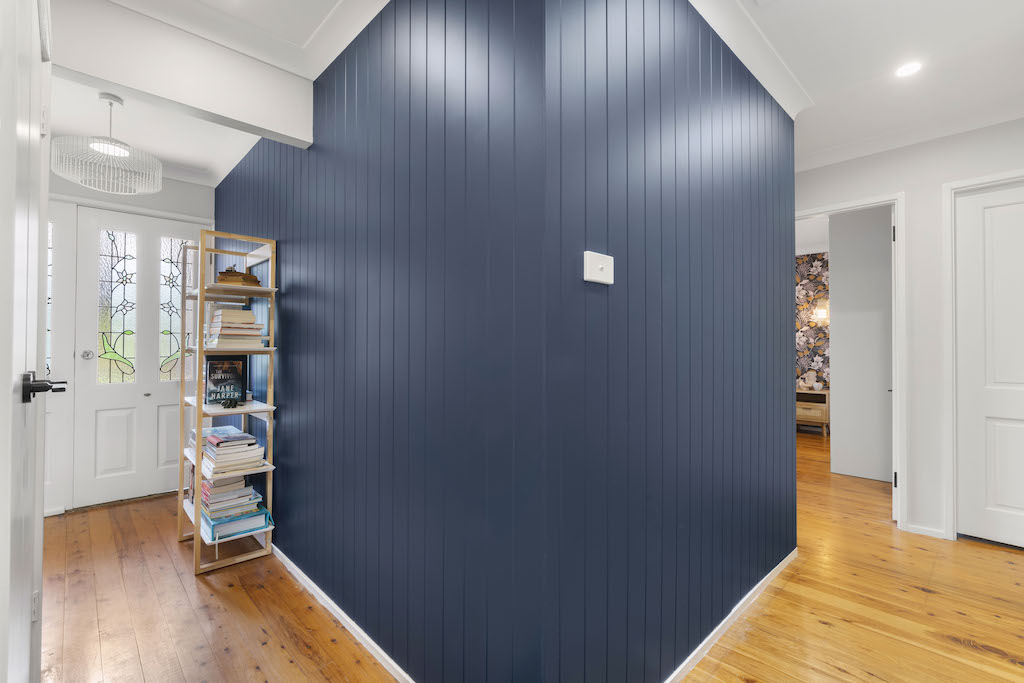
THE HALLWAY
Not too much to report in the hallway. I simply repeated the VJ feature wall onto one side of the hallway wall that helps visually tie this space to the lounge room. That dark blue feature wall colour has been repeated again for design continuity & the other walls painted in Taubmans Cloudburst to soften the room.
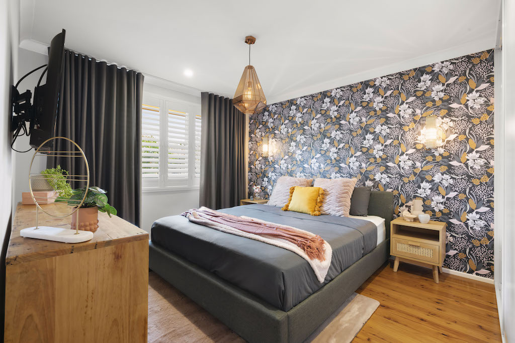
THE MASTER BEDROOM
Next up, we’re looking at the master bedroom. As the before photo shows, it’s hardly a space that conjures up any images of romance. I wanted this important room to feel like Holly & Darren’s private retreat & have its own feel but not be out of sync with the rest of the house. Holly indicated she loved native botanical prints which I used as my design cue.
The Native Floral Wallpaper from Luxe Walls was a super easy addition that packs a lot of punch into this bedroom, especially when you’re not working on a huge budget. It was quite a good wallpaper option because even though it’s quite a busy print, the dark blue colour base in the wallpaper, ties beautifully with those dark blue feature walls in the other parts of the home. New charcoal coloured blockout curtains from Wynstan were added in, a new Bravo King Bed in Graphite from Fantastic Furniture & the Elliot Squat Pendant in Copper & Corbelle 1 Light Wall Bracket in Antique Brass add much needed light to the room.
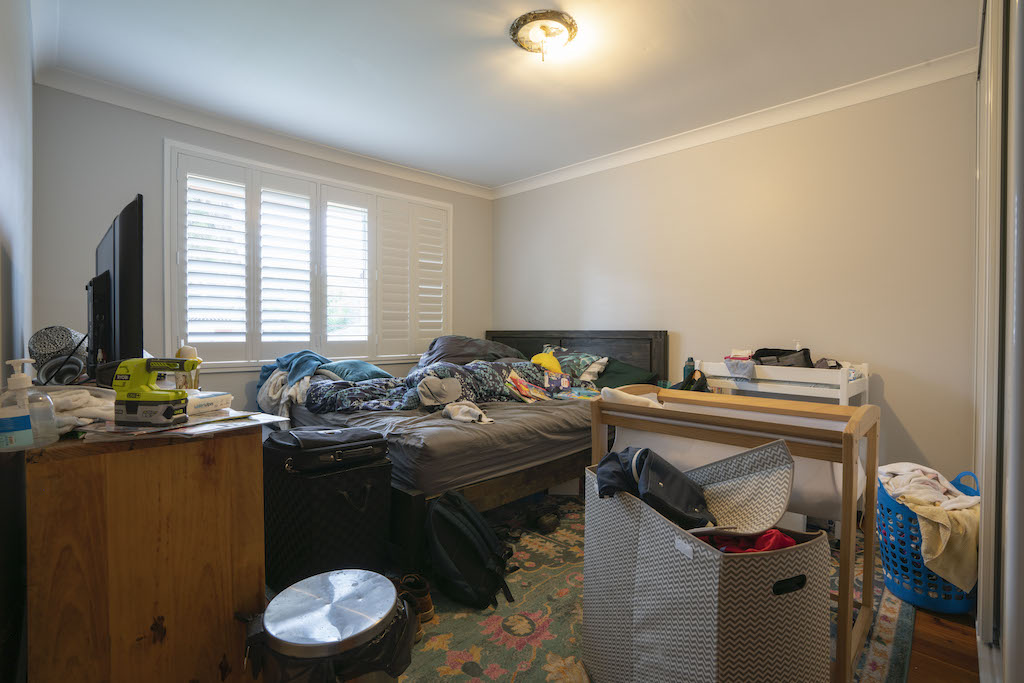
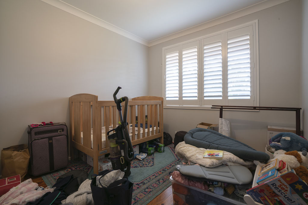
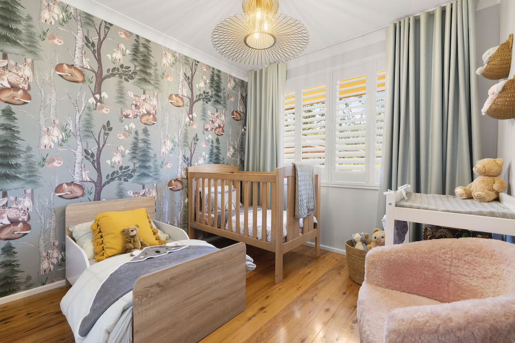
THE KIDS ROOM
Let’s have a quick look at the kiddies room, slash nursery. It was time Holy & Darren’s little 2 year old boy upgraded to a toddlers bed & the 12 month old bubba shared the room with her little brother so mum & dad have their own special space. I selected the Woodland Theme Wallpaper in Mint from Luxe Walls which adds a light & whimsical detail to the tiny room. Picking up on the green colours in the wallpaper, I added pale green curtains again from Wynstan for colour cohesion & the Phoenix Pendant from Beacon Lighting to add depth to the room. The oak Cabin Toddler Bed from Fantastic Furniture was a pretty close match with the existing cot & I completed it with new bedding from Kmart.
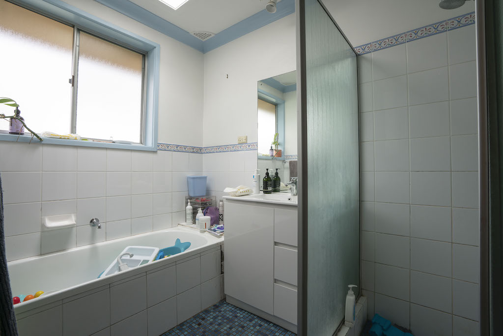
THE BATHROOM
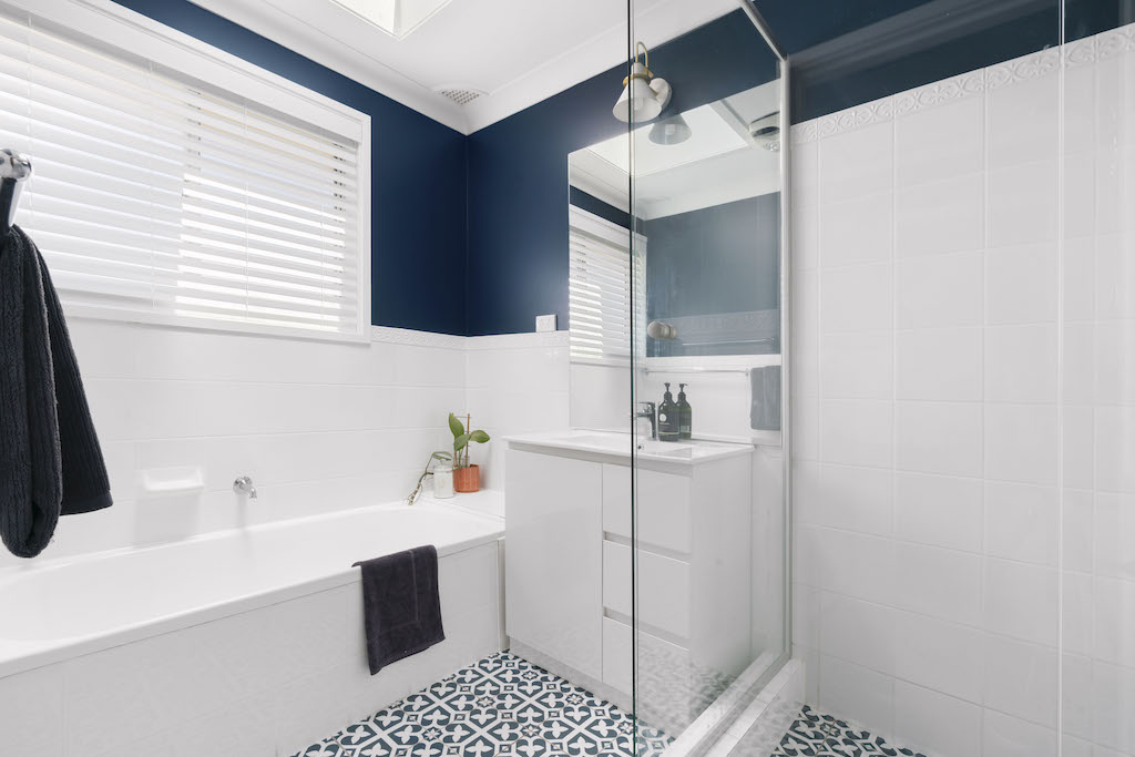
Last but not least, we tackled the bathroom. We only had a few thousand to spend in this room so whilst perfectly functional, it did have a dated appearance, which would have become even more obvious with the improvements I’d made to all the other rooms. With a growing workload, I called in Megasealed to lay new floor tiles & they regrouted all the tiled areas so this bathroom is 100% water tight for many more years to come.
Continuing with the blue theme from the living / dining rooms, I chose the Majorca Palm Springs Deep Blue Matt Tile from Beaumont Tiles & painted the upper walls in Taubmans Elegant Evening. At the time, I wasn’t entirely sure I’d made the right decision painting the walls in that darker colour but all the tradies on site loved it, so I ran with it. I still look back on these photos, thinking I should have painted those upper walls in white. You be the judge!
I freshened up the existing wall tiles with White Knight Renew Tile & Laminate Paint & got my sparkies to install a simple wall light above the vanity for practical lighting. Taking out the frosted glass shower screen & replacing it with a new clear glass screen, did wonders for this bathroom, instantly making the room feel so more spacious.
All up, this renovation cost $68,145.79 for all the materials, labour, furniture & styling items at full retail cost. Of this, building materials accounted for $35,322.87, labour at $17,286.00 (excluding my time only) & all the new furniture & styling items at $15,536.92. The uplift in the property value was a whopping $ 210,000, resulting in a net renovation profit of $141,854.21.
On first glance of their newly renovated home, Holly burst into tears, with Darren not far behind. It’s not their forever dream home but it does feel like home to them, for now. Whether you’re a passionate DIY enthusiast, a budding interior designer or simply someone seeking to create a home that truly feels like a reflection of your soul, this renovation shows the remarkable power of a well thought-out & executed renovation that cultivated a space that not only looks great, but is also nurturing to your spirit.
As always, if you have any questions on this renovation, be sure to reach out to us via [email protected].
Much love,
Cherie x

Awesome, looks amazing, great use of a bold colour, and the light grey kitchen works brilliantly.
That’s so lovely to let me know this Greg. Thanks so much! CB x
I love it! I have so many questions and comments though!
1. Were there always windows in the section that is now the dining room or is this a new addition?
2. Having changed the door, it now seems a little strange to have the light switch in the middle of the wall. With the electrician already there putting in other lights, how much extra would this have cost to shift?
3. I like the look of the kitchen, but I fear the sticky fingerprints on the gloss base cabinets.
4. Did you change anything of the kitchen skylight? I know a lot of older skylights now look really tacky.
5. Seeing as you were already making changes to a load-bearing wall, was there the opportunity to open up the space for a slightly more open-plan kitchen/dining/living area?
6. I do really like the blue in the top section of the wall in the bathroom. I think it links the floor tiles in really well. I think it would look a little better if the tiles were all at the same height but you work with what you’ve got. I’d like to see a photo looking back toward the door of the bathroom.
Hi Rebecca, just answering your questions. (1) Its actually an external doorway not windows that were already existing in the dining room. (2) Ideally the light switch would have been relocated next to the door architrave. Due to time & budget, I left the light switch as is. To move it, would have cost minimal expense (less than $100) with the sparky but the wall would have had to be plaster patched where the old hole was located. (3) Just personal preference – some people prefer matt or satin kitchen cabinets, others like glossy. All surfaces still tend to show sticky fingers 😉 (4) No, I never made any changes to the skylight except painting the walls around it white (5) It wasn’t possible on this house to go any further opening up the door cavity due to other structural members in the roof space (6) Glad you liked the blue wall colour! CB x
Wow!!! Beautiful job Cherie & so glad you let us all know the exact costs for the renovations. I wish all the reno shows on TV did the same.
Love your work!
My absolute pleasure Debbie. As they say, sharing is caring! CB x
I agree with the tradies, I like the darker colour on the bathroom walls 💙
Thanks for letting me know Trudi. That makes me feel good! CB x
And I agree with Trudi- your choice of blue on the bathroom walls was spot on. White would have looked quite dull, I think.
Hi Gabrielle, yes it seems that people do like the blue walls in the bathroom so glad I ran with it now. Thanks so much for letting us know. CB x
Wow, such an inspiring transformation. I especially love the living room. It looks calm yet welcoming with the yellow and other bright colours against the dark blue and white background.
So glad you love this reno Elise. Thank you for letting us know. CB x
Only one word comes to mind Amazing!!!
I guess that’s why they call you ‘The Renovation Queen’
Thank you so much Christine! So glad you loved this reno & thank you for your lovely words! CB x
Did you do any changes to the outside of this home?
A fantastic result on the whole home. An awesome financial result for the family also!
Hi Rebecca, I just renovated the internals of the house & never touched the outside. Would have loved to do the outside too but I only had 4 days reno timeframe! CB x 😉
Stunning and affordable, you really got it right with a young family. It’s joyful and uplifting. It looked like Nannas house before your touch, the blue walls in bathroom is spot on.
Thank you Margaret. We’re really glad you liked this reno. Cherie Crew x
Yes great reno. Amazing what yu can.achieve for.the price of a.kitchen. It all looks good and yes dark.colour in bath room.looks great….moving doors etc makes a huge difference….
Hi Denise, yes closing the doorway in & creating a wall opening on the other wall was a game changer for this house. Glad you like the blue in the bathroom too! Cherie Crew x
Beautiful Reno. I’m with the tradies in the bathroom, gorgeous.
I painted my bedroom that blue and I absolutely love waking up to it every day. With white doors, ceiling, cornice and one wall of robe with a white/grey subtle pattern on the sliding doors 💙
Hi Jacquie, So glad you love the dark blue colour in the bathroom! Thank you for letting us know. Cherie Crew x
Looks so great – as always!
Thank you Jayne! Cherie x
Superb reno in every room! I love the dark blue in the bathroom as well. You truly are a Master of Colour Cherie. I love your colour choices in every reno you’ve done. Missing seeing you on TV. Can’t wait to see you on there again. So happy to hear that you ‘unplugged’ for a bit. I wish you well in everything life has to offer you.
Perth Fan, Terri x
You’re very sweet Terri! I’m just about to start filming Season 4 of Channel 9’s Space Invaders show so I’ll be back on the tele with 10 new renovations in Feb 24. Thank you for your very kind words. Cherie x
Cherie
This is remarkable! I love the transformation! I have forwarded to my daughter, she and her husband have just purchased a home which needs updating… can we hire you??
Hi Di,
So happy you like this reno & its giving your daughter some inspiration for her new home. Unfortunately I only do my TV renos & my own personal projects but keep following my stuff so you can tackle yours! Cherie x
Everything is great from start to end.
Cheers!
This transformation is truly inspiring! Cherie’s 4-day renovation proves that with the right vision and expertise, any space can go from bland to beautiful. Loved the smart upgrades and efficient execution great work.
Thanks Paul’s Creation. Glad you liked it! Cherie Crew x