


How To Look At Your Home Like A Designer
In my last blog, I spoke about the importance of locking down a theme for your home before you start renovating. In case you missed it, it was all about creating a masterplan … that grand plan of attack for your property so to speak, that visually makes your property look like it’s got 1 consistent theme running through it. This process is easily started simply by creating a vision board.
So, once you’ve done that, what comes next? Well, before you plunge yourself head-first into your furniture & accessory shopping, it’s handy to learn some basic interior design principals so you can design your rooms to reach their maximum potential. Most people shuffle their furniture & accessories around in their rooms with no real game plan in place. They hope it’ll magically “all just come together” when in all reality, most don’t.
The Importance Of Interior Design
How you move through a room, where your eye falls when you first enter a room, whether your place feels warm & inviting or cold & sterile, all comes down to how your space has been fitted out, furnished & styled.
Good interior designers can visualise exactly how to fix internal & external problem areas just by using design principles they’ve studied, similar to an accountant who looks at a set of figures & can see straight away why they don’t add up.
Without a basic understanding of what makes some places look fabulous & others a complete flop, you may struggle with your makeover. Unquestionably, there’s an absolute art to interior design, but with knowledge of the following key design principles, you’ll be on your merry way to getting it right.
The Principles Of Interior Design
In the world of interior design, there are some key principles you’ll need to understand. At a very basic level, they are:
- Scale & Proportion
This is super important as it sets the tone for your whole room. Scale refers to how well your pieces fit in your space, size wise. Proportion refers to how well those pieces fit together. Put simply, scale & proportion is all about how all the objects in a room relate to one another – and to you as you move around them. While this is the most mathematical interior design principle possible, your eye can easily identify when something looks out of place.
One of the single biggest mistakes people make is to choose furniture & styling items that are too big or too small for their space. As a rough rule of thumb, larger rooms need larger furniture to anchor the space, while small rooms demand smaller pieces, otherwise they’ll feel overcrowded & claustrophobic.
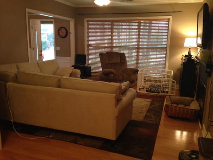
Some of this stuff is just plain ‘ole common sense. If you have a small bedroom, don’t stick a king size bed in it. If you’ve got a room with standard 2.4m ceilings, don’t install taller furniture otherwise your ceiling will feel like it’s closing in on you, leaving no free air space. Choosing lower height furnishings is a more sensible scale for a room with low ceilings.
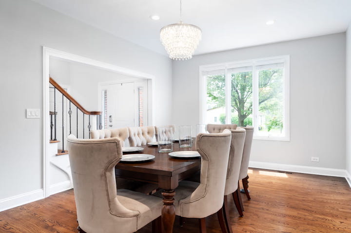
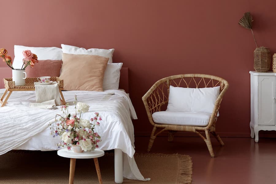
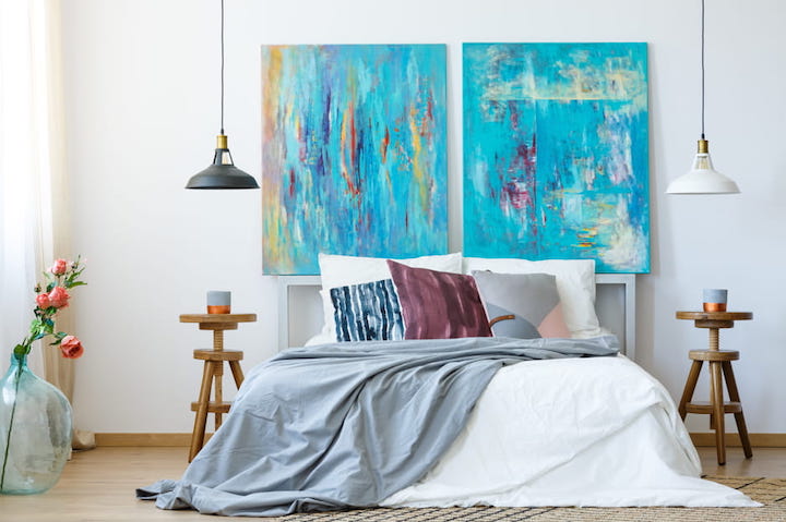
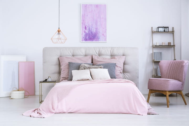
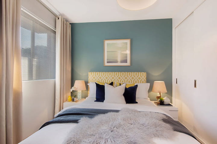
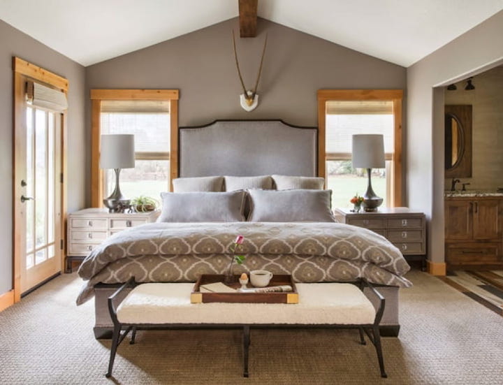
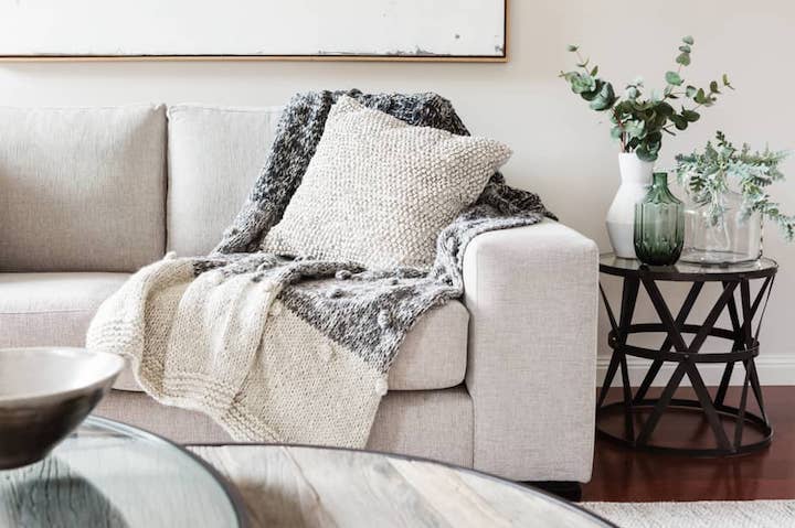
Another great example is rugs – people get this wrong so often! They pick a rug for their dining room that’s way too small, barely fitting under your table. Ideally, it should be big enough that when someone pulls their chair out to eat, it’s still resting on the rug. The same applies with your styling accessories which also can’t be out of whack with the size of your room. A general rule of thumb is to keep your styling items no taller or wider than one-third the length or the height of the piece it will sit on. When it comes to hanging artwork over your furniture or over your bed, size your artwork that’s half or two-thirds the width of the furniture or your bed below it.
When you think about the scale of your room, don’t forget about negative space, too – that is, the space you don’t fill. You want to leave enough air space around your furnishings so that people can move freely around the room without tripping over things.
A good tip is to choose the main furnishing item in your rooms first, say the sofa in your lounge room, then let that set the stage for the scale of all your other furnishings in the room. Then start layering your other items – coffee table, chairs, rugs, window treatments, artwork, etc. You can move things around & experiment with placement of furniture until you feel everything works together beautifully.
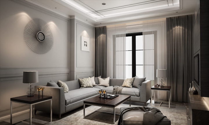
BALANCE
This is about weighting objects & colours in the room so they’re pleasing to the eye through symmetry & asymmetry. When you walk into a room that’s balanced, you’ll feel immediately at peace.
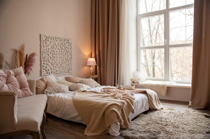
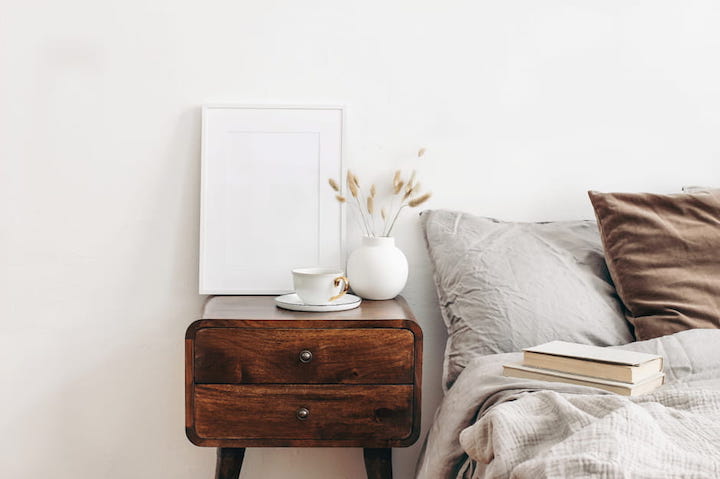
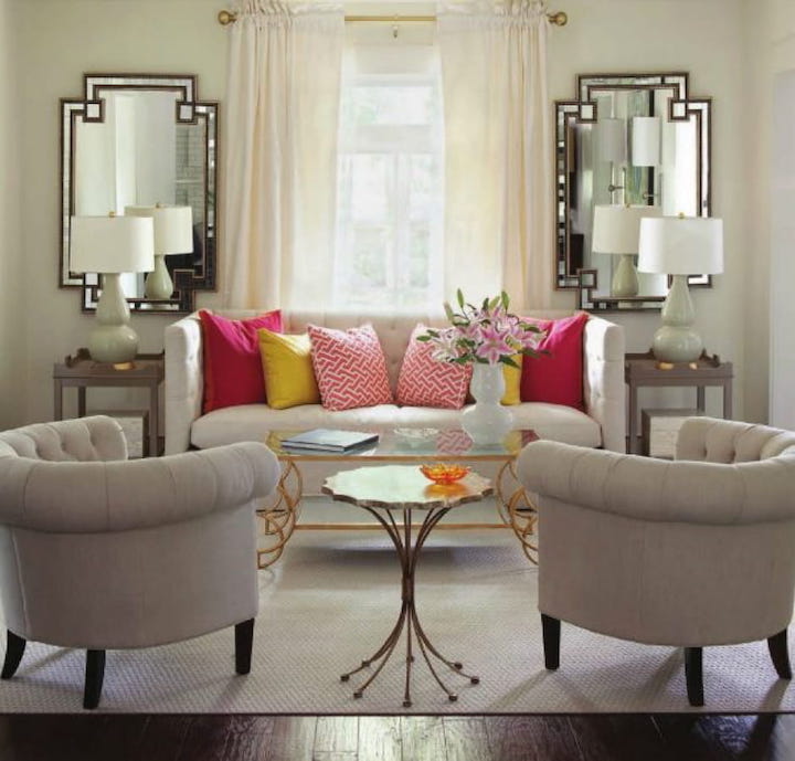
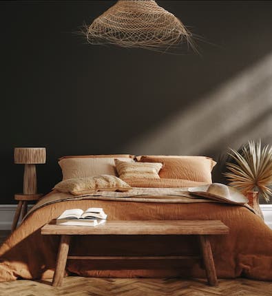
An example of “symmetrical” design might be a bedroom, where the bed has 2 matching bedside tables on either side & perhaps identical bedside lamps.
“Asymmetrical” design is where you create a balanced look in a room with items that are different yet still maintain cohesion. It may be as easy as using items of the same colour or height.
If you want an asymmetrical furniture arrangement, think about balancing an oversized sofa with several chairs. Or you might have a sofa with a tall lamp on one side & an end table with a pile of books on the other.
It’s important to note that symmetrical design is fine for a bedroom with that “mirror image” kind of symmetry but could be pretty boring in a living room. In a living room, you might want a different kind of balance; something that feels more informal & lived in. It’s the same concept as to when celebrities sport clothes that look like they’ve been effortlessly “thrown together”, despite them spending hours in front of the mirror curating that casual outfit.
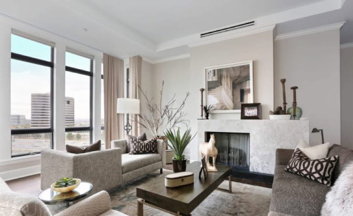
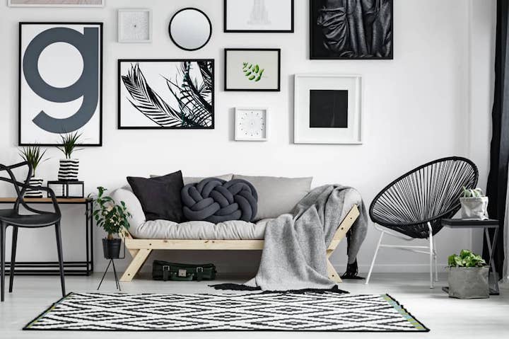
This is when you’ll hear interior designers talk about this thing called “visual weight”. Your individual pieces might be quite different in style & size, but the overall visual weight is the same. On a mantelpiece, for example, you might place a large vase or framed picture on one side of the mantle then balance that out with several smaller items on the other side, maybe playing around with varying heights of objects to make it more visually interesting. There’s no hard & fast rules, it’s just about training your eye to understand when things feel balanced.
Arranging your styling accessories in groups of odd numbers (3 or 5 is best) is a great way to use asymmetrical design – dissimilar objects that have equal visual weight or eye attraction. A good tip is to look at images of rooms you love & try to spot where the designer has successfully done this.
DOMINANCE & EMPHASIS
This is really about creating focal points. No one wants to walk into your room & look at your pile of dirty laundry in the corner of the room. But unfortunately, if that’s the thing that visually dominates a room, then that’s where your eye is going to fall.
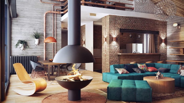
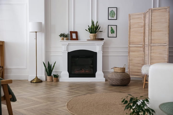
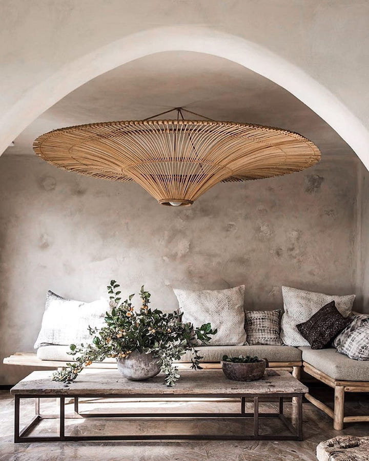
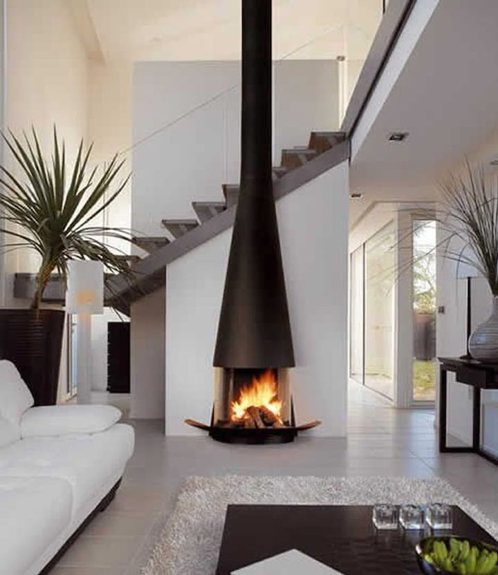
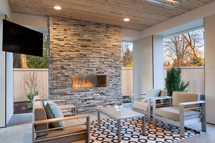
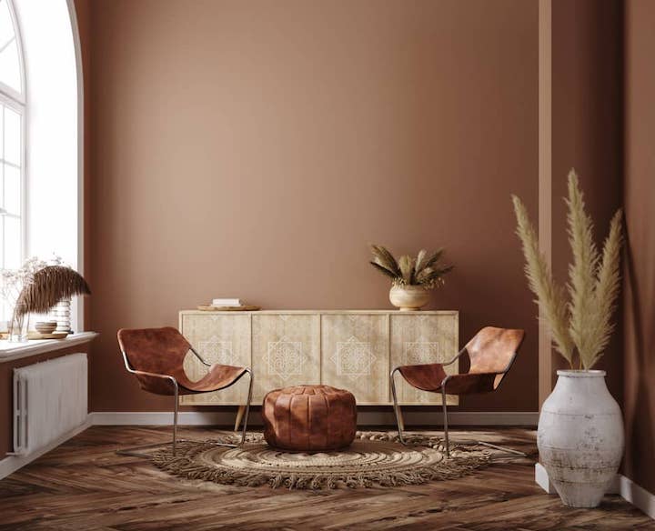
To master dominance & emphasis, you’ll need to carefully choose the things you want to emphasise – say a lovely old fireplace, an enormous chandelier, a beautiful big window with a view of the garden, a wallpapered feature wall or an oversized artwork on a big white wall.
It’s about getting that wow factor. The focal point leaps out of the room and says: “Hey, look at me!” You can do this through the sheer size of something, a bold colour, a really interesting shape – something that is going to visually dominate.
UNITY & HARMONY
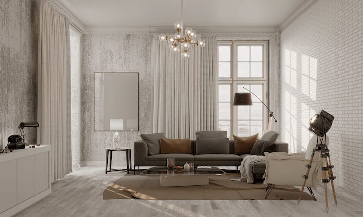
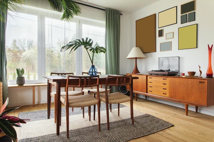
This is your ultimate goal. Think of your house as a whole; a series of spaces linked together by hallways, landings, doorways & stairs. Your job is to create 1 unified feel for your home. There are many ways to do this, but it starts with picking an overall style or theme for your home – Hamptons, coastal etc, – and continuing that throughout your whole space.
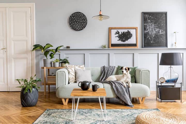
One common way to create unity is through colour. You may choose a similar colour palette – maybe 3 or 4 colours – and use those colours throughout your whole home.
When you walk into a space & naturally feel a sense of calmness, you know you’ve achieved harmony.
RHYTHM & REPETITION
Now all of that calmness & serenity needs something to give it a bit of energy. That’s where rhythm & repetition comes in. This decides how & where your eye travels around a room. It gives your rooms their pulse.
Rhythm & repetition really is the process of creating movement & harmony throughout your space with recurring patterns, colours, textures, forms, shapes & lines throughout your space. One example on how to achieve rhythm is by using a colourful rug on your floor. Pick up on the colours of the rug & replicate that colour in your cushions then your artwork. Repetitions such as this help carry your eyes around a room.
WHERE TO FROM HERE?
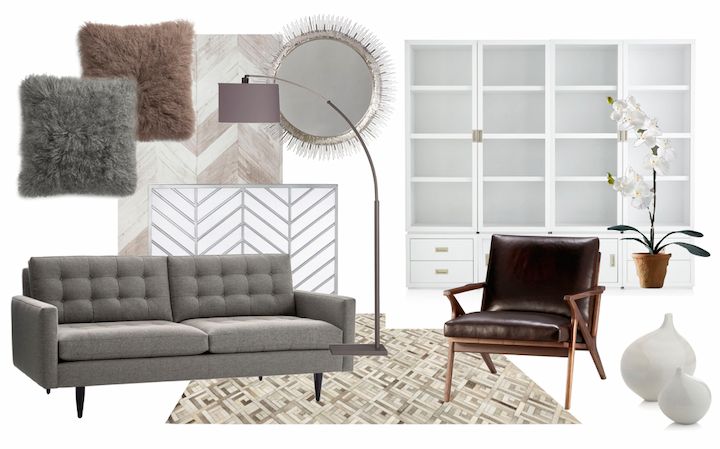
With this newfound knowledge, you might want to jump onto websites like Pinterest or Houzz & start researching some of these design principles. The best way to understand how these things work is to look at professional interior design images online to see how they play out in real life.
For an expanded version on the principles of good interior design, listen to my Fantastic Furniture podcast here:
Happy renovating & decorating folks! Let me know if you enjoyed this article or other topics you’d like me to write about.
Much love,
Cherie x

Thanks Cherie,
Some real pearls in here. What an informative article with many tricks of the trade simplified for ease of learning. Thanks so much for sharing your knowledge.
Hi Aj, thank you so much for your lovely feedback, Cherie Crew x
The post is so helpful. Thanks for sharing.
Your welcome Kathy, Cherie Crew x
HI Cherie
I really enjoyed this article and got a lot of great info from it Thanks
I would like to see an article on steep driveways how they can be made to look more appealling , safe and on a budget withut having to sepnd a fortune on concreting
Thanks Dee & really glad that you found this Blog informative. Cherie is going to be doing a Blog on Driveways in the next couple of months so keep an eye out, Cherie Crew x
I go round in circles trying to keep up with the latest and greatest.and in the end all really want to do is hide some ugly plumbing pipes and enjoy what I have.
Hi Jen, we’d suggest you don’t focus on what is ‘on trend’ as that will lead more to analysis paralysis. We’d suggest you focus solely on the issue of how you conceal some ugly pipes. We’re not sure where they are located on your property so if you pop us an email, we can take a quick look for you & give you some pointers of what you can do. Cherie Crew x
This is a really great article Cherie. Thank you for sharing some really good images to emphasis the themes you are talking about. Very helpful. Love and admire your career trajectory. Keep up the good work. PS Can’t wait to see your Byron Bay project come together.
Your welcome Trish, Cherie Crew x
I loved the article Cherie. I want to think that this article is for me and for amateur people like me that have a passion for interior design a good and fundamental way to start. We are bombarded with so many home styling tv programs (that I love) but all of of them are more focused on final results that the actual process to get to that final result. Thank you for such an eye opening article.
Your welcome Emma, thank you so much for your lovely feedback! Cherie Crew x
Thank you Cerie Crew for all
information.
You’re welcome, have a lovely day! Cherie Crew x
Great info Cherie, love reading, listening & watching your work.
I’ve yet to work out a theme for our house & colour scheme as we have cream / beige’s and love the white’s & greys’s…. LOL.
I’m checking out the Taubmans chart to see what I come up with.
Thank you for ALL your tips. Greatly appreciated.
Your welcome Christine, Cherie Crew x
Awesome Cherie, this really helps, Im back to the drawing board and shooshing some things around !!
You’re welcome Suzanne, glad this blog has been able to help you. Best of luck, Cherie Crew x