How to choose the best white paint for your home
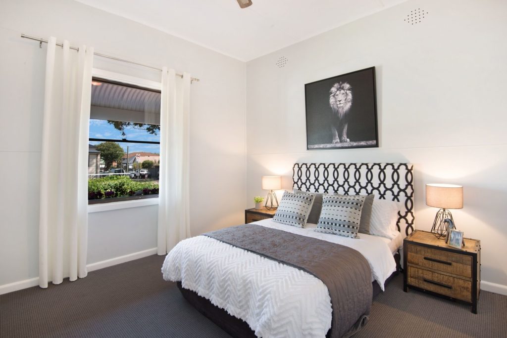
A neutral colour scheme never goes out of style – whether it’s shades of white or any of the soft beiges or greys. It’s a way to create a calming oasis away from the busyness of modern life, and is a fresh and clean scheme that works as the perfect background to a rotation of bold artworks and colourful accessories.
However, if you stood frozen with indecisiveness in the aisle of a paint section, you’ll know not all beiges and whites are the same. In fact, even the most subtle difference can dramatically alter the result – and let’s not forget the huge impact sunlight has. And then there’s the colours you put with your white walls: they can throw an unintended hue. No wonder choosing a white paint is a minefield!
COOL WHITES VERSUS WARM WHITES
The first thing to understand is that whites fall into two camps: warm whites and cool whites with the underlying pigments deciding which each belongs to. You only need to see the starkly different light that Warm White globes and Cool White globes shed to appreciate they’re worlds apart, and the affect on the ambience of the room.
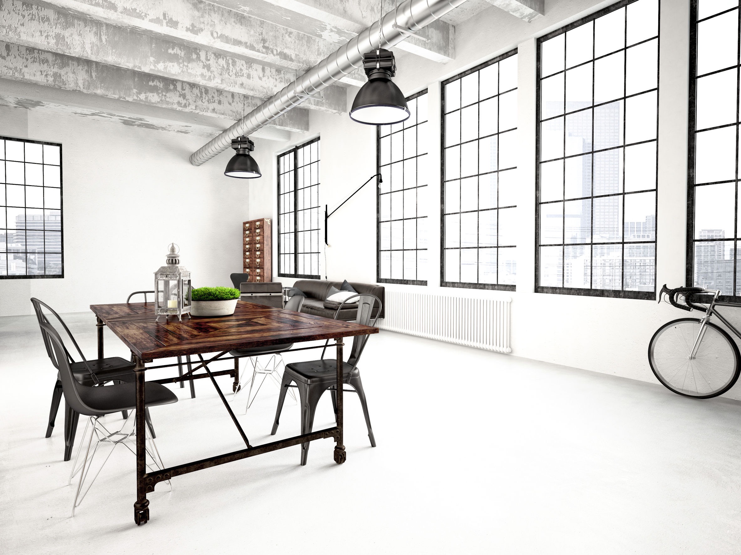
Cool whites have a blue or black base and work well in rooms that get a lot of sun, as they can handle the bright sunlight. It’s often the choice for a cool, minimalist aesthetic, where maybe the architecture or artworks or furnishings are the hero. Think modern warehouses or loft apartments.
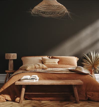
Warm whites have yellow, red or brown undertones, which give them more earthy, less austere tones. They make a room feel cosy. They’re generally well-suited to older spaces with period character. That means the neutral scheme you use for a coastal style interior will be vastly different to what works in an urban industrial-style apartment.
EARTHY MIXES
For neutrals, warmer brown and green tones work well in most spaces, as they’re earthy tones and complement natural materials such as timber and stone. Be careful with colours that have blue tones in them as they can make a room feel cold, so need a lot of light and space to work.
Taubmans Barely Beige is a versatile neutral that suits just about any interior. Use it in quarter or half strength, depending on what you’re pairing it with. Some of Taubmans’ popular beiges include Fossil Find, Taupe Stone, Tenacity and Poland Stone.
PAINT SELECTION TIPS
- Always use a generous test swatch, either on the wall or a large sheet of cardboard.
- Ensure you look at the painted swatches in the morning, the afternoon and at night to see how the colour changes under different light conditions.
- The globe you use will have an equally dramatic impact on the shade of neutral you choose.
- Early to mid-morning sunlight tends to have slightly blue tones, while afternoon to sunset is usually a lot warmer in tone. In direct sunlight, a colour will always look 2-3 shades lighter than it will indoors in artificial light.
- The type of surface you’re painting, as well as its position and composition, can also alter the appearance of a colour significantly. A colour will appear differently when painted on a smooth timber panel, as opposed to a textured rendered wall.
- If you’re painting your whole house or exterior, consider becoming a Home SuperSaver member, you’ll instantly save 30% off Taubmans paints and get member exclusive discounts at many other renovating retailers too.