


How Cherie Uplifted A Property Value by $160,000 in Just 7 Days
There’s no doubt about it, if you know how to renovate strategically & smartly, it can change your financial life for the better. This was the case for one of my recent TV renovations on Channel 9’s Space Invaders show where I uplifted the home of a beautiful family from Cambodia, by an incredible $160,000 in just 7 days.

THE PROPERTY
Located in Sydney’s south-western suburbs (about 40 minutes’ drive out from Sydney CBD), this standard size Aussie red brick house hadn’t been renovated for the best part of four decades.
Internally, the property was stuck in the 80’s & the outside certainly lacked any signs of street appeal. The excessive foliage covered most of the façade, making it hard to see the property from the street. Whilst I would have loved to tackle the whole property internally & externally, I had to limit my scope of work to just the internals due to my TV reno timeline of just 7 days.

Internally, this property is quite representative of most Aussie homes. It’s structurally in good nick, many of the rooms were of a decent size & it benefitted from reasonable sized windows that let lots of natural light in. The real hardwood floorboards were in great condition which was an instant cost saver for my budget. Whilst the home is perfectly liveable, the pastel-coloured walls & unpainted timber trims cumulatively make all the rooms feel more dated than designer.
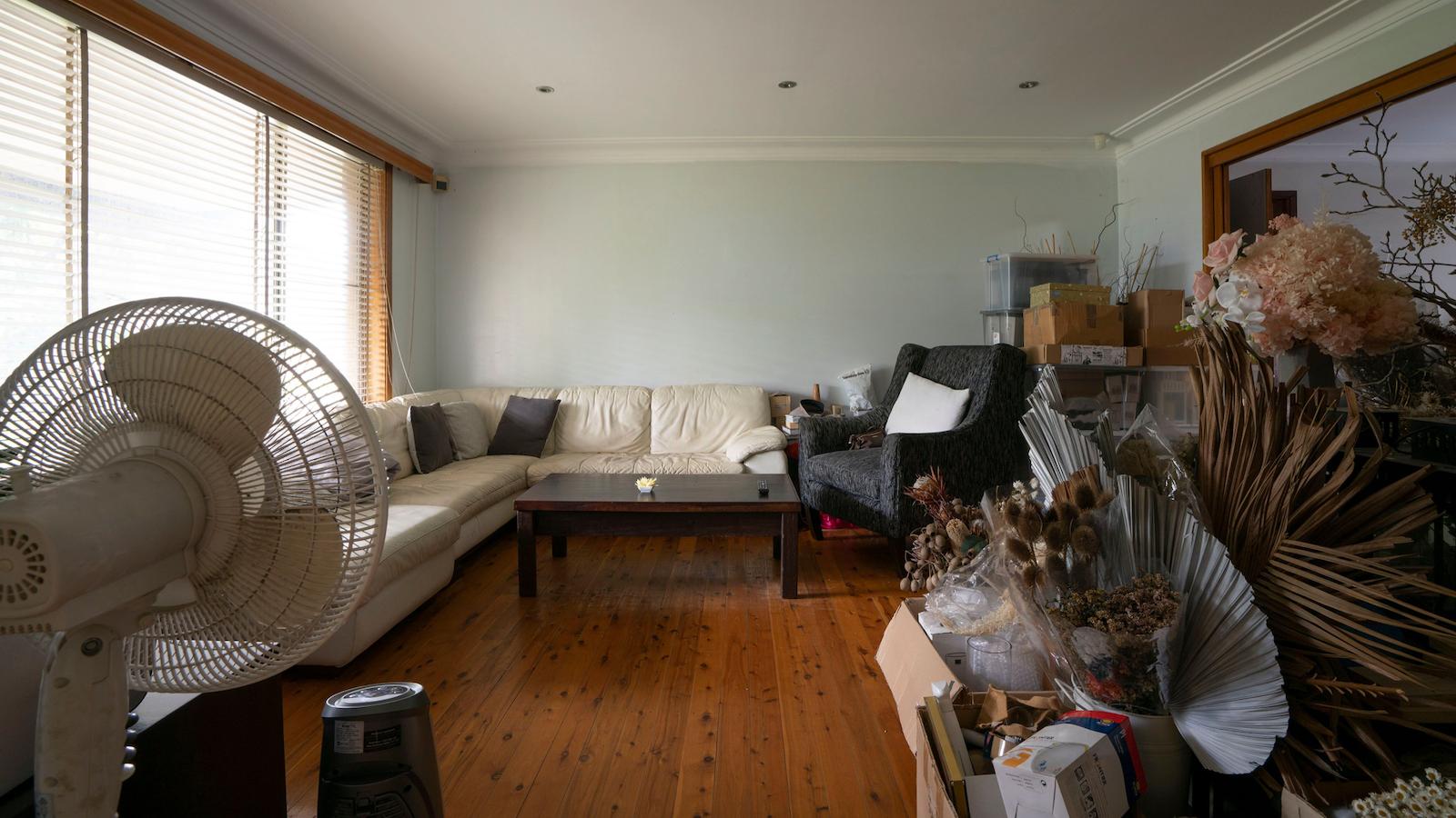
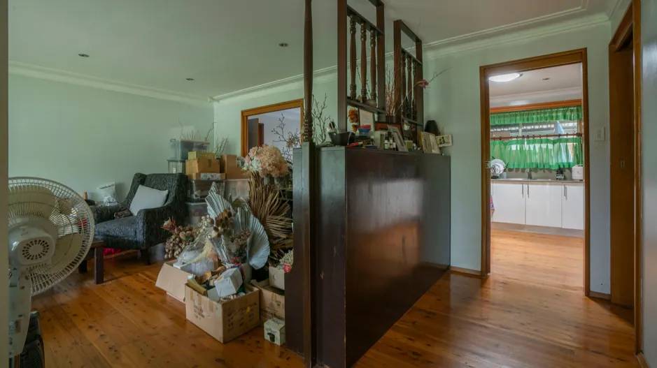
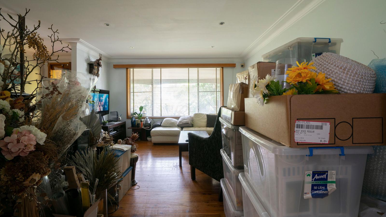
What should instantly spring out to you is the amount of clutter in this lounge room – the result of one of the daughters using her parent’s house as an unofficial storage shed for her floral business. Naturally, that was one of the first things to go.
As soon as you walk through the front door, your eyes are visually drawn to that brown bookcase with ornate overhead posts. That would be ok if it looked visually attractive but unfortunately it doesn’t ….
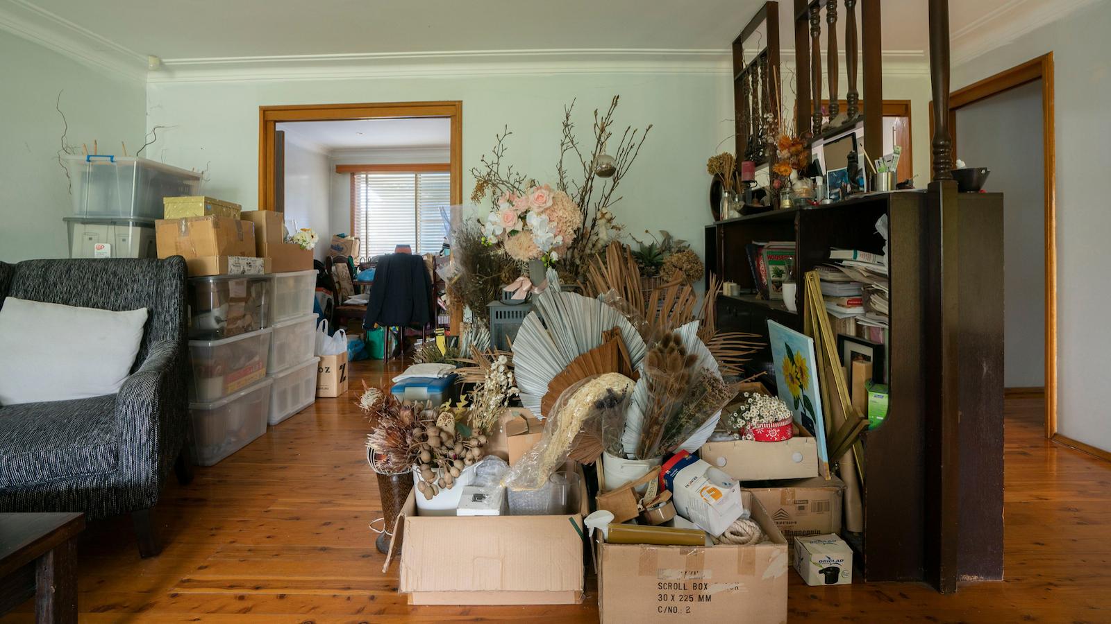
Furniture placed incorrectly around the room & pushed right up against the walls (which is a big no-no in my books) all contribute to a room that feels lack-lustre & without any real sense of style.
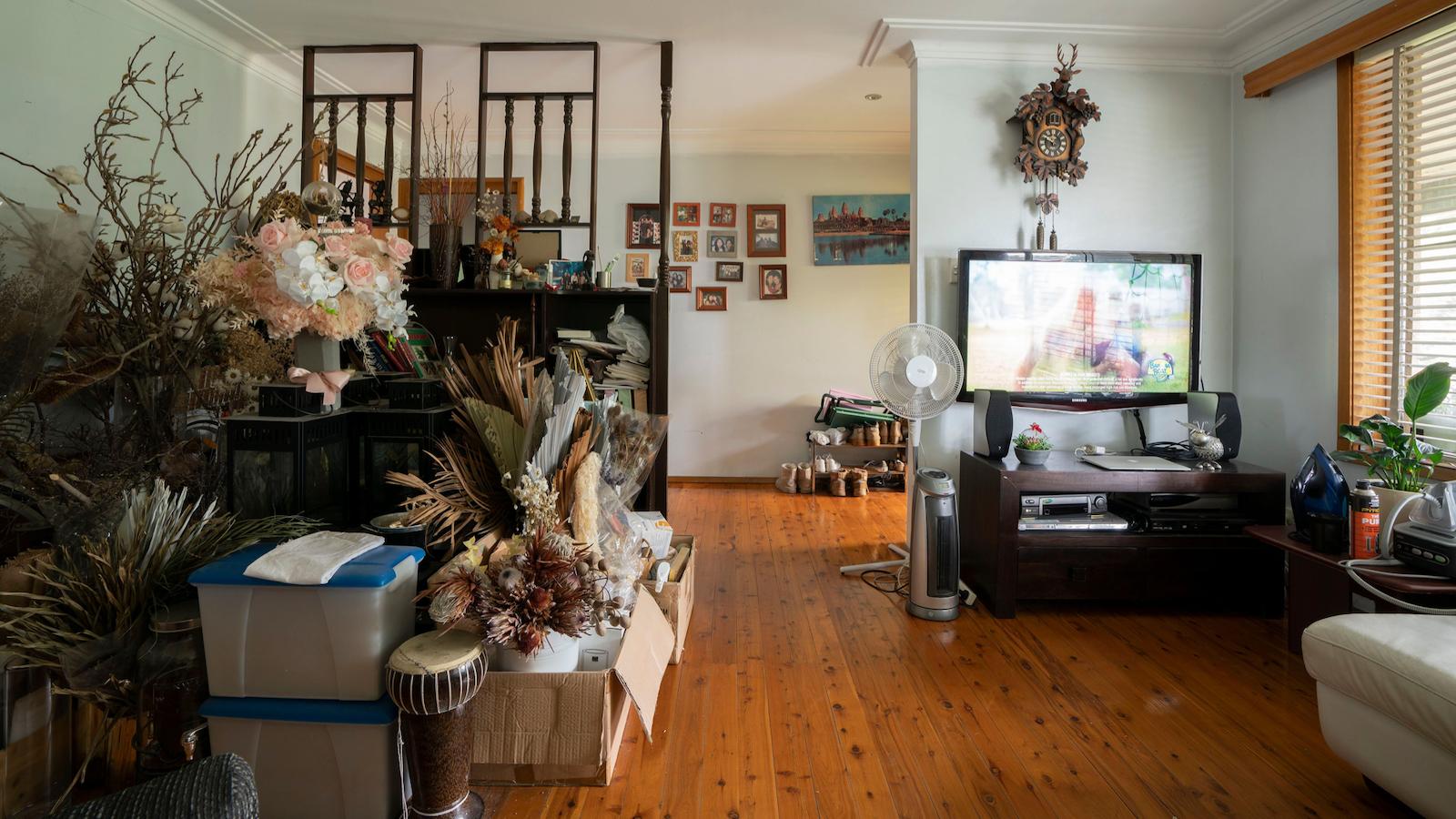
Poor lighting is also evident in the picture below. Whilst the property had a decent amount of older style downlights, it needed something more to remove lots of shadowy spots around the room. The curtains cast off a green tinge around the room, playing havoc with your eye …
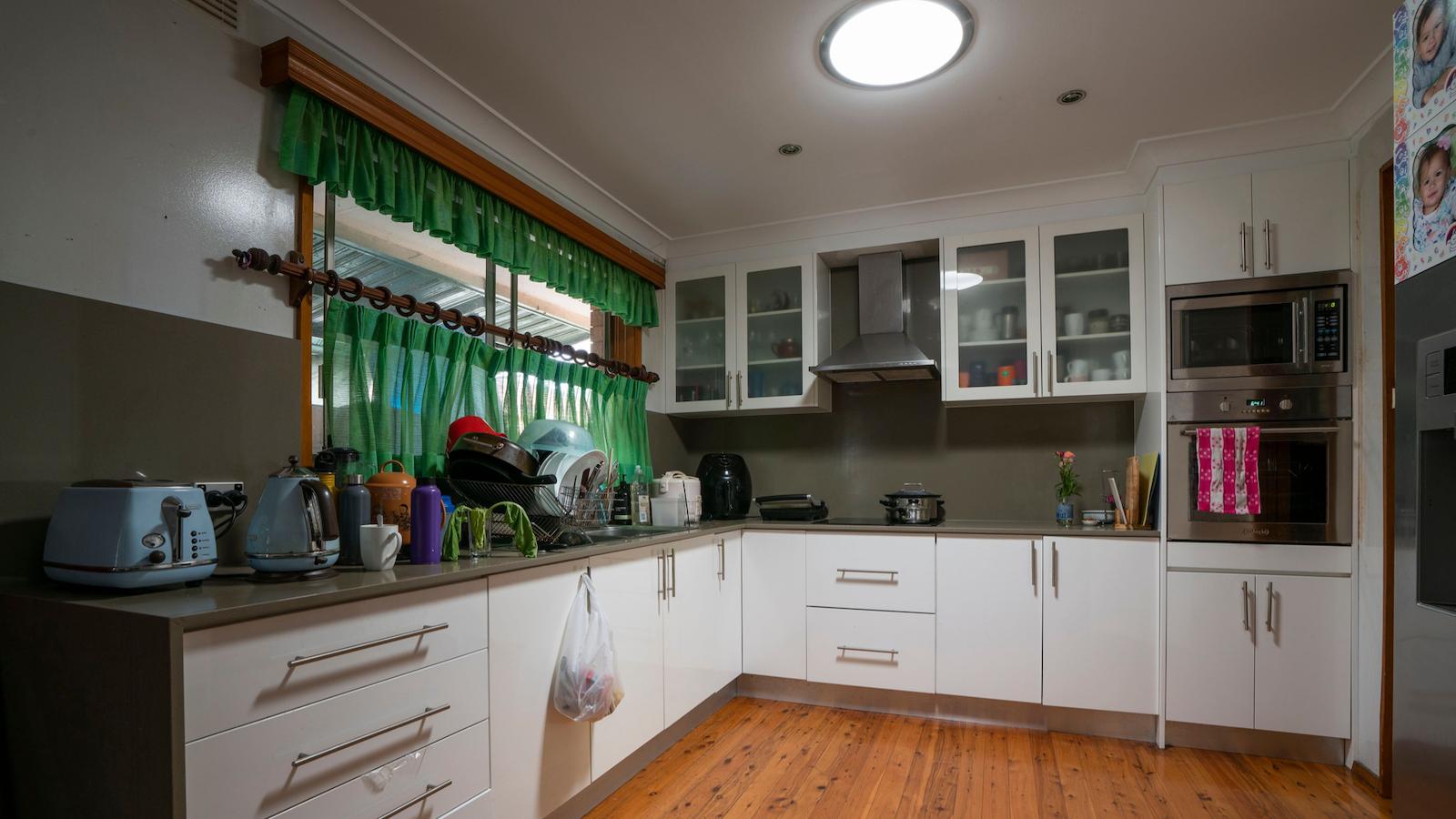
Let’s now tackle the kitchen … again it’s a decent size with everything in the right, logical spot. It has a good number of cabinets that provide plenty of storage with enough bench space for meals to be prepared comfortably. The nature of it being an L shaped kitchen, means multiple people can be in the kitchen all at once & able to freely move around without bumping into each other. Without doubt, the kitchen has a lot of positives.
When I first saw the kitchen then, why did it instantly strike me as dated? Two answers: the green curtains & the brown benchtop come splashback that visually dominates the space.
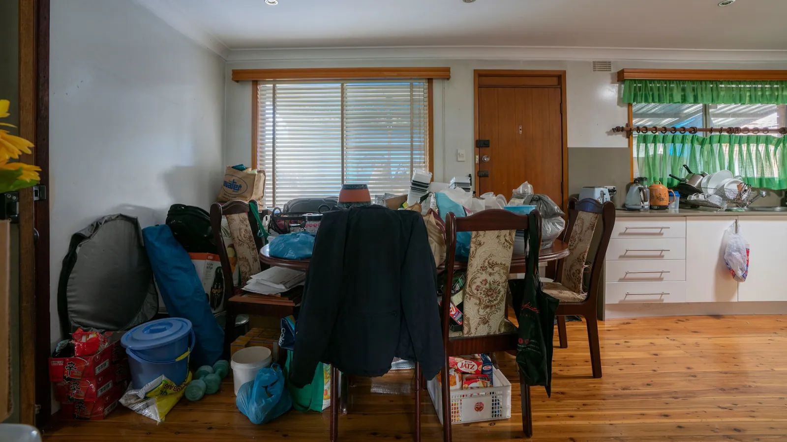
As for the dining room, hard to share a family meal together with all that clutter permanently stored on the dining table for the last few years! Where would you put your plate or sit on a chair even?
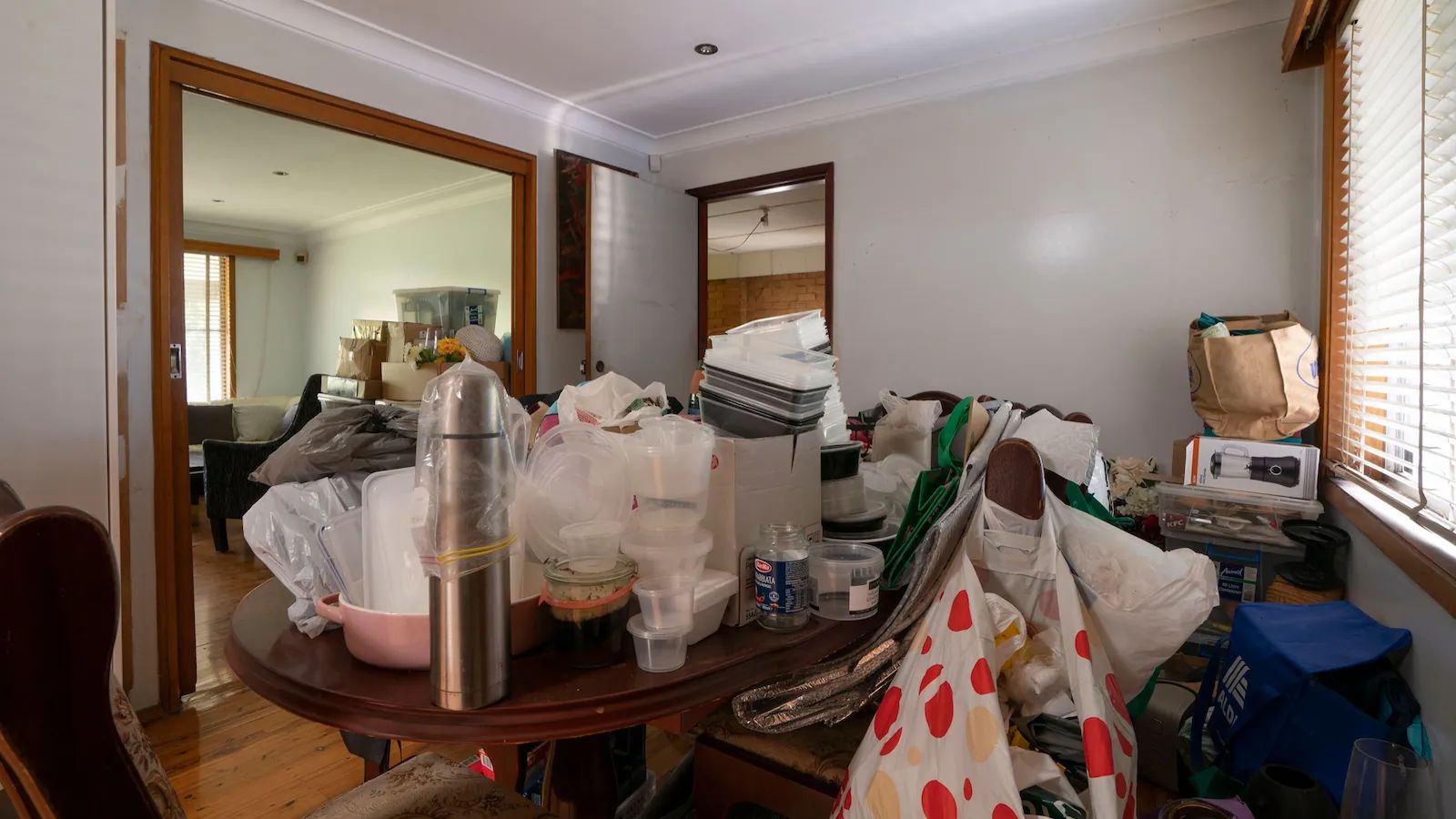
The dining table was an older style oval table with those high back fabric chairs from the 1970’s. They look strangely familiar to me & I’m pretty sure we had the same identical chairs in my family home when I was growing up. For a smaller size room, the high-backed chairs do nothing more than consume visual air space, making the room feel more cramped.
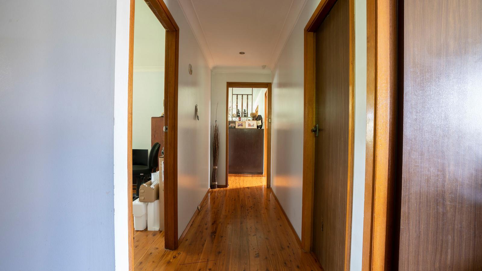
Next up is the hallway – look how perfectly straight those walls are! For a property that was likely renovated back in the 80’s, it was nice not to having to deal with 50 layers of paint on those walls. That instantly made my painters job so much easier in not having to extensively sand walls back to sand out imperfections.
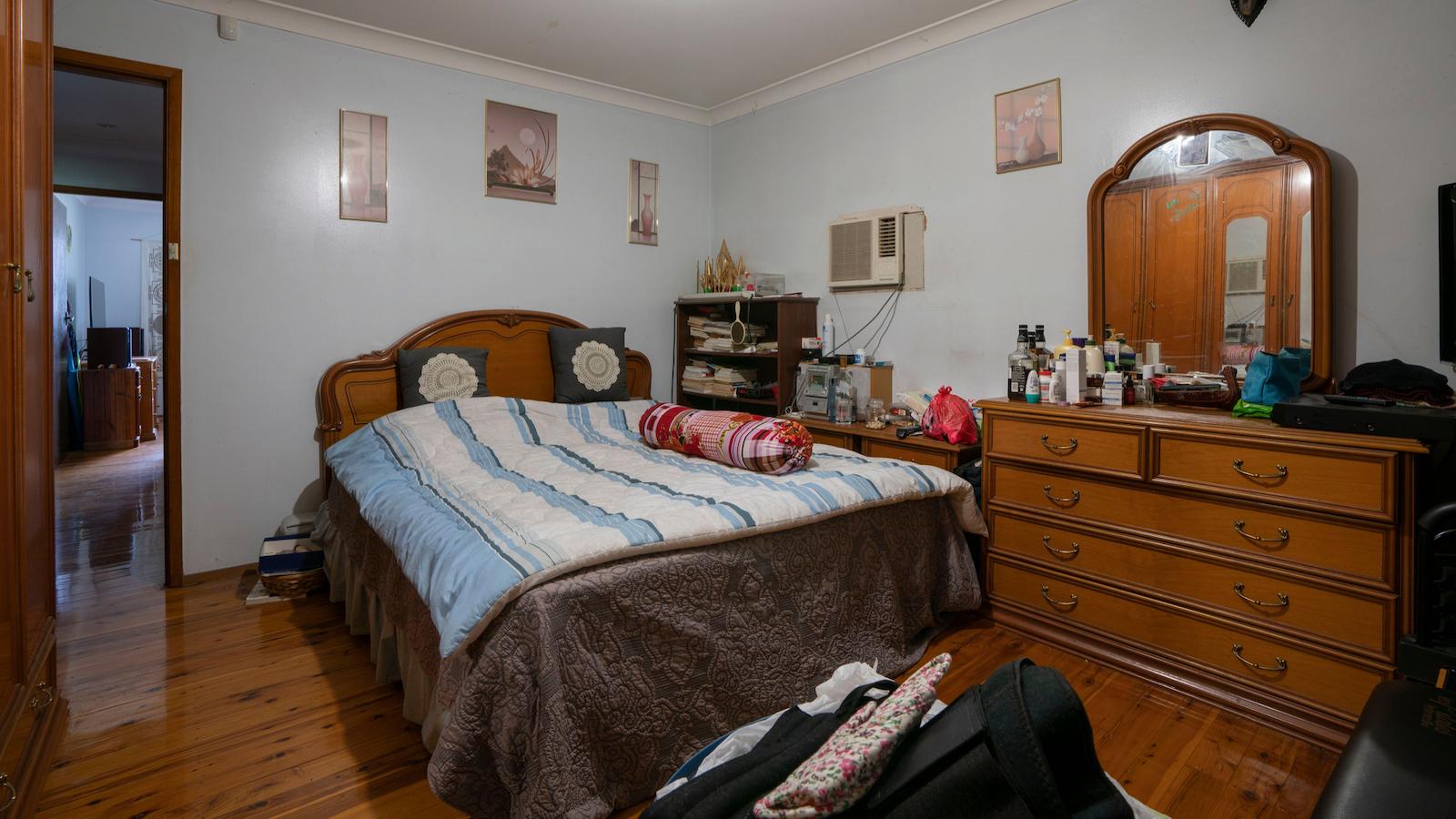
Now it’s time to look at this beast of a room – the master bedroom. Whilst large (6.5 metres long x 4 metres wide) & rectangular in size, everything in the room was orientated the wrong way around. The homeowners had their bed right next to the door on a short wall with their large freestanding wardrobe running along the long side of one wall. Orientating the furniture this way, leaves a big chunk of dead space right at the end of the room. So, what do you do with that? Fill it with more clutter of course …
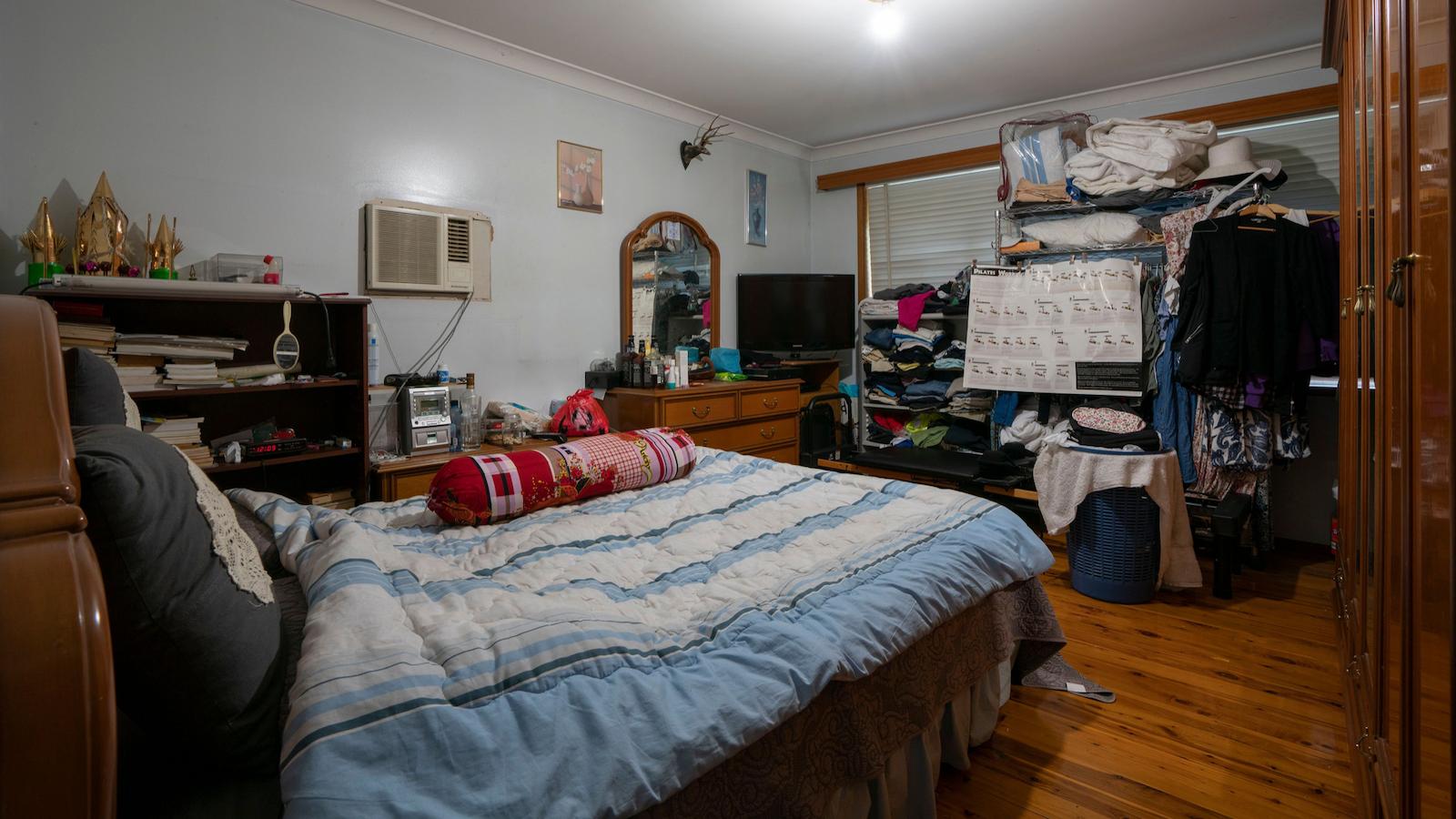
Now let’s all agree, this bedroom is ok but if we’re going to be brutally honest, you can hardly call it, one’s own personal sanctuary, right? Whoever got the side of the bed by the door, lucky you. For the other person, not so much … Getting out of bed each morning & squeezing down the narrow passageway and around the obstacle course of the dressing table, is not something sweet dreams are made of!
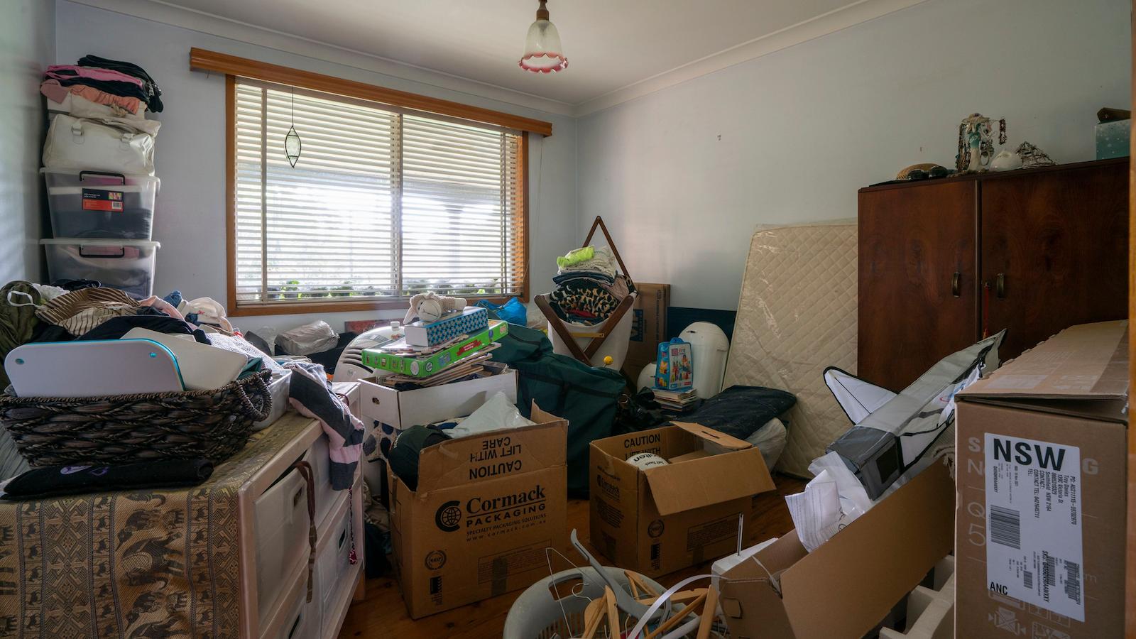
Up next, we have the guest bedroom. Ummm …. if guests are sleeping over, don’t they need a bed? Boxes …. not so comfy. In all reality, when rooms don’t have a clear purpose, it’s so easy for them to become nothing more than a dumping ground for “stuff”.
No wardrobe in this room was a downer but on the positive side, it was a good size with a big window that let lots of natural light in. The diminutive ceiling light really didn’t do or add much to the room & overall, it lacks personality.
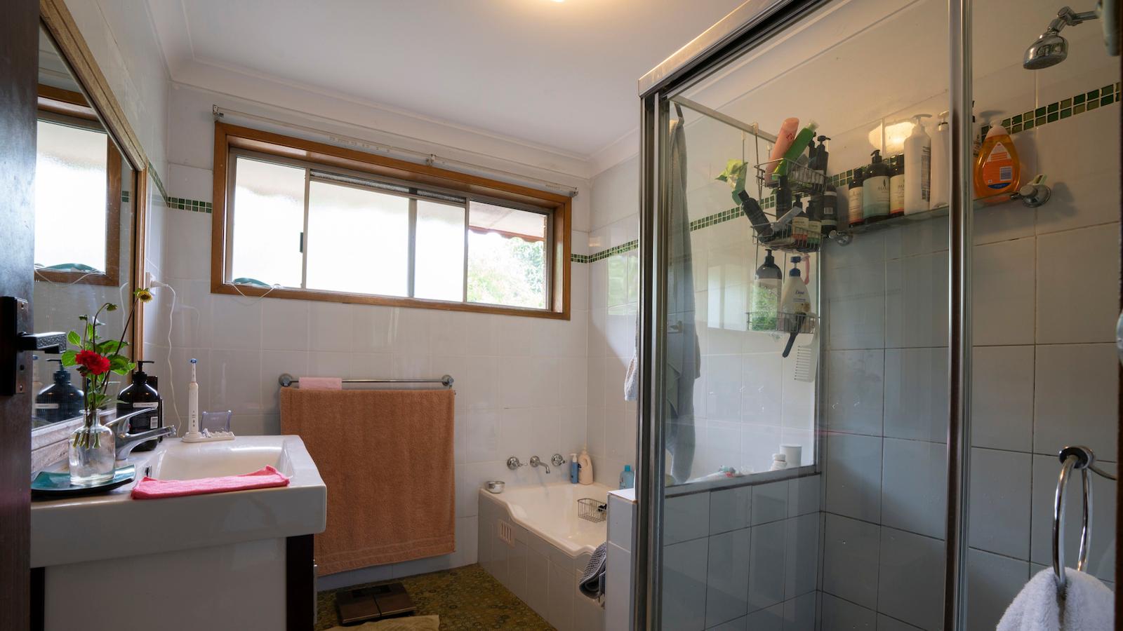
Last but not least, the bathroom. When you first walk in the room, your eye goes straight to the window as its visually the first thing in your line of sight. That would be fine if it was a nice window with something nice to look out onto, but it doesn’t ….
At first glance, the shower area looks ok but when the homeowner told me “the shower floor moves when we’re taking a shower”, I knew my week was about to get dramatically worse …
The bath was a tiny 1.3 metre length, perfectly fine if you’re a little blue smurf! The decorative brown 70’s floor tiles & the white gloss wall tiles with forest green trim would have been the height of home fashion back in the 80’s but now, look rather unaspiring.
With confirmation of rather major water damage in the shower area, I decided it’s a gut the bathroom & start again sort of job. To add to my workload, of course the bathroom walls were riddled with asbestos! I engaged Jim’s Asbestos Removals to professionally remove the asbestos which meant no work on site for 1 whole day for any of my crew.
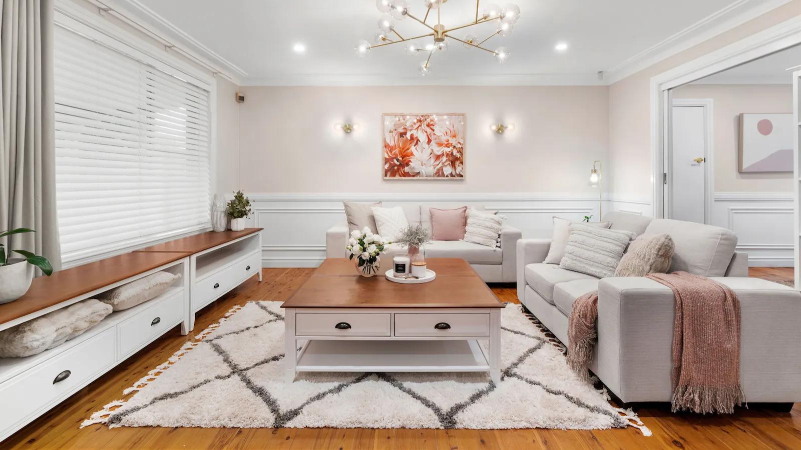
THE RENOVATED LOUNGE ROOM
My aim with this renovation was to add value to this property & make it as appealing as possible to a wider demographic of people. With the homeowners getting older in age, they had indicated a desire to downgrade to a smaller home in the foreseeable future.
First up, I added decorative mouldings around the bottom half of the walls to make the rooms look just a bit more luxurious. I added several different types of timber mouldings from Intrim around the walls that instantly added immediate decorative texture & depth to the room. I deliberately painted the bottom half of the walls in Taubmans Crisp White & added a pop of colour above the mouldings in Taubmans “Sheer Scarf” colour.


To improve the lighting & add some luminosity to the room, I added the dramatic Orion 15 Light Pendant from Beacon Lighting with 2 matching wall scones that help to define the large artwork in the centre of the wall.
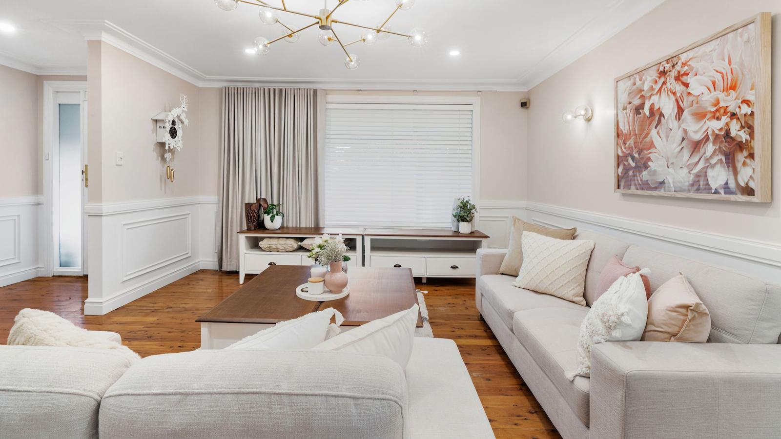
Let’s not forget the importance of good window furnishings … That’s where my friends at Wynstan (with a y) stepped in. We added a white timber venetian to the window that let light in but provided privacy from the busy road outside. In any room you’re renovating & styling, its all about layering different things to bring fullness to the room. It was therefore a no brainer decision to add a large curtain to add softness to the room. If you need new window furnishings, be sure to join my Home SuperSaver group which gives members 25% Off Blinds, Doors & Awnings at Wynstan & 20% Off Shutters & Curtains. New furniture from Fantastic Furniture provided an affordable furniture solution that most people could afford.
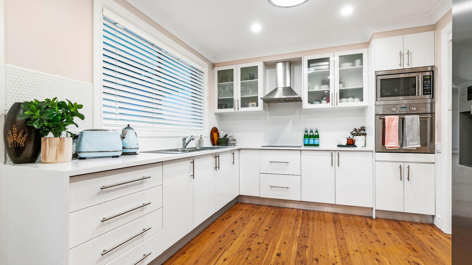
THE RENOVATED KITCHEN
With such good bones already & a lot of things already right in this room, I only needed to do 5 key updates: (1) install a lighter benchtop, (2) install a new lighter coloured splashback, (3) install a new lighter coloured blind, (4) paint the ceiling & walls & (5) upgrade the downlights.
Instead of ripping out that brown stone benchtop, I called the lovely folks in from Granite Transformations who placed a 8mm thin layer of engineered stone benchtop in colour: White Shimmer, straight over the top of the existing benchtop. This was done for a sliver of the cost of a full slab of stone & no-one would ever know the difference. The other big plus is that your new benchtop goes in, in just a matter of hours, versus waiting weeks with stonemasons.
To lighten up the tile splashback, I installed a classic matt white penny round mosaic tile from Beaumont Tiles & finished off the window with a white timber venetian, again from Wynstan.

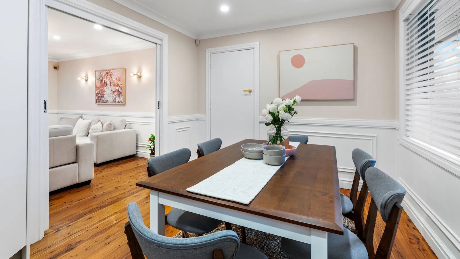
THE RENOVATED DINING ROOM
As the dining room is wedged in between the lounge room & kitchen, it made sense to continue the aesthetic changes I made in the lounge room, into this room as well for design continuity.

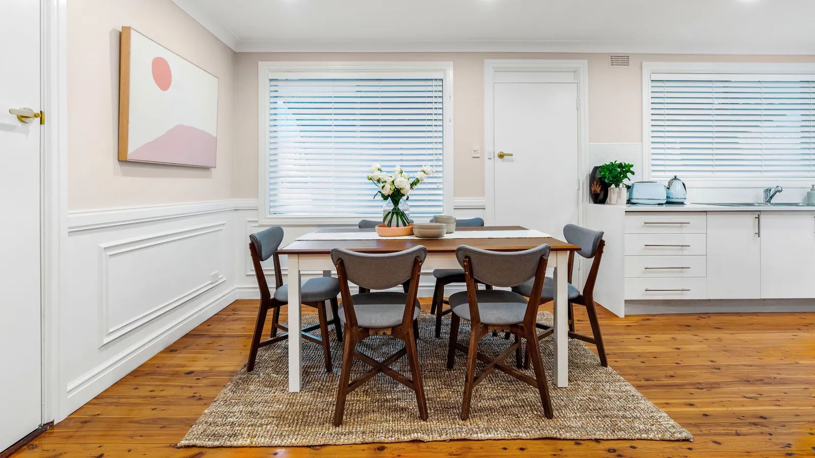
A simple artwork from Urban Road perfectly compliments the colour tones in the room & a larger 6-seater dining table provides a good solution for meals with plenty of space for all the associated dining paraphernalia.
What would I have done differently in this room? The rug. It’s a simple jute style which is fine however it should have been a much bigger size that enabled all chairs to be still, fully placed on the rug, when pulled out. Thanks to Covid shortages, my options for rugs in my timeframe were very limited. Better to rug than no rug, I say!

THE RENOVATED HALLWAY
Such a difference! It’s now light & bright, thanks to those beautiful Taubmans colours that are just naturally smoothing by themselves. Again, those Intrim mouldings add a lot of detail to the room for minimal expense and 2 new wall scones (that match the lounge room lights) continue the design style running through the home.

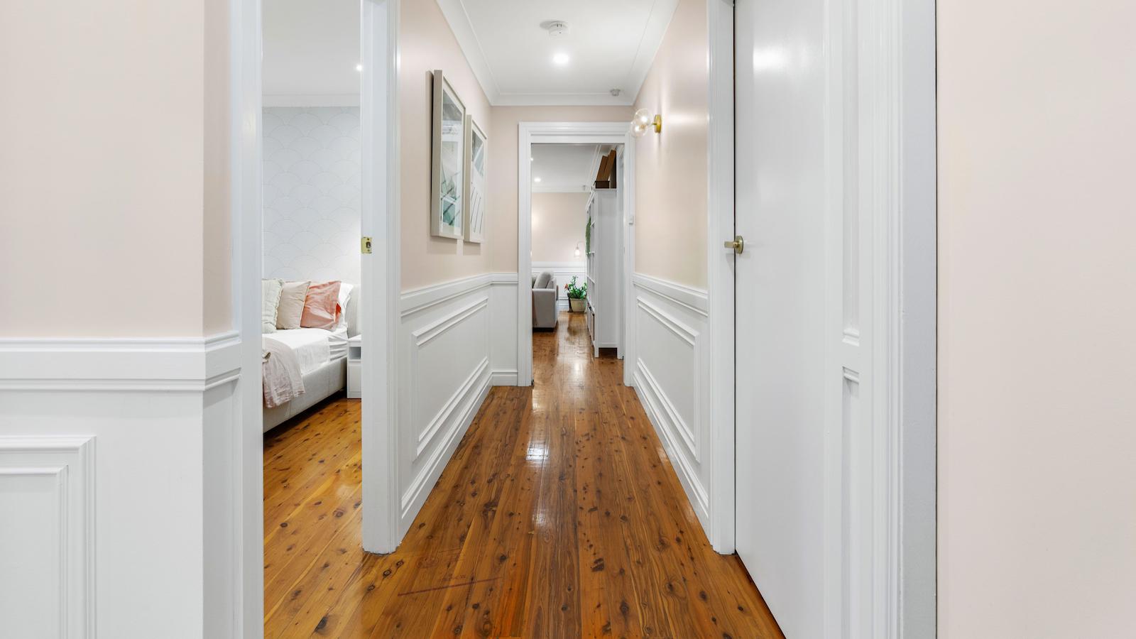
You can’t renovate all your ceiling & walls without doing your doors & trims too. A fresh lick of Taubmans Crisp White makes all those old doors look brand new, fitted off with brushed brass door handles from Bunnings to complete the look.
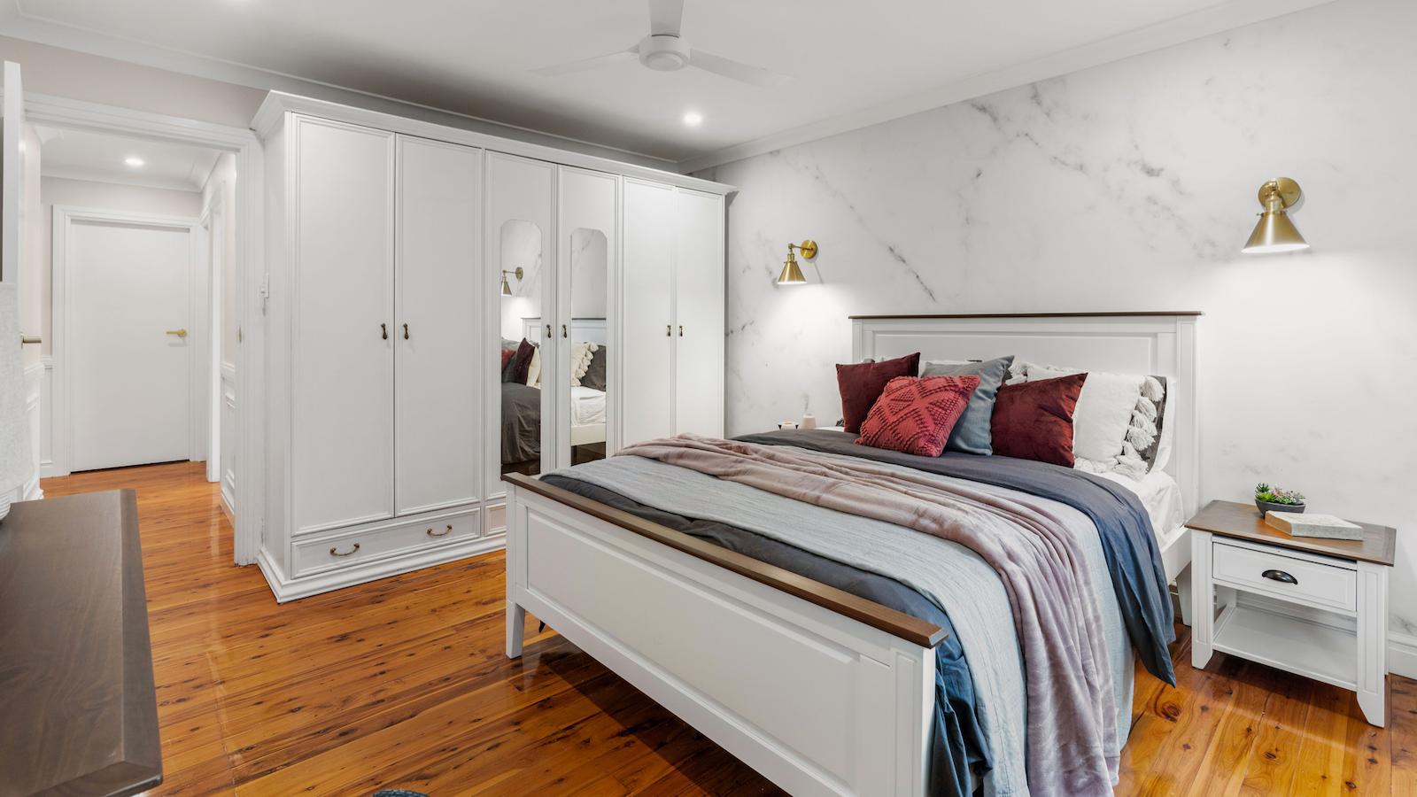
THE RENOVATED MASTER BEDROOM
Whilst big in size, thankfully I didn’t have to spend too much money in the master bedroom. It was more a case of some cosmetic tweaks, followed by a furniture layout reshuffle.
One of the two biggest changes in this room was removing the old air conditioner that hadn’t worked for the last 10 years & installing a ceiling fan overhead. My carpenter patched the wall internally & externally, lucky it wasn’t asbestos.
The second biggest change was moving the bed to the longest wall in the room. This one change makes the room feel more balanced now & provides proper circulation space around both sides of the bed.

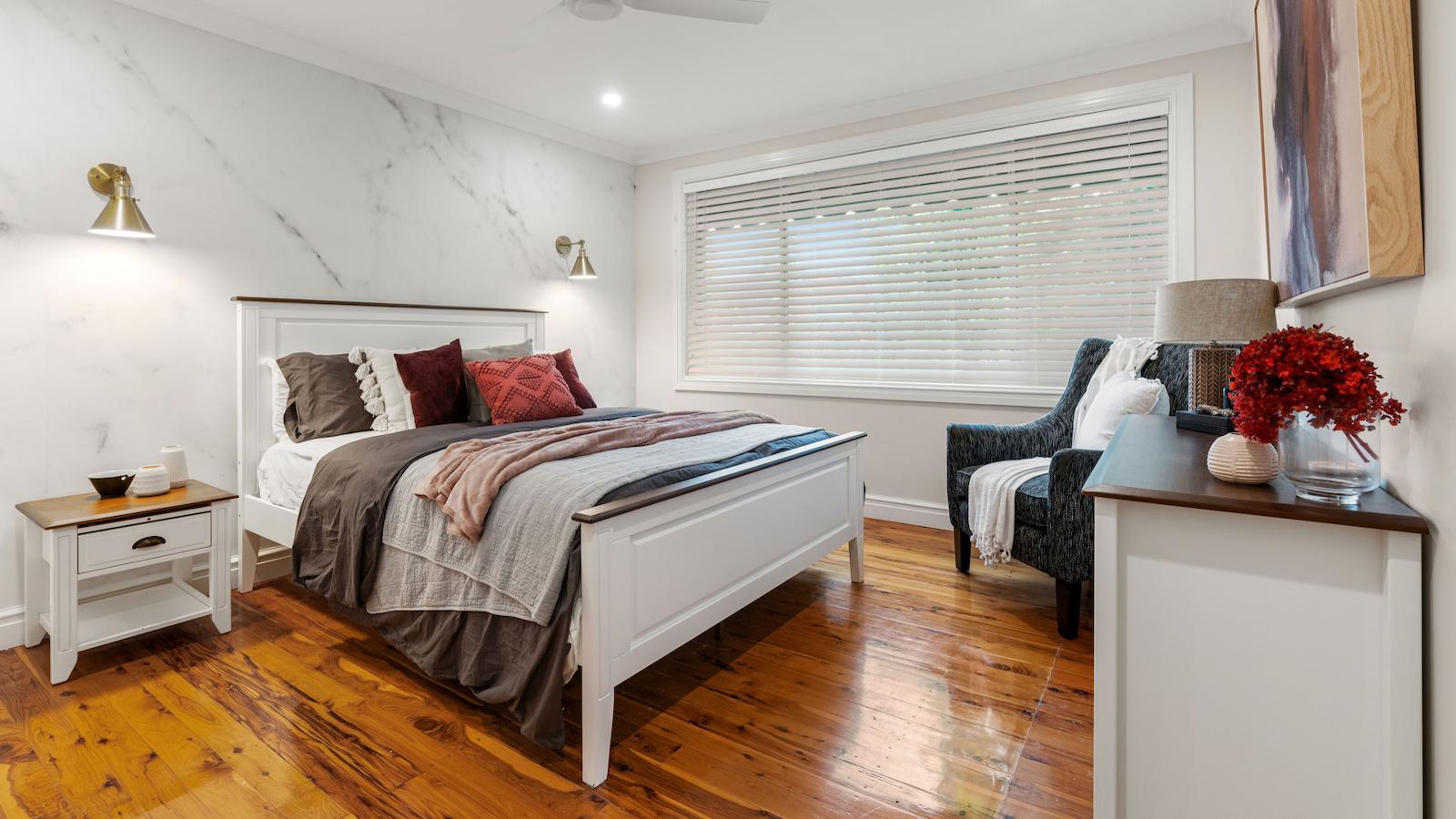
To give the room a bit of elegance, I installed the peel & stick White Carrara Marble Wallpaper from Luxe Walls as the main feature wall. By adding two beautiful brushed brass wall scones on the walls, critical room is freed up on each bedside table for more essential, everyday items.
I know you’re probably wondering “where has the wardrobe gone?” …. It was moved just near the doorway to maximise space & just squeezed onto that wall with millimetres to spare. Whilst the large timber wardrobe looked dated, that was no reason to throw it out. Instead, it was cosmetically painted using White Knight’s Renew laminate paint in Crisp White & new door handles added on.
By reshuffling the furniture layout around, it freed up space in the room for a larger size bed, two new bedside tables & his n her dressers for extra clothes storage that weren’t there previously. So much extra furniture yet it still looks more spacious …

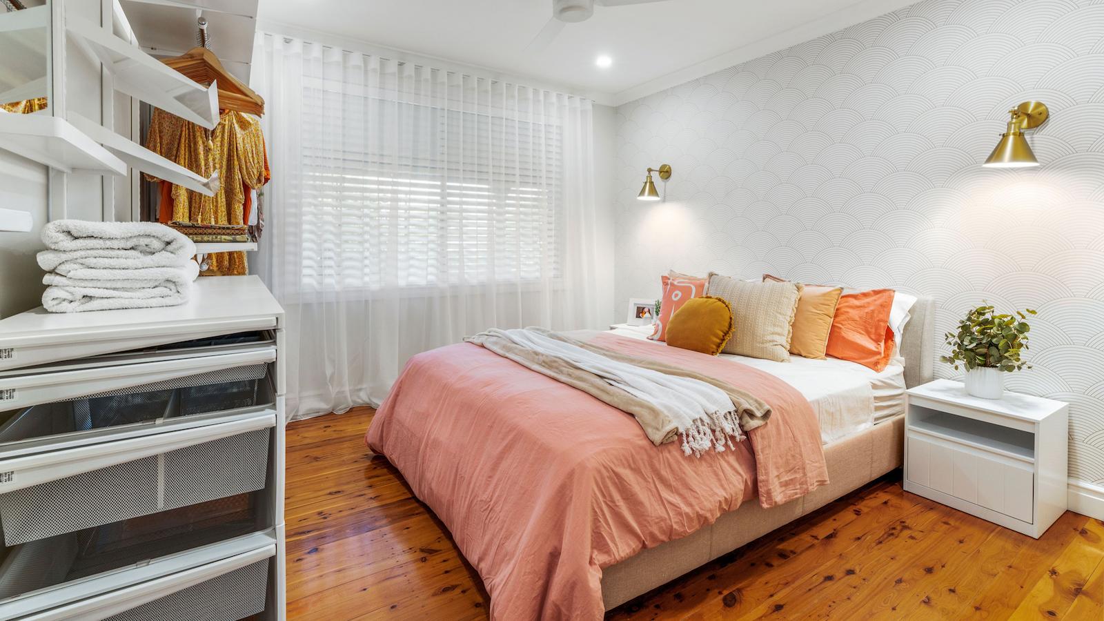
THE RENOVATED GUEST BEDROOM
Following on from the master bedroom, the guest bedroom incorporated the same sort of cosmetic renovation changes – painting, a peel n stick wallpaper feature wall from Luxe Walls, a new curtain, upgraded lighting & a new Elfa wardrobe storage system so guests have somewhere to hang their clothes when coming to stay. A much-needed bed was added with colourful bed linens that make the room feel modern & fresh.

THE RENOVATED BATHROOM
Due to the major water leak, structural damage underneath & asbestos riddled walls, the bathroom was gutted in its entirety. This enabled me to change the layout around, squeezing in a more sizeable 1.7 metre long, back to wall freestanding bath that the family can now truly enjoy.
A simple open shower was added with a clear glass panel that enables the older homeowners to shower more easily. A floor mounted vanity provides lot of practical storage as does the circular mirror which contains sneaky storage behind. Beautiful champagne coloured tapware from Beaumont Tiles Meir range work beautifully with the coral coloured gloss tiles, also from Beaumont Tiles.

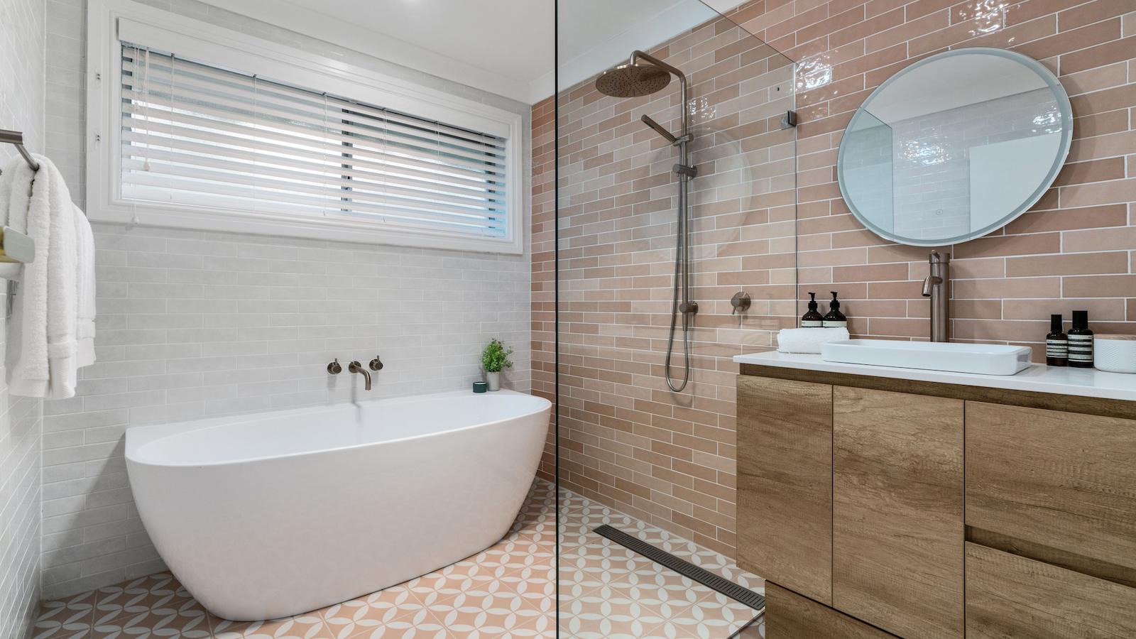
Bathrooms are a tricky space to renovate. They’re one of the most labour intensive & fixtures & fittings heavy rooms to complete but so worth it, in terms of adding value to your property. If you don’t have the budget for a new bathroom, be sure to read one of my previous blogs: 5 bathroom renovations to inspire you.
All up this renovation rolled in at a total cost of $88,955, comprising $38,670 in tradie labour costs at normal price & $50,285 for materials inclusive of all construction materials, asbestos removal, rubbish removal costs, all furniture, artwork & styling items. There were areas I could have saved more money if the purse strings had been tightened along the way.
With the property originally valued at $740,000 pre-reno & a post reno value of $900,000, the property was uplifted by $160,000 in just 7 days with a net profit margin of $71,045, all said & done. If the homeowners decide to renovate the externals of their house, they’ll see a further uplift in their property value, yet again, if they renovate the right way.
Does this renovation inspire you to do a renovation of your own? Be sure to download my free “Cosmetic Renovations For Profit eBook” by Clicking Here.
If you’re keen to renovate dated homes for a profit, it might be a smart move to register your interest now in my new 2022 version of Cosmetic Renovations For Profit which is currently being completely updated to reflect current property market conditions & property prices in a post covid world. The new version of this course launches 15/7/22 & still remains Australia’s most popular renovation course. Only those who’ve registered their interest will be notified early with an exclusive early bird offer, guaranteed to save you a few hundred bucks!
Would love to know what you thought of this renovation.
Much love,
Cherie x

Beautiful renovation, an excellent end result in adding $160,000 value, but, what was the cost of the renovation???
Hi Deborah,
Thank you! The last couple of paragraphs in the blog share all the costs. You may not have got to the end of the blog as it was a touch on the long side 😉 The total cost of the renovation, inclusive of all furniture & styling items, all construction materials & tradie labour costs was $88,955. This resulted in a total net profit of $71,045, all said & done for 7 days work. Hope this is helpful. Cherie x
Very fulfilling breakfast read!
Love the sliding before and after!
Great job👍🎈
Thanks Marcella, Cherie Crew x
Your talent and taste is amazing
Thanks so much Theresa, Cherie Crew x
LOVE your work. Pat yourself and your team on the back.
I’m looking at this with my colleague while we’re meant to be working.
One thing, there’s a missing link for one of the wall sconces?
Thanks so much for sharing your incredible work!
Thanks so much Elise. Don’t want to get you into trouble with the boss! 🙂 I didn’t put all the product details into the blog as it would have ended up 100 pages long so if you let me know the wall sconce you’re after, we can let you know the model. If it helps, all the lights were purchased from Beacon Lighting. If you join our Home SuperSaver group, you can get 25% off at all Beacon Lighting stores nationally! Now get back to work 😉 Lol. Cherie x
Amazing transformation! I think I need to re-paint my house now. Some great ideas in here. Thanks for your usual inspiration, Cherie xx
Thanks so much Susan for your lovely feedback, happy painting! Cherie Crew x
Having cosmetically renovated each home I’ve moved to over the years, I am an avid fan of RENOS FOR PROFIT! I love watching Cherie do great work for little outlay. However, I’m now in my 70’s and my body won’t allow me to do the heavy work these days.
So many ideas, so little time, versus old age!!!
Thanks so much Margaret, sounds like you’re quite the renovator yourself! Glad you enjoyed the read, Cherie Crew x
You’re never too old to renovate Margaret. I’ll be doing it until I can’t see my reno’s anymore. Cherie 🙂
Hi Cherie,
Have you thought of being a Project Manager for others who want their house/apartment renovated?
Many people do not have the ideas, vision or skills to pull all the trades together. You might be their valuable ‘missing link’.
Hi Sandy, my office receives emails every day from people wanting me to project manage their reno but unfortunately I just don’t have any spare time. I’m still very active with my own personal property projects & my TV reno’s consume a big chunk of my time, then there’s a daughter to manage, a business to run, the list goes on! Just not enough hours in the day. Lucky I love what I do! Cherie x
Another amazing transformation Cherie. I would be interested to know what percentage of the original home value was spent on the cosmetic renovation?
Hi Jacinta,
The original home value was $740,000 & the reno cost inclusive of all new furniture, artwork & styling items was $88,955. Normally you don’t include styling items in your construction budget but if we do factor those costs in, it sits at around 12% of the pre-reno value. Cherie x
I have done your course and it was the best thing I have ever done. I have renovated two properties using your manuals and am on my third. I love the moulding in the lounge and hallway in this reno. You have changed my life Cherie. After my husband passed away tragically leaving me with very little money and very little self confidence I threw myself into renovating and can honestly say it was the best therapy to get me back on track financially and regain purpose in my life. I cant thank you enough. Forever grateful, Pat
Hi Pat,
Seeing your message has almost bought me to tears! So happy for you. Seriously, I have the best students ever! They never cease to amaze me & thank you for your time sending this lovely feedback. Much love, Cherie x
Every time we read this stuff by Cherie and about what she does we “Pinch” ourselves remembering how lucky we are that we went to Sydney to do her course way back in 2014 and that remains, one of THE BEST things we have ever done. And while the “reno Stuff” is good and has inspired us to launch into maybe 20 properties since, the absolute BEST thing is the feeling in our hearts from Meeting Cherie several times, daughter Milan, Cherie’s sister and her team.
The stuff you learn from these guys is MUCH more than inspirational for Renos, it is a foundation with principles as to how to address many things in life from Business Problems, relationship problems, depression, etc.
You are a SUPER person, Cherie. We will always love you and NEVER be able to thank you enough!!
Oh my gosh, Mark & Leenah! What a beautiful message to receive. It’s amazing students like you both that make all of us proud at Renovating For Profit. Incredibly chuffed that you’ve done 20+ reno’s since doing the course – AMAZING! Keep on rocking it! Cherie x
Just loved the transformation!💗 The heaviness disappeared when those fresh light colours and new surfaces were introduced. They gave that “breath of fresh air” feeling!
Loved everything you did, especially the wall trims!
Thank you Debby for the lovely feedback. Much appreciated! Cherie x
Amazing transformation! The house looks wonderful. I love the bath. Can I ask what it’s called Cherie?
Hi Lisa,
The bath is a back to wall freestanding bath. I purchased it from Beaumont Tiles & is called the Keeto Back To Wall Bath Acrylic – 1700mm in Gloss White. Hope this helps! Cherie x
Beautiful renovation, very similar trims and doors in our home but now thinking we should paint them white as it looks so fresh.
Thank you Maria. Lighter colours will definately make a room feel lighter, brighter & make it appear larger, that’s for sure. Cherie x
Hi Cherie, I am a big fan of yours, awesome work again!
May I ask if the floor-to-ceiling storage cabinets in the master bedroom are custom made or purchased somewhere? How much roughly does it cost please?
Hi Lynda, thank you so much for your lovely feedback 🙂 The big wardrobe in the master bedroom was the old timber wardrobe that the homeowners already had in their room. I kept that wardrobe & simply painted the whole wardrobe in the White Knight Renew laminate paint in Taubmans Crisp White colour. The floor to ceiling wardrobe in the guest bedroom is called the Elfa system which you can get from Howards Storage World. With that system, you can customise your wardrobe & shelves any way you like. Hope this helps. Cherie x
I am always amazed with your work and find it an inspiration, the only person to share this work Cherie you are wonderful.
Hoping you continue to share your projects.
Grateful thanks.
Beautiful, as always, Cherie. You are amazing.
I have a question: am wondering where you got the circular mirror with storage behind it? I would like something like that too
Thanks in advance, to you & your staff.
Beth
Hi Beth, glad you liked the reno. The mirror came from Beaumont Tiles. These sorts of mirrors (with storage behind) are very common so even places like Bunnings have these sorts of products now. Hope this helps. Cherie x
Hi Cherie
Love, love, love the mouldings. Can I ask where you sourced these from please.
Hi Chris, they were supplied by Intrim Mouldings, Cherie Crew x
Dear Cherie
I just have to comment on the transformation of this home you renovated. WOW!!!!! Absolutely LOVE your styling and work. I wish you could renovate my unit in South Australia as I just don’t seem to be able to re-invent this 2 bedroom place I have. Love watching anything with you in it as you truly are very talented/gifted. Well done!!!
From a big fan of yours 🙂
Leonie
Thanks so much for your lovely feedback Leonie, Cherie Crew x
Thank you so much Leonie for your very kind words! Cherie x
Love your work
Can I ask were the door architraves and skirts painted in ? Gloss crisp white ?
Thanks in advance
Thanks David, Cherie used Taubmans Crisp White on the architraves & skirting boards. Cherie Crew x
Hi there! I know this is somewhat off topic but I was wondering which blog platform are you using for this website?
I’m getting tired of WordPress because I’vehad problems with
hackers and I’m looking at alternatives for another platform.
I would bbe great if you coud point me in the direction of a good
platform.
My blo post – https://Sites.Google.Com
Hi Marta, Thank you for your question. We also use WordPress but you could look at the Storyblok, Sanity or Contentful platforms for a more modern web solution. They do require a really skilled developer, so WordPress is usually the platform of choice for those wanting something easy to build for cheaper. Cherie Crew